Every autumn brings a fresh round of paint announcements, and most of them pass without changing a single room in your house. A shade looks beautiful on a swatch card, then turns cold on a north-facing wall or clashes with the sofa you already own, and the tin ends up back in the garage. It is easy to feel that colour of the year news is made for showrooms, not for real homes.
That feeling is fair, because a single colour rarely tells you how to live with it. You need to know what it does in morning light and in lamplight, what wood tones calm it down, and whether it belongs on all four walls or just on a door. Without those answers, even a pretty shade becomes a decorating risk, and many of us stick with the same safe white for another year rather than gamble.
This year the story is different, because the three headline shades for 2027 actually work together. These 2027 colours of the year, Celery, Soulful Sage, and Grounded, form a soft, earthy palette that suits kitchens, bedrooms, and living rooms without a full redecoration. Used in the right proportions, they make a home feel fresher, calmer, and more grounded at the same time.
What the Three Colours Actually Look Like in a Real Room
 Save
Forget the names for a moment and look at what each shade does on a wall. Celery is a pale, yellow-leaning green, the colour of the inner stalks rather than the dark outer leaves. It reads light and fresh, almost like a warm white with a green whisper, and it lifts a room without shouting. In a bright kitchen it feels clean and cheerful, while in a dim hallway it can fade toward cream, so it needs decent daylight or warm artificial light to show its green side.
Soulful Sage sits a step deeper and greyer. It is a muted, dusty green with a soft grey undertone, calm rather than crisp, and it settles a room instead of waking it up. That makes it a natural choice for places where you rest, because it does not demand attention. It pairs easily with linen, pale oak, and off-white bedding, and it looks especially good next to natural textures that stop it from feeling flat.
Grounded is the anchor of the trio. It is a warm, earthy brown, closer to turned soil or a well-worn leather chair than to chocolate paint. It gives weight to a scheme and stops the two greens from floating away. Used on a large area it can feel serious, so it works best where you want warmth and depth, such as a living room wall behind a sofa, a hallway, or painted woodwork that frames a lighter room.
| Colour | Feel in a room | Best first use | Pairs well with |
|---|---|---|---|
| Celery | Light, fresh, gently green | Kitchen walls or a sunny dining nook | Pale oak, cream, brushed brass |
| Soulful Sage | Calm, dusty, restful | Bedroom walls or bathroom cabinets | Linen, stone, matte black taps |
| Grounded | Warm, earthy, solid | Living room feature wall or hallway woodwork | Warm wood, cream, woven texture |
Styling tip: paint a large test patch, at least a metre square, and live with it for two days before you commit. Swatch cards lie about scale, and a colour that looks soft on a card can look much stronger once it covers a whole wall.
Celery Belongs Where the Day Starts
 Save
Kitchens and breakfast corners are where Celery earns its keep. Morning light suits it, and its fresh tone makes white cabinets, pale worktops, and wooden chopping boards look cleaner without the cold feel of a stark white wall. If your kitchen has little natural light, keep Celery to the upper walls and let a warm cream or pale wood take the lower cabinets, so the room stays bright rather than washed out.
Celery also works well in a dining nook that doubles as a workspace. A pale green behind a table makes a small space feel open, and it flatters food, plants, and everyday crockery in a way that a bold green never would. Keep the table wood warm rather than grey, since cool grey wood can pull Celery toward a chilly mint tone. A woven placemat, a simple ceramic vase, and a wooden board are enough to finish the look.
If a full kitchen repaint feels like too much, try Celery on one element first. Painted open shelving, the inside of a glass-fronted cabinet, or a single pantry door gives you the freshness without the disruption. You can live with that smaller dose for a month and decide whether the rest of the room wants to follow, which is a far kinder test than repainting everything in one weekend.
Soulful Sage Makes Bedrooms and Bathrooms Feel Settled
 Save
Bedrooms need colours that quiet the mind, and Soulful Sage does that job without making the room feel dark. On bedroom walls it sits behind bedding beautifully, especially with white or oatmeal linen, and it makes wooden bed frames and bedside tables look richer. Keep the ceiling and trim a warm white rather than a bright white, so the contrast stays soft and the room does not feel striped at the edges.
In a bathroom, Soulful Sage suits painted vanity units and panelled walls, where its dusty tone hides water marks better than a pale cream and feels more considered than plain white tile. Pair it with stone, brushed brass, or matte black fittings, and keep towels in cream or soft white so the green stays the main note. A plant on the windowsill, real or not, helps the colour read as natural rather than painted on.
Small bedrooms benefit from a simple rule with this shade. Paint the wall behind the bed in Soulful Sage and keep the other three walls in a warm off-white, so the room gains depth without losing light. That single wall becomes the backdrop for pillows, art, and lamplight, and the rest of the room stays airy. It is the same restrained approach that makes our greenery bedroom ideas work, where a few strong green notes carry the room instead of a wall-to-wall wash of colour.
Grounded Gives Living Rooms and Hallways Their Weight
 Save
Living rooms often suffer from the opposite problem to bedrooms. They have plenty of light and furniture, but nothing holds the scheme together, so the sofa, rug, and art all compete. Grounded solves that by giving the eye a warm base to rest on. A Grounded wall behind a sofa makes cream cushions, a wooden coffee table, and a woven rug look intentional, and it warms up rooms that face north or get little direct sun.
Hallways are another strong home for this shade, especially on woodwork. Painted skirting, a stair balustrade, or an internal door in Grounded adds warmth to a passage that would otherwise be a white tunnel, and it frames the lighter rooms on either side. Keep hallway walls pale so the passage does not feel narrow, and let the darker woodwork do the work. A runner in a warm neutral and a simple mirror complete a hallway without clutter.
Grounded also suits rooms with existing brown or terracotta pieces, because it echoes them instead of fighting them. If your living room already has a leather chair, a wooden sideboard, or terracotta pots, a Grounded accent wall will tie those pieces together. For more ideas on working with warm browns, see our chocolate brown and terracotta decor ideas, where the same warm family is used to make a room feel cosy rather than heavy.
Pairing the Trio Without Turning Your Home Green
 Save
The temptation with three related colours is to use all three in every room, and that is where the palette starts to feel like a theme park. A better rule is to let one colour lead in each room and let the other two appear as small supporting notes. A Celery kitchen might gain a sage green tea towel and a brown wooden board, but it does not need sage walls and brown cabinets as well.
Neutrals do most of the balancing work here. Warm white, cream, pale oak, and natural linen sit happily with all three shades, and they give your eye a rest between green and brown. Brushed brass and warm wood add a gentle shine, while matte black works as a quiet contrast on handles, light fittings, and picture frames. Avoid cool greys and stark whites in the same room, since they can make Celery look cold and Grounded look muddy.
Designer note: step back and count the colours in a room before you add anything new. If you can already see three strong colours plus wood and white, the room is full. The next addition should replace something, not join it.
Paint Less Than You Think: Doors, Cabinets, and One Wall
 Save
You do not need to repaint a whole house to take part in a colour trend. In fact, the most successful uses of these shades are often the smallest ones, because a painted door or cabinet gets noticed every day without changing the light or scale of a room. A Grounded front door inside a pale hallway, a Celery pantry door in a white kitchen, or sage bathroom cabinets all give you the colour with a fraction of the work.
Single walls work in the same way, provided you choose the right wall. Pick the wall you face when you enter the room, not a side wall that catches uneven light, and keep the remaining walls in a warm neutral that matches the undertone of your chosen shade. That approach is far more forgiving than painting all four walls, and it leaves you an easy exit if you change your mind next year. If you do want a full-room wash, read our colour drenching technique first, since drenching a room in one colour needs careful attention to ceilings, trim, and light.
Furniture is another low-risk route. A second-hand wooden dresser painted in Soulful Sage, a bedside table in Grounded, or a kitchen stool in Celery can test a colour in your home for the price of a small tin of paint. Budget swap: start with a single piece of furniture or a door before you buy paint for a whole room, and keep the original hardware if it suits the new shade.
No Paint at All: Textiles, Ceramics, and Art in the New Palette
 Save
Not everyone wants to paint, and these colours translate well into soft furnishings and objects. A Celery throw on a cream sofa, sage cushion covers on a bed, or Grounded ceramic vases on a shelf all bring the palette into a room without a brush. The trick is to repeat one shade at least twice in a room, so it looks deliberate rather than accidental. One sage cushion alone can look like a stray; two sage cushions plus a sage vase look like a choice.
Art and ceramics are useful here because they let you mix the shades in a controlled way. A landscape print with sage fields and brown earth, a set of bowls in graduating green and brown tones, or a woven wall hanging in cream and sage can carry the whole palette on one shelf or wall. Keep the surrounding surfaces calm so the objects stand out, and avoid adding patterned textiles in competing colours at the same time.
Texture matters as much as colour when you skip paint. Linen, wool, rattan, and unglazed ceramic all soften these earthy shades, while shiny plastic or chrome can make them look flat. If your room already has a lot of smooth, modern surfaces, add one woven basket, a woollen throw, or a textured cushion to give the new colours something to sit against. That tactile layer is what stops a trendy palette from feeling like a showroom display.
Mistakes to Avoid With Green and Brown Palettes
 Save
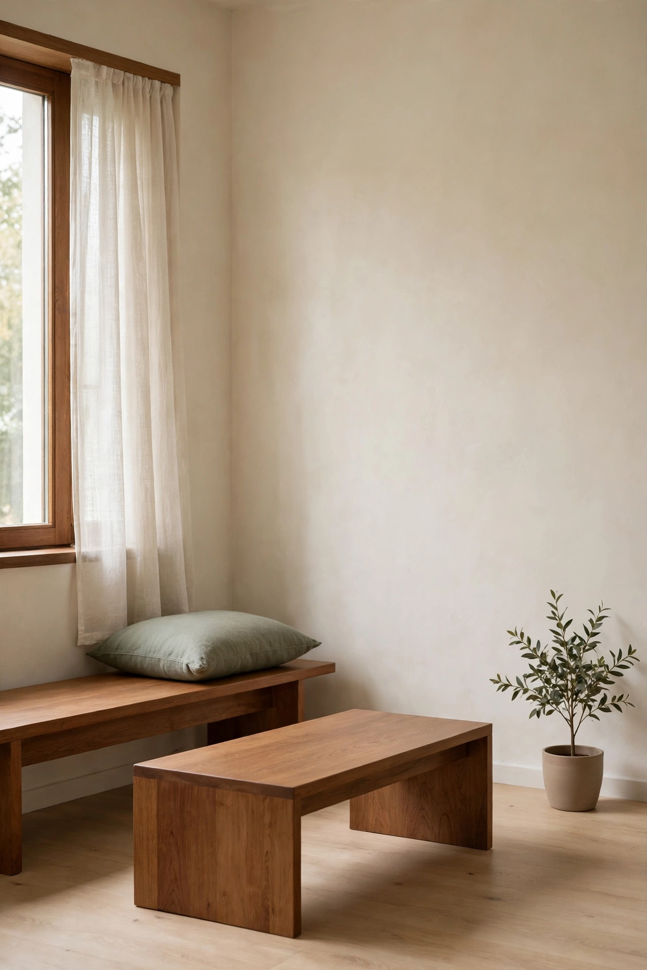
The most common mistake is stacking too many greens together. Celery and Soulful Sage are related, but they are not interchangeable, and putting them on adjoining walls can make both look murky. Keep them in separate rooms, or separate them with a generous amount of cream, wood, or white, so each shade has room to breathe. The same applies to brown: one warm brown anchor per room is plenty.
Light is the second trap. Green paint changes dramatically between daylight and warm lamplight, and a shade that looks fresh at noon can look dull under a cool white bulb. Before you paint, check your test patch under the lights you actually use in the evening, and swap cool white bulbs for warm white ones in rooms where you use these colours. That single change often does more for a green room than a second coat of paint.
Finally, avoid pairing these earthy shades with very bright accent colours in the same room. A vivid red, electric blue, or hot pink will fight the calm, natural feel of the palette and make the greens look accidental. If you love bright colour, keep it in a separate room or in small, removable objects like a book cover or a single vase, so the main palette stays settled. For a softer way to add texture to a painted wall, our limewash walls guide shows how a textured finish can add depth without adding another colour.
Bringing It All Together
Start with one room and one leading colour. A Celery kitchen nook, a sage bedroom wall, or a Grounded living room accent will tell you more about this palette than any swatch card, and you can build from there at your own pace. Let warm neutrals and natural wood do the supporting work, keep the other two shades as small notes rather than rivals, and test every colour in real light before you commit to a full wall.
The appeal of Celery, Soulful Sage, and Grounded is not that they are new. It is that they are easy to live with, easy to pair with what you already own, and easy to change later if your taste moves on. That is a rare combination in a colour trend, and it is why this trio is worth trying in a real home rather than just admiring in a paint catalogue.
Frequently Asked Questions
Which of the three colours should I try first?
Start with the room you use most and pick the shade that suits its light. Celery suits bright kitchens, Soulful Sage suits calm bedrooms and bathrooms, and Grounded suits living rooms and hallways that need warmth. One leading colour per room keeps the palette calm and makes the next room easier to plan.
Can I use Celery and Soulful Sage in the same house?
Yes, but keep them in separate rooms or separate them with cream, wood, or white. They are related greens, so placing them on adjoining walls can make both look murky. Used in different rooms, they feel like a coherent palette rather than a clash.
Will Grounded make a small room feel smaller?
It can if you paint all four walls, so use it on one wall, on woodwork, or on furniture in a small room and keep the other walls pale. That gives you warmth and depth without closing the room in, and a mirror or a pale rug will help the space feel open.
Do I need to repaint everything to follow the 2027 palette?
No. Painted doors, cabinets, or a single piece of furniture give you the colour with far less work, and textiles, ceramics, and art can carry the palette with no paint at all. Start small, live with the shade for a few weeks, and extend it only where the room still feels unfinished.
What colours should I avoid pairing with this palette?
Avoid cool greys, stark whites, and very bright accent colours in the same room, since they can make Celery look cold and Grounded look muddy. Warm white, cream, pale oak, brushed brass, and natural linen are safer partners, and they let the greens and browns stay the main notes.