Intro
Most of us were taught that walls come in two settings: white, or one feature wall. Everything else was considered brave. But if you have ever walked into a room where the walls, ceiling, skirting and even the bookshelf all wear the same deep, saturated colour, you know the effect. It stops you. The room feels deliberate, calm and strangely bigger than it is.
The trouble is that committing to one colour everywhere sounds like a gamble. What if it feels dark? What if the ceiling looks wrong? What if you hate it by Tuesday? So people default to the safe accent wall and wonder why the room never quite looks like the photos that inspired them.
Colour drenching is the technique of painting everything in a room one colour: walls, ceiling, woodwork, doors and sometimes the radiator and built-in furniture too. Done well, it blurs the edges of a room so the space reads as one continuous cocoon. This guide walks you through the whole thing: what drenching actually means, why designers keep reaching for it, how to choose a colour that survives real life, and the exact painting order that keeps the finish flawless.
What Colour Drenching Actually Means
 Save
Colour drenching sounds dramatic, but the idea is simple. You take one paint colour and carry it across every surface in the room: the four walls, the ceiling, the skirting boards, the window frames, the doors, the architraves and, where you have them, radiators, picture rails and fitted shelving. The colour stays constant; what changes is the finish, so a wall might be flat matt while the woodwork gets eggshell and the ceiling a dead-flat paint that never flashes.
This is not the same as a feature wall, which spotlights one surface and leaves the rest white. It is also not colour blocking, which deliberately sets blocks of different colours against each other. Drenching does the opposite of both: it removes the visual stopping points. Where a white ceiling meets a coloured wall, your eye registers a boundary. When ceiling and wall share the colour, that boundary dissolves and the room reads as one uninterrupted volume.
Designer note: drenching is not only for deep colours. Pale versions, like a soft clay or a warm putty taken across every surface, give a calm, plaster-like envelope that works beautifully in bright rooms. The technique scales with the colour; the saturation sets the mood.
There is one common misunderstanding worth clearing up: you do not have to paint the furniture. Most drenched rooms keep the sofa, bed and big pieces in contrasting or neutral tones so the room has somewhere for the eye to rest. The drenching is about the architecture of the room, not everything inside it.
Why One Colour Everywhere Changes How a Room Feels
 Save
Designers return to colour drenching for one reason: it changes the geometry of a room. When every surface shares a colour, the eye stops measuring where the wall ends and the ceiling begins. Low ceilings feel lifted in a drenched pale colour, and awkwardly shaped rooms, the kind with dormers, bulkheads and strange corners, suddenly feel intentional because the paint stops pointing out the irregularities.
The second effect is emotional. A single colour wrapping the room removes the fizz of contrast, and that quiet feels luxurious. Hotels have used this trick for years: a deep green bedroom or an ink-blue study calms the nervous system because there is nothing competing for attention. You feel held by the room rather than stimulated by it.
It also fixes the most common decorating problem, which is timid colour. People buy a bold paint, use it on one wall, and the room still looks mostly white and a bit unfinished. Drenching removes the half-measure. The same colour that looked loud on a sample card behaves differently when it becomes the whole environment: it settles, it deepens, and it lets everything in front of it, a brass lamp, a linen sofa, a wooden chair, look richer by contrast. Against a drenched background, pieces with interesting shapes and warm metallics get a proper gallery wall to sit against.
Try this: stand in a room you are considering and look at where your eye naturally jumps. If it bounces between the white ceiling, the white skirting and the furniture, the room is asking for less contrast, not more. That is the signature of a space that would take to drenching.
Choosing a Colour That Survives Real Life
 Save
This is the step that makes or breaks the whole project, and it is mostly about light. A colour drenching lives or dies by how the paint behaves at 8 in the morning and at 8 in the evening, because you will see every square metre of it all day long.
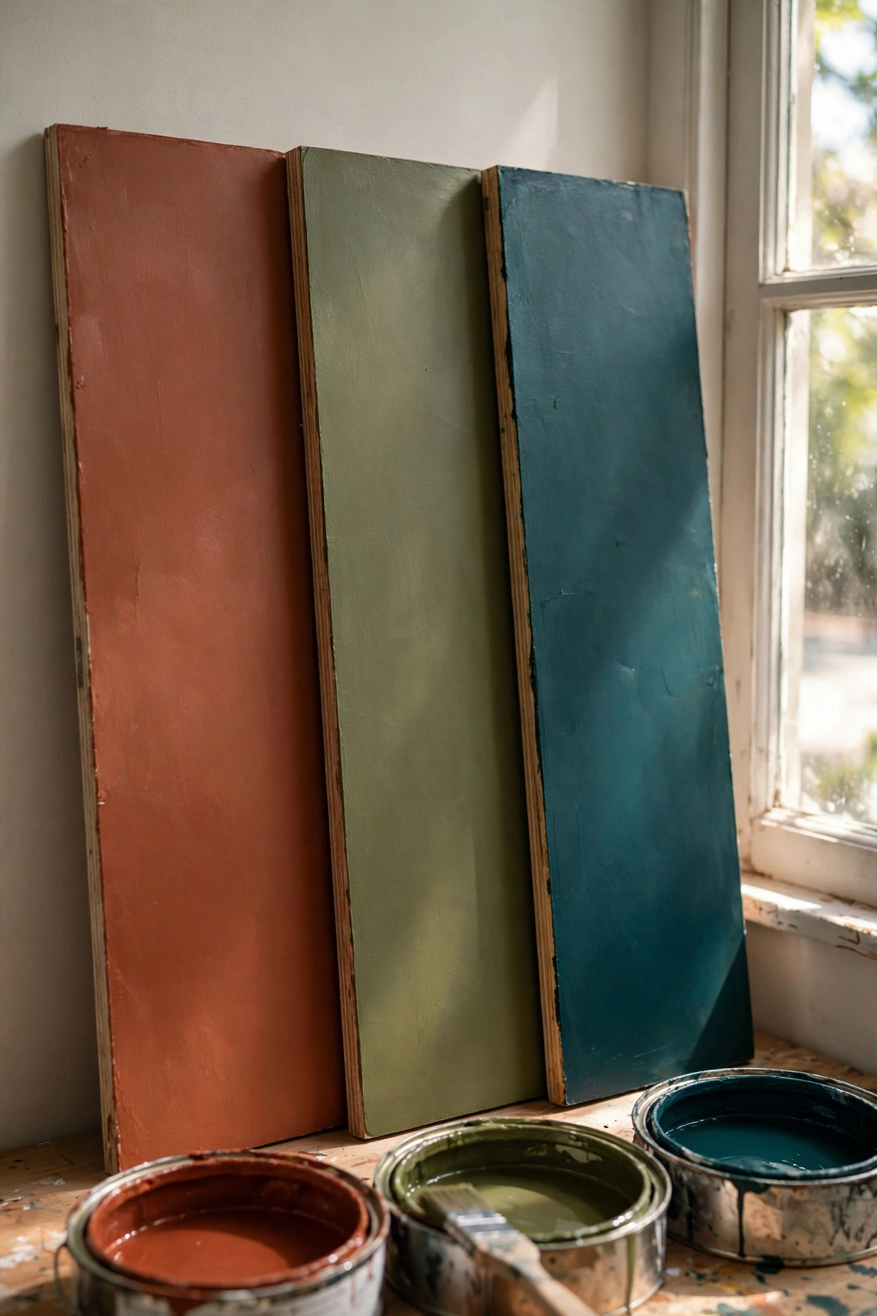
Start with orientation. North-facing rooms get cool, blue-tinged daylight that flattens warm colours and makes cool colours feel colder, so choose colours with warm undertones there: olive instead of sage, terracotta instead of blush, a deep honey-tobacco instead of grey-green. South-facing rooms can take almost anything, including the inky blues and bottle greens that go dead in a north-facing space.
Next, sample at scale. A postcard-size tester tells you nothing about drenching. Paint large boards, at least a metre square, and prop one against each wall, plus one flat on the floor where the ceiling would be. Live with them for three days, checking morning, midday and under lamplight. The colour you love at noon may go muddy by dinner, and that is information you want before you buy six litres.
| Room orientation | What to lean into | What to avoid |
|---|---|---|
| North-facing (cool light) | Warm undertones: olive, tobacco, terracotta, warm clay | Cool greys, icy blues, blue-based greens |
| South-facing (warm light) | Saturated hues: ink blue, bottle green, burgundy, black-green | Very pale pastels that wash out to nothing |
| Small / no windows | Mid-tone colours rather than very dark; finish matters more than depth | Jet black or navy with zero light to bounce |
| Open-plan corner | Colours with a clear family link to the adjoining space | Anything that fights the next room’s palette |
Budget swap: if you cannot decide between two finalists, buy the cheaper colour now and the dream colour later. Painted rooms are not tattoos; the second coat goes faster once the prep is done, and living in the first choice teaches you exactly what you want to adjust.
As for which colours actually suit drenching, the reliable families are deep botanical greens, inky blues, rich burgundies, warm chocolates, terracotta and saturated clay. These have enough complexity to stay interesting across a whole room. Very clean brights, like a primary red or a neon-adjacent yellow, are harder work because they vibrate at the edges; if you love them, take them a few shades deeper or dustier.
What to Paint and What to Leave Alone
 Save
The drenching purist paints everything, but real rooms have exceptions, and knowing them is what separates a confident drench from a regret.
Always include the ceiling. This is the non-negotiable part. A white ceiling above drenched walls looks like an oversight, and it breaks the cocoon effect completely. Paint it the same colour, usually in a dead-flat finish so it never catches a sheen. Ceilings take less light, so the same paint will read slightly darker up there, which is part of the charm.
Woodwork, skirting, architraves and doors: paint them. White skirting against a drenched wall draws a chalk line around the room that chops it up. Matching woodwork in eggshell gives you a soft tonal shift from the matt walls without the hard boundary. Doors painted the same colour disappear beautifully, which is a gift in small rooms where every door competes for attention.
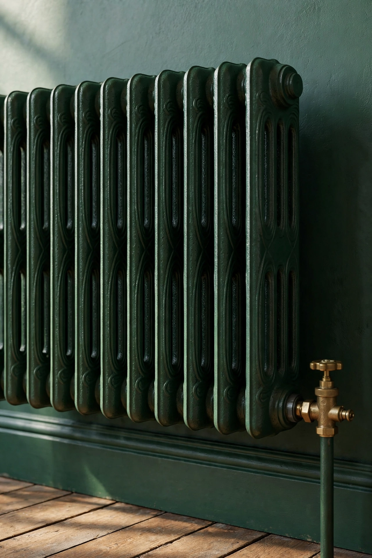
Radiators, pipes and vents: paint them if the paint suits metal. Radiators in the wall colour melt away instead of sitting there as white rectangles. Use a heat-resistant eggshell or a dedicated radiator paint matched to your colour, and remember they need their own primer.
Fitted shelving, bookcases and alcove cupboards: usually paint them. Drenching built-ins turns them into architecture rather than furniture, and books and objects pop against the uniform colour behind them.
What to leave alone: the floor (a wooden or neutral floor grounds a drenched room), kitchen worktops and bathroom sanitaryware (painting over these looks wrong and wears badly), and ceiling roses or coving only if they are genuinely decorative and you want to keep a highlight, though most drenched rooms look better with them painted too. If you are pairing the technique with striped or patterned ceilings, commit to one idea per room: pattern and drenching fight for the same job.
The Painting Order That Keeps It Flawless
 Save
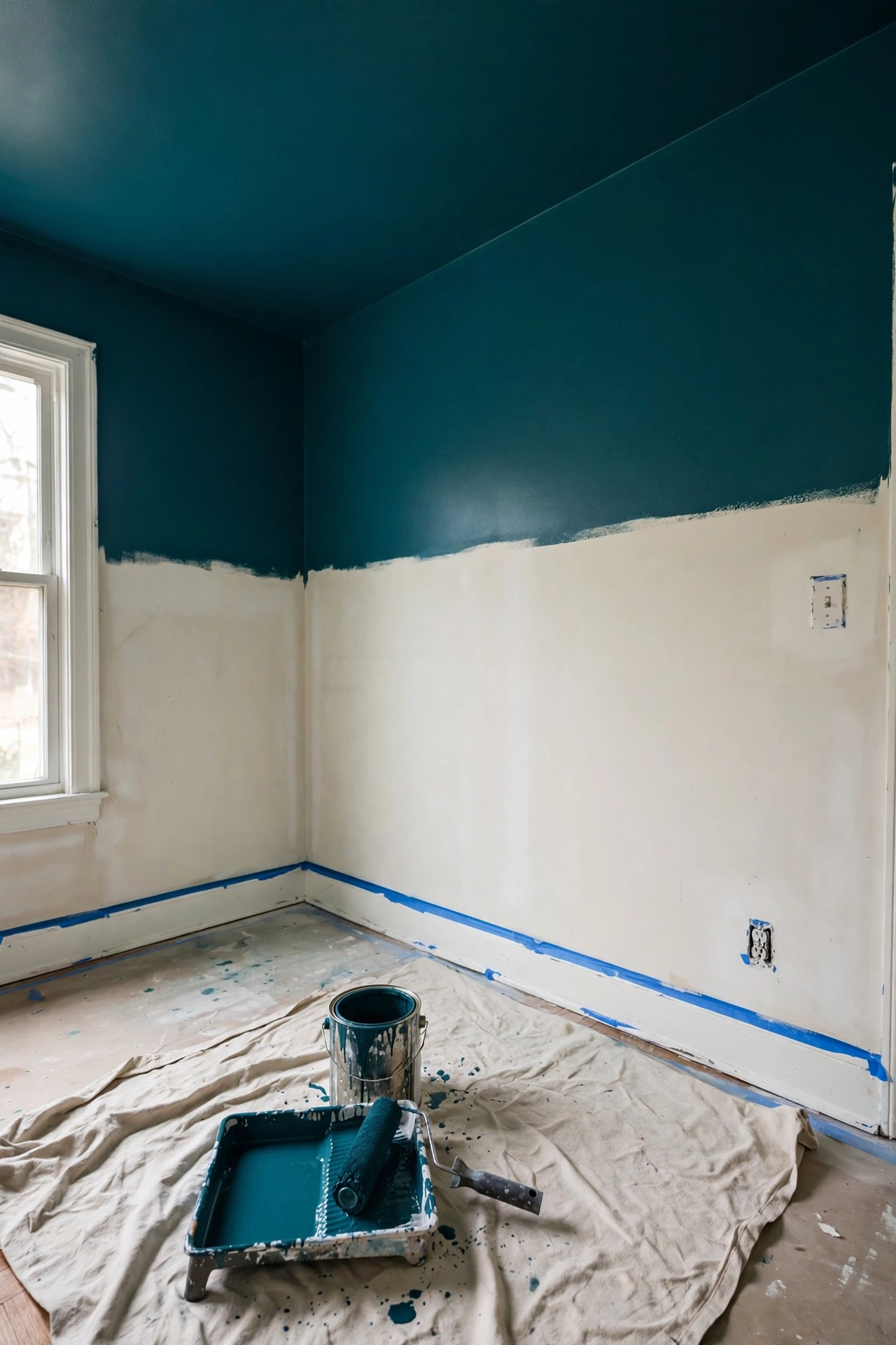
Drenching a room is not harder than painting it normally; it is just one colour, after all. But the order matters, because with no colour changes to hide behind, every edge shows.
1. Clear and mask properly. Move everything to the centre, mask the floor fully, and take off socket covers, curtain brackets and door handles. With drenching you paint up to the floor and the ceiling line, so edge protection matters everywhere at once.
2. Prep like it will be photographed. Fill every crack, sand the filler flat, and lightly key the woodwork with fine sandpaper. One colour across everything means imperfections have nowhere to hide, so this step is worth the hour it takes.
3. Prime everything once. A quality primer evens out the difference between bare plaster, old paint and filler, and it stops the topcoat drinking in unevenly. This is the difference between a flat, rich drench and a patchy one.
4. Paint the ceiling first. Cut in around the edges, then roll the ceiling in overlapping strips. Ceiling paint drips down, so it always goes before the walls.
5. Then the walls, top to bottom. Work one wall at a time, cutting in at the ceiling, the corners and the skirting, then rolling while the cut-in is still wet so the two blend. Two full coats is the standard; deep colours over light walls may need three.
6. Woodwork last. Doors, skirting, architraves and window frames get the eggshell finish after the walls are done and dry. Mask the wall where it meets the woodwork for a crisp line, or freehand it if your cutting-in is confident.
7. Radiators and fiddly bits. Do these after the main surfaces, with the radiator paint or eggshell. Remove the thermostatic valve heads rather than painting around them.
Styling tip: between coats, leave a painted board leaning in the room so you can check the drying colour. Wet paint looks darker than the finished result, and seeing the true colour early keeps you from second-guessing a good choice.
One more practical point: buy more paint than the tin maths suggests. Drenching paints surfaces you would normally leave white, so rooms take 30 to 50 percent more than a standard job. Running out mid-project and finding the next tin is a slightly different batch is how patchy walls happen. A quick note for anyone comparing wall treatments: a textured paint finish like limewash gives a similar enveloping feel with more visible movement, and it can work alongside or instead of drenching on accent areas.
Furnishing and Lighting a Drenched Room
 Save
Painting the room is half the job. A drenched room needs its contents tuned, because everything in it now sits against one strong backdrop.
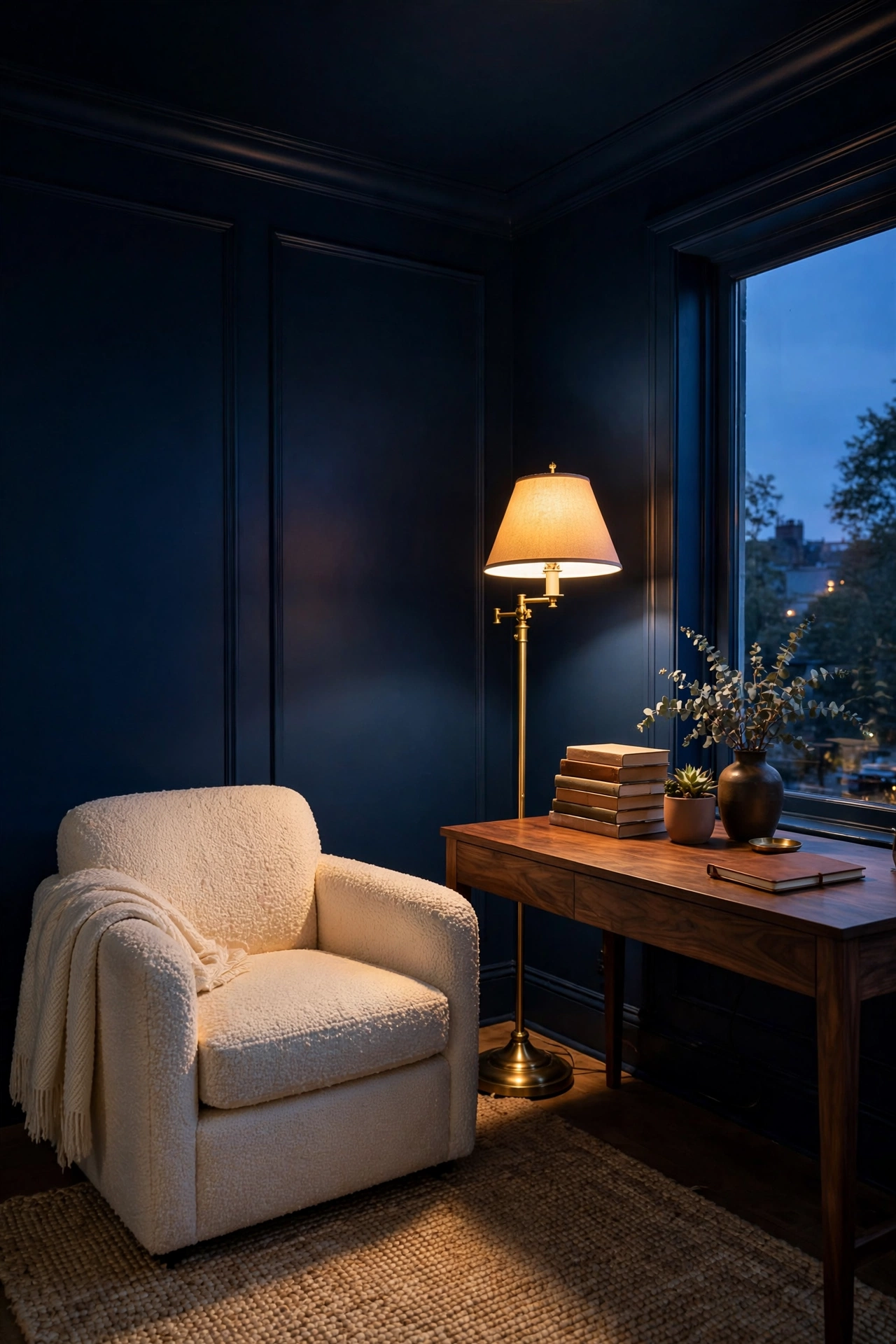
Start with lighting, because deep colours drink light. You need roughly one-third more light than the room had before: an overhead source for general wash, plus two or three warm table or floor lamps at different heights. Warm-white bulbs (around 2700K) keep deep colours rich; cool white turns them flat and institutional. If the room has dimmers, use them: drenched rooms look their best when the light is layered and adjustable.
Texture becomes the star. With no colour contrast to look at, the eye reads texture instead, so this is where boucle, velvet, rattan, wool and raw linen earn their keep. A drenched olive room with a bouclé armchair, a jute rug and a worn leather footstool feels curated; the same room with flat, textureless furniture feels monotonous. Mix at least three distinct textures in every drenched space.
Art and mirrors need confident handling. Frames in black, dark wood or brass work well; white frames look accidental against a drenched wall. Mirrors are particularly useful in small drenched rooms because they bounce light and double the glow of lamps. One oversized mirror does more than three small ones.
As for the furniture palette, pull from three directions: neutrals with warmth (oatmeal, camel, natural wood), tones from the same colour family two steps lighter or darker (a sage chair in a forest room), and one metallic for lift (brass and aged bronze love deep greens and blues). Avoid introducing a competing saturated colour unless you know the room can take it; a drenched burgundy room with a cobalt sofa becomes a circus, not a cocoon. If you love moody, layered interiors, drenching is the fastest route to that look, since the paint does the heavy lifting that layered accessories would otherwise do.
Bringing It All Together
Colour drenching looks like a leap, but it is really a shortcut. Instead of agonising over which wall gets the colour and which white breaks it up, you commit once and let the room do the rest. Choose the colour in real light, paint the ceiling without fear, vary the finishes so the surfaces stay alive, and then light and texture the room like it deserves. The result is the calmest version of your room: one colour, everywhere, doing exactly what paint is supposed to do.
Frequently Asked Questions
Does colour drenching make a small room look smaller?
Usually the opposite. A small room with white ceilings and skirting looks chopped into pieces, which reads as cramped. When everything shares one colour, the edges blur and the eye measures the whole volume at once. Mid-tone colours are safest in windowless box rooms; very dark colours still work if the lighting is layered well.
Do I have to paint the ceiling the same colour?
Yes, honestly. The ceiling is the single most important surface in a drenching job. A white ceiling on drenched walls looks unfinished and breaks the whole effect. Use a dead-flat paint up there; it will read slightly darker than the walls, which adds depth rather than looking wrong.
Which paint finish should I use on each surface?
Walls: flat matt or a durable matt, which hides imperfections and gives that velvety drenched look. Ceilings: dead-flat, never anything with sheen. Woodwork, skirting, doors and architraves: eggshell, which gives a soft tonal lift over the matt walls. Radiators: heat-resistant eggshell or matched radiator paint.
Can I colour drench a rented room?
Only if your landlord agrees in writing, because one-colour rooms need several coats to revert to white. A safer renter-friendly route is drenching the furniture zone with colour: upholstered pieces, curtains and art in one colour family against existing walls. It gives a hint of the effect with nothing to paint back.
How do I fix it if I hate the colour?
Live with it for two weeks before deciding; paint needs to cure and your eye needs to adjust. If it is still wrong, you are repainting one room, not stripping anything, and the prep work is already done, so the second colour goes on faster. Most regret stories come from choosing under store lighting, which is exactly what the three-day sampling test prevents.