Intro
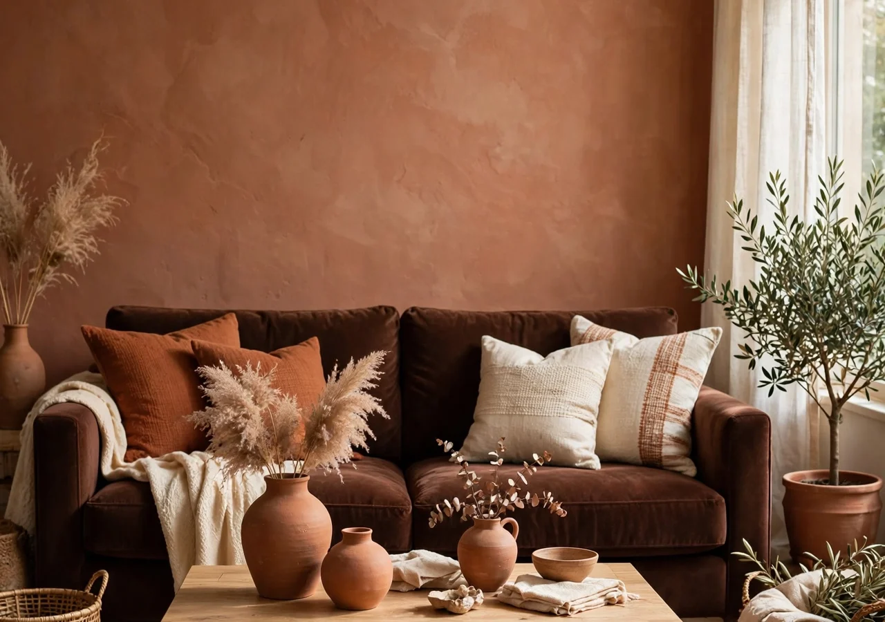
Brown spent years as the color people apologized for. Beige was safe, grey was modern, and brown (rich, earthy, unmistakably warm brown) sat in the corner waiting for its moment. That moment has arrived. Chocolate brown is showing up on sofas, kitchen cabinets, and front doors, and it looks anything but dated.
The reason is simple: brown is the warmest neutral there is. Where grey cools a room down and white can feel stark, chocolate brown wraps a space in something that feels grounded and calm. Pair it with terracotta (its sun-baked, clay-toned cousin) and you get a combination that feels earthy, collected, and quietly confident.
These twelve chocolate brown and terracotta decor ideas are built for real homes and real budgets. No full renovations required: most of them are weekend projects or single purchases that change the entire temperature of a room.
Quick-Start Guide: Brown and Terracotta in Five Minutes
- Pick one anchor: Start with a single big piece (a brown sofa, a terracotta rug, or one painted wall) then build everything else around it.
- Balance the warmth: Pair these earthy tones with creamy whites, soft black, or pale natural wood so the room stays fresh instead of heavy.
- Texture does the talking: Velvet, raw clay, leather, boucle, and washed linen make brown and terracotta feel expensive. Flat, shiny surfaces flatten them.
- Test before you commit: Paint a large swatch board and move it around the room through the day. Brown and terracotta shift dramatically between morning and evening light.
- Watch the undertones: Chocolate browns with red or amber undertones sing next to terracotta; ash-grey browns fight it. Hold samples together in real daylight before buying.
1. A Terracotta Limewash Accent Wall
 Save
One wall in limewash or mineral paint the color of fired clay changes a room more than almost any furniture purchase can. The matte, clouded finish catches light unevenly, so the wall looks different at 9 a.m. than it does at 9 p.m.: like plaster in an old Mediterranean house rather than a flat painted surface.
Pick the wall your eye lands on first: behind the sofa, behind the bed, or the dining room wall. Keep the other walls a warm white (something with a creamy base, not blue-white), and the terracotta reads as intentional rather than loud.
Why it works: Limewash adds movement and depth that flat paint cannot. In a rental, a peel-and-stick limewash-effect wallpaper gives you 80 percent of the look with zero paint drama.
Try this: Sample the paint on a 2-foot square at least, not a tiny chip. Terracotta deepens as it dries, and a shade that looks perfect on the card can dry noticeably darker.
2. A Chocolate Brown Velvet Sofa
 Save
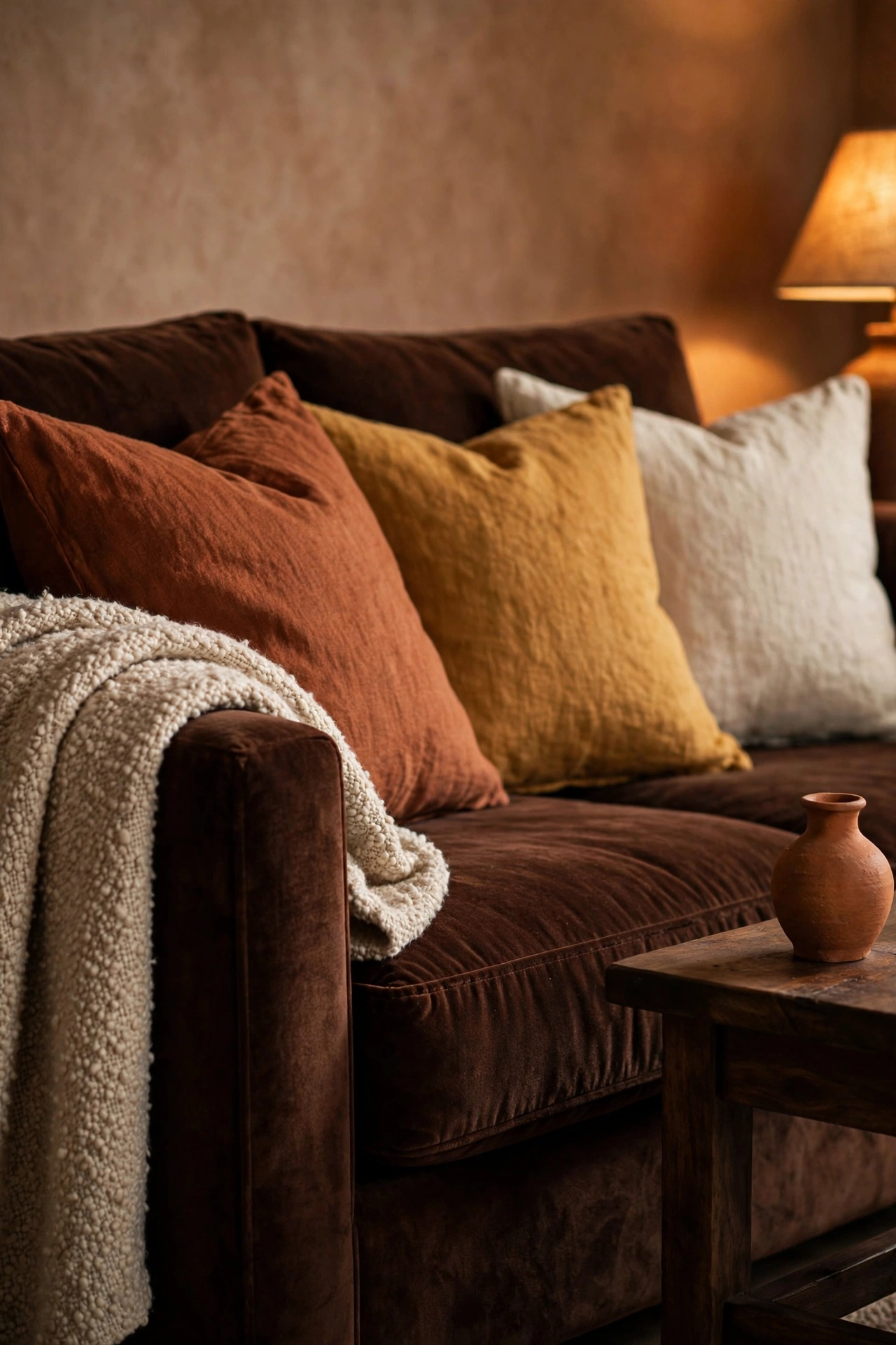
If there is one purchase that commits to this palette, it is a deep chocolate velvet sofa. Velvet’s pile drinks in light, so the brown looks soft and dimensional instead of flat: closer to melted chocolate than to a cardboard box. In a living room with pale walls and one terracotta accent, this sofa does the entire heavy lifting.
Style it with cushions in rust, ochre, and cream linen. A boucle throw in oatmeal keeps it from feeling too autumn-only, and a black metal floor lamp beside it sharpens the whole arrangement.
Designer note: Espresso and walnut browns photograph as nearly black in dim rooms. If your living room faces north or gets little sun, choose a milk-chocolate tone rather than the darkest one: it stays visibly brown under lamplight.
Budget swap: Re-covering your existing sofa costs a fraction of a new one. A made-to-measure chocolate velvet slipcover transforms a tired beige couch for the price of a nice dinner out.
3. A Cluster of Terracotta Planters
 Save
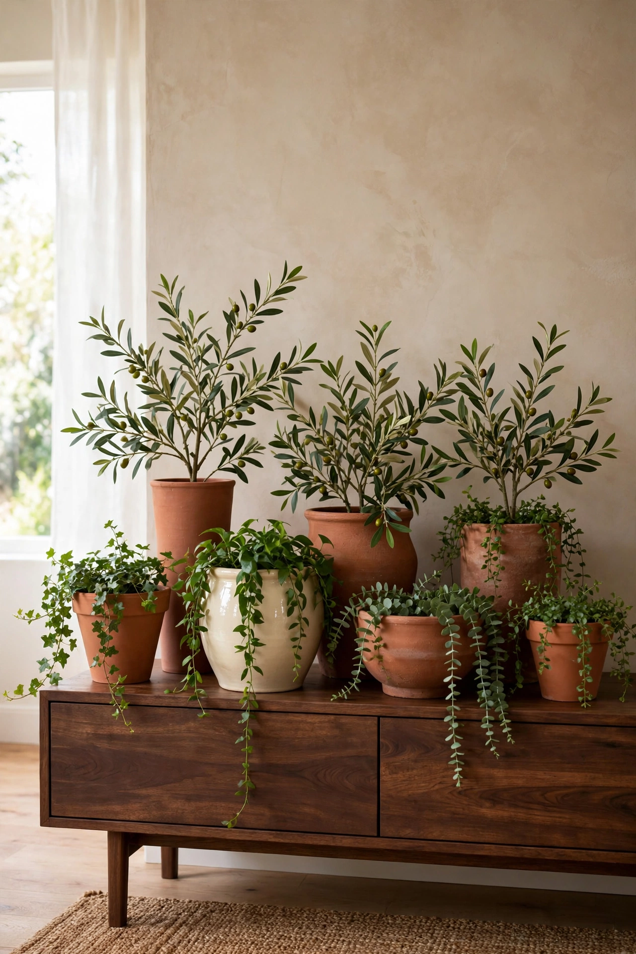
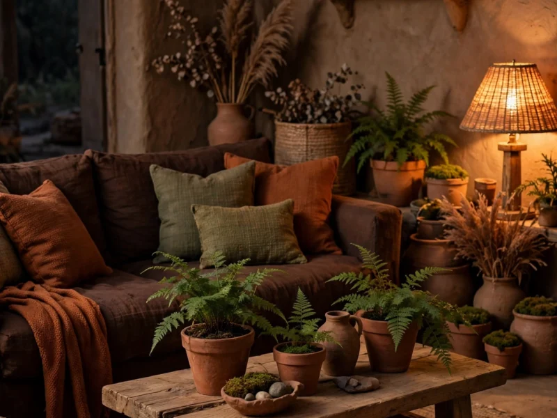
Terracotta pots are the cheapest way to get this color into your home, and grouping them is what makes them look like decor instead of leftovers from the garden center. Gather five to seven pots in different heights (some classic tapered, one or two modern cylinders) and fill them with olive branches, dried grasses, or a trailing pothos.
A cluster on a hearth, a console table, or a bright bathroom shelf reads as a deliberate styling moment. Mix in one glazed ceramic pot in cream or deep green so the group feels collected rather than matched.
Styling tip: Age brand-new terracotta pots by rubbing them with damp soil and a little plain yogurt, then leaving them in the sun for a week. The patina makes them look decades old for essentially zero cost.
4. Chocolate Leather Club Chairs
 Save
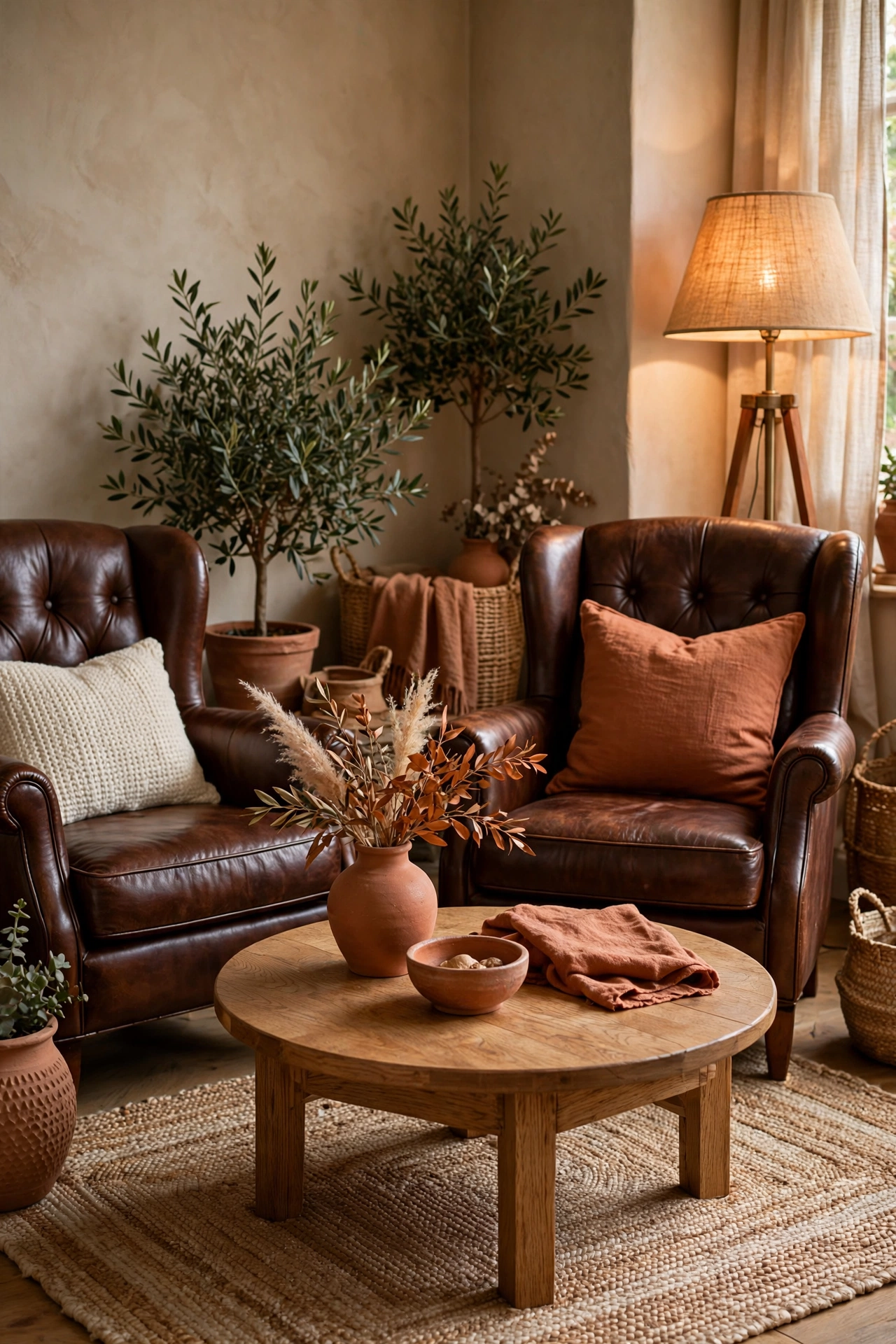
There is no piece of furniture that improves with age the way a brown leather chair does. A pair of chocolate club chairs flanking a fireplace or angled around a coffee table brings instant library energy: the kind of room where people actually sit down and stay. Pair them with the seating ideas in our cosy fireplace styling guide.
Look for full-grain or top-grain leather if the budget stretches; it develops a patina instead of cracking. Faux leather has come a long way too, but test it in person: cheap versions read shiny and plasticky under bright light, which kills the whole earthy effect.
Why it works: Leather’s warm sheen bridges the gap between chocolate brown furniture and terracotta accessories. It is the texture that makes the two colors feel like they belong to the same family.
Get the look: Thrift stores and estate sales are full of solid leather chairs with good bones. A professional leather re-dye in a chocolate tone costs far less than buying new.
5. Terracotta Throws and Cushions, Layered Thick
 Save
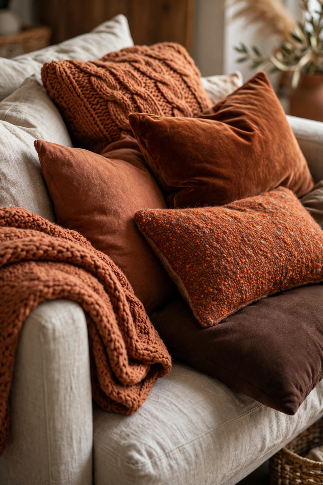
You do not need to paint or reupholster anything to join this trend. A stack of cushions in terracotta, rust, and burnt sienna (mixed with cream linen and one dark brown) layered on a neutral sofa reads completely intentional. The trick is variety: different textures (knit, velvet, linen, wool), different sizes, and slightly different shades so nothing looks like a matching set from a catalog.
Fold a chunky terracotta throw over one arm of the sofa and drape a second one, in a darker tone, across the seat. Instant warmth, zero commitment.
Styling tip: Odd numbers look better than even ones. Five cushions on a three-seater sofa is the sweet spot: enough to feel abundant, few enough to sit down comfortably.
6. An Earth-Toned Gallery Wall
 Save
Art is where brown and terracotta get to be expressive. Pull together prints with desert landscapes, abstract clay shapes, vintage botanical plates, and warm-toned photography. Frame them in a mix of natural oak and thin black frames: the inconsistency is what makes a gallery wall feel personal instead of staged.
Keep a consistent mat color (warm white, not bright white) across all the frames and the collection will hang together even when the art styles differ wildly.
Try this: Lay the whole arrangement on the floor first and photograph it from above. Rearranging on the floor takes minutes; patching nail holes takes a weekend.
Budget swap: Museum shops and library archives sell high-resolution public-domain art prints for a few dollars. A $6 desert landscape print in a decent frame looks like a $200 piece.
7. Terracotta Crockery on Open Shelves
 Save
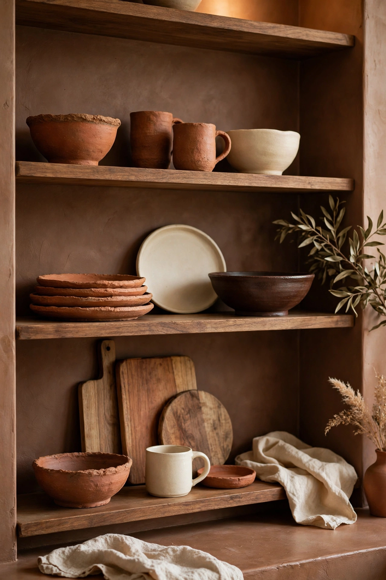
Open kitchen shelving lives or dies on color discipline, and terracotta dishware is the easiest way to make it sing. A row of handmade-look bowls, mugs, and serving plates in clay tones turns everyday dishes into display pieces. They look good empty on the shelf and even better full of food on the table.
Mix in a few cream stoneware pieces and one dark brown serving bowl so the shelf reads as a collection, not a matching set. Wooden cutting boards leaning at the back add a natural layer that ties everything together.
Why it works: Kitchens skew hard and shiny. Steel, stone, glass. Matte clay pottery softens all of that and adds the handmade warmth that makes a kitchen feel like a home instead of a showroom.
8. A Chocolate Brown Upholstered Headboard
 Save
Bedrooms are where chocolate brown truly earns its keep. An upholstered headboard in a deep cocoa velvet or linen makes the bed feel like the center of a cocoon, especially against warm white walls and terracotta bedding. It is the fastest route to a bedroom that feels like a boutique hotel: moody, calm, and a little bit indulgent.
Keep bedding simple: cream or oatmeal sheets, a terracotta duvet or quilt folded at the foot, and two sleeping pillows plus two euros. The headboard is the statement; everything else should whisper.
Designer note: A tall headboard (at least 50 inches) makes low ceilings feel higher by drawing the eye up. In a small bedroom, choose one with clean straight lines rather than a wingback: it takes up less visual space.
9. Layered Rugs in Brown and Terracotta
Layering rugs is a stylist trick that adds instant depth, and this palette is made for it. Start with a large natural jute or sisal rug, then layer a smaller vintage-style rug in rust, terracotta, and chocolate tones on top, angled slightly off-center. The fringe peeking out underneath looks effortlessly collected.
This works especially well in living rooms where one rug feels too safe and a full replacement feels too expensive. The layered look also hides wear on an older rug underneath: the bottom layer can be anything.
Styling tip: The top rug should be at least two feet shorter on every side than the base rug. Too close in size and the layering looks accidental instead of intentional.
Budget swap: Washable rugs in warm patterns give you the layered look without the vintage price tag or the cleaning anxiety.
10. A Terracotta-Painted Interior Door
Doors are the most underused canvas in a house. Painting a single interior door (the pantry, the study, the front door’s interior face) in a rich terracotta turns a thing you walk past into a thing you notice. It is a one-afternoon project that costs a quart of paint and changes how the whole hallway feels.
Pair it with aged brass or matte black hardware. Terracotta with shiny chrome fights; terracotta with warm metal sings.
Try this: Paint the door, the trim around it, and the skirting in the same color for a “color-drenched” effect. Monochrome edges make even a narrow hallway feel designed rather than leftover.
11. Chocolate Brown Kitchen Cabinets
White kitchens had a long run, but brown cabinetry is quietly taking over, and for good reason. Chocolate brown lower cabinets with creamy uppers (or warm white walls) give a kitchen the grounded feel of a European farmhouse without the fussiness. The brown hides wear and fingerprints far better than white ever did.
If a full repaint feels like too much, start with the island. A chocolate island in an otherwise light kitchen is the lowest-risk way to test the color, and islands repaint easily if you change your mind.
Why it works: Kitchens have a lot of hard, cool surfaces. Brown cabinetry adds visual warmth at the largest surface area in the room, which balances everything else for free.
Get the look: Satin or eggshell finish, never high gloss. Glossy brown reads dated; a soft satin sheen reads custom and current.
12. Handmade-Look Terracotta Tiles
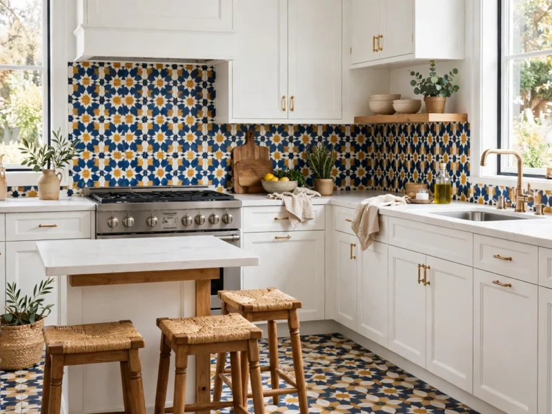
The zellige tile (small, handmade, glazed squares in imperfect terracotta tones) is the backsplash equivalent of jewelry. Each tile catches light slightly differently, so a whole wall of them shimmers in a way flat ceramic never does. Use them in a kitchen backsplash, a bathroom shower niche, or even just a fireplace surround.
Real handmade tiles are an investment, so be strategic: a small area of the real thing beats a large area of a flat imitation. A 3-foot backsplash strip behind the range makes more impact than a full wall of lookalike tile.
Designer note: Terracotta-look tiles pair beautifully with unlacquered brass taps and warm white grout. Cold grey grout is the fastest way to kill the handmade warmth: insist on a warm-toned grout from the start.
Bringing It All Together
Chocolate brown and terracotta work because they are colors with a memory: of clay, of earth, of things made by hand. Start with one anchor piece, layer in texture, and let the warmth build gradually. A room dressed in these tones does not shout for attention; it holds it, quietly, the way a good conversation does. It is one of the defining looks in our fall 2026 home decor trends.
Frequently Asked Questions
Do chocolate brown and terracotta go together, or do they clash?
They are natural partners. Both sit on the warm side of the color wheel with red and amber undertones, so they blend rather than compete. What matters is matching undertones: a red-based chocolate next to terracotta feels seamless, while a grey-based brown next to it can look muddy.
Will brown decor make my small room feel smaller?
Dark colors recede rather than advance, so a chocolate accent wall can actually make a small room feel deeper: but only with enough light. In a small, dark room, use brown on furniture and textiles instead of walls, and keep terracotta to accents. In a small, bright room, go ahead and paint the wall.
What colors go with chocolate brown and terracotta?
Creamy warm whites, soft black, oatmeal, natural wood tones, olive green, and aged brass all work beautifully. Avoid pairing them with cool greys or icy blues unless you want deliberate contrast, and even then, keep the cool tones to small doses. The same warm-metal restraint shapes our warm minimalist living room ideas.
Is the brown and terracotta trend going to look dated in a year?
Earth tones have cycled through interiors for decades without ever truly leaving: think 1970s terracotta, 1990s Tuscan kitchens, today’s clay minimalism. Because these are nature-derived neutrals rather than fashion colors, they age far better than, say, millennial pink did. Choose classic shapes and good materials and the look will outlast the trend cycle.
What is the cheapest way to try this color palette?
Textiles and paint. A terracotta throw, three cushions in rust and brown, and a cluster of clay pots will transform a living room for under a hundred dollars. If you own a paintbrush, one terracotta accent wall costs a single quart of paint and an afternoon.
7 thoughts