Walk into any boutique hotel lobby this year and you will catch it out of the corner of your eye: a vase that flashes green then pink as you pass, a side table that seems lit from within, a bathroom tile that changes colour with the steam. Iridescent decor has moved past its party-supply reputation and into grown-up interiors, and honestly, most of us are still surprised it works.
The hesitation is understandable. The word “holographic” drags in memories of rainbow phone cases, nail polish with a thousand glitter flecks, and gift bags you could spot from across the playground. Nobody wants their living room to feel like a teenager’s birthday. But the iridescence showing up in interiors right now is a different animal: quieter, smarter, and far more restrained. Think of it less as a colour and more as a lighting effect you can buy.
This guide is about threading that needle. You will learn which pieces carry the shimmer beautifully, which ones tip into costume territory, and how to layer iridescent finishes into the home you already have. By the end, you will be able to spot a good iridescent buy in the wild and know exactly where to put it.
Why Iridescent Decor Is Having a Moment
 Save
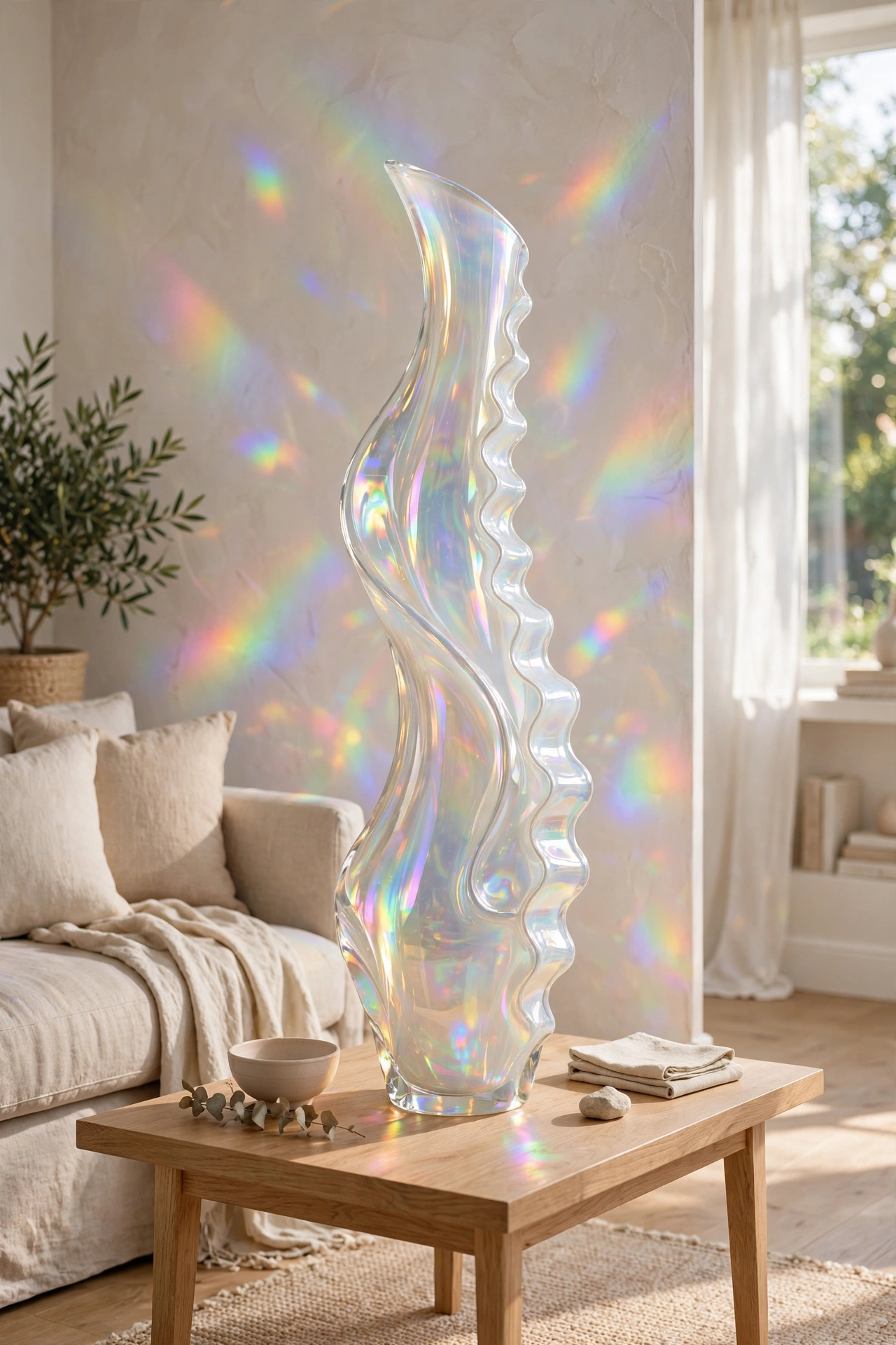
Every few years, interiors get tired of flat colour. After the long run of chalk-white minimalism and the earthy neutrals that followed, something had to give. Pinterest’s data backs it up: searches for “opalescent” interiors climbed 115%, and showrooms from Copenhagen to Los Angeles have started giving iridescent glass, glassy glazes, and mother-of-pearl finishes real floor space.
Part of the appeal is practical. Most of us live under mixed lighting, morning sun from one side, a warm lamp at night, and iridescent surfaces respond to all of it. A flat grey vase is a flat grey vase in every light. An opalescent one looks dove grey at noon, blush at dusk, and faintly green under a kitchen spot. That shapeshifting quality keeps a room feeling alive without adding a single new object.
There is also a mood factor. After years of interiors that photograph well but feel a little stern, people are letting playfulness back in. Iridescence is decoration that does not take itself too seriously. It says the homeowner has taste but is not afraid of a little magic.
The timing matters for your own decorating, too. Trends are easiest to adopt on the way up, when interesting pieces are appearing but every second home does not have them yet. Buy one or two good iridescent pieces now and you get to enjoy them while they still feel fresh, long before they show up in budget big-box aisles. The current mood also shares DNA with 2026’s Art Deco revival, another trend built on mirrored, lacquered, light-catching surfaces.
Designer note: Iridescence photographs unpredictably. A piece that looks silver in the listing photo can read peach on your mantel. If you are buying online, read the review photos, not the product renders, and choose retailers with free returns.
Start Small: Accessories That Give Light to a Room
 Save
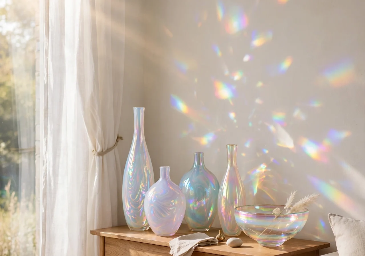
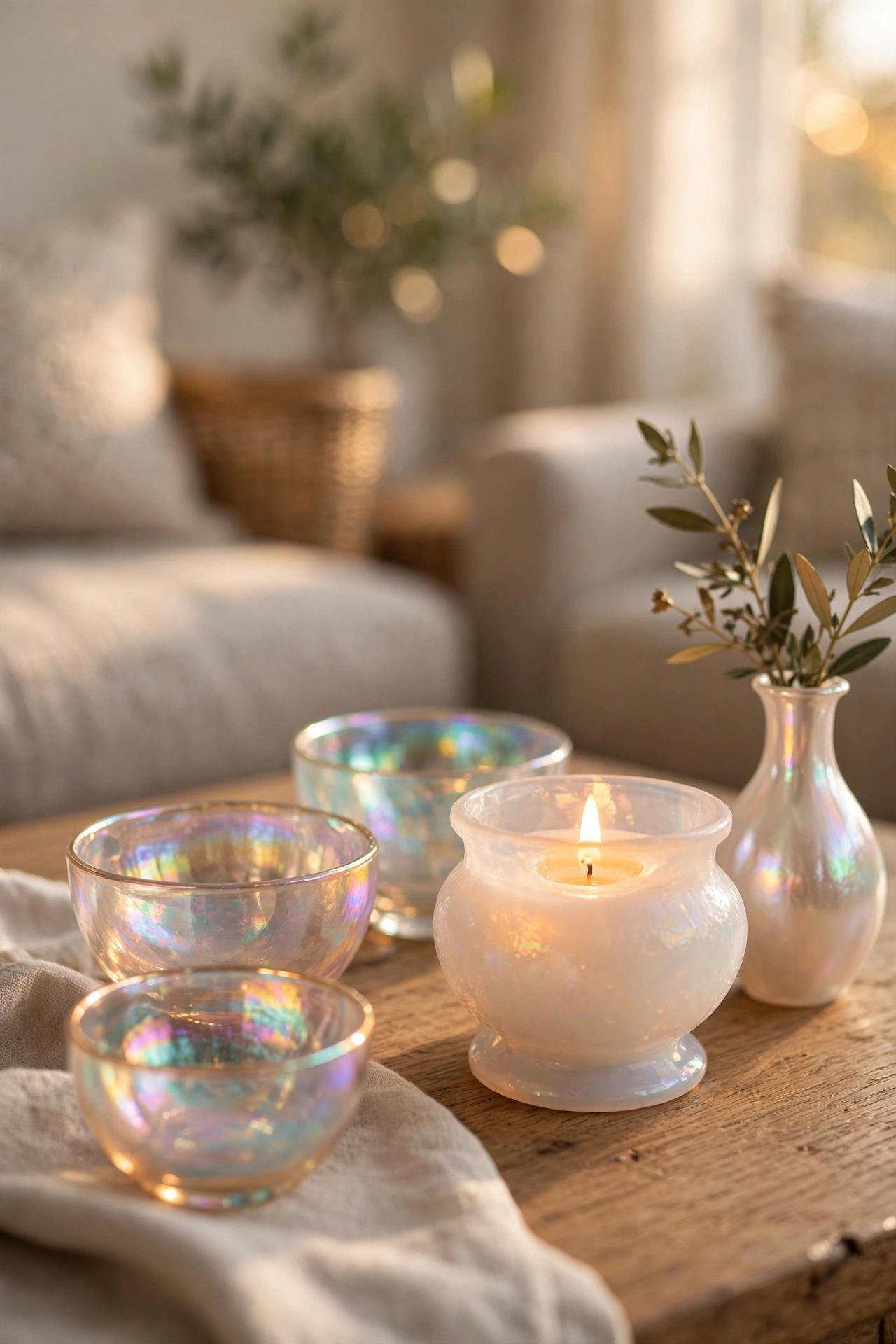
The safest entry point is the small stuff: objects you can pick up with one hand. A footed glass bowl in iridescent finish on a coffee table catches the window light and throws little rainbows onto the sofa. A set of drinking glasses with an opal glaze turns an ordinary open shelf into something guests ask about. These are low-risk, high-reward purchases, usually under the price of a nice dinner out.
Vases are the natural starting place. A single tall iridescent vase, empty, on a console table does more than most styled arrangements. Leave it empty in summer, when the light is strongest, and fill it with bare branches in winter so the shimmer peeks between the twigs. Bud vases work in clusters of three; a lone small one can look lost, but three at staggered heights read as intentional.
Candle holders and lanterns are the sleeper hit of this trend. Iridescent glass over a tea light does two jobs at once: it colours the flame and it colours the wall behind it. A pair of iridescent hurricane lanterns flanking a fireplace or lining a dining table gives you evening drama for almost no money. Keep the candles unscented white so the glass, not the wax, stays the star.
Picture frames and trays sit in the middle ground. An iridescent tray on a dresser corrals perfume bottles or watches into something that looks curated, and an opal frame makes even a casual snapshot feel considered. These pieces mix easily with whatever metal finishes you already own, because iridescence does not read as silver or gold. It reads as its own thing.
Budget swap: If artisan iridescent glass feels steep, look for “opaline” or “pearlised” finishes in high-street home stores. The effect is softer and less saturated, but at a third of the price it is the perfect way to test whether the look suits your space before committing.
What ties all these small pieces together is mobility. You can move a bowl from the dining table to the bathroom shelf to the entryway console in a single afternoon and see where it sings. Big commitments do not offer that luxury, which is why the accessories come first. Find the spots in your home where the light moves through the day, then place iridescence where it can chase that light.
Iridescent Walls and Windows: Glass, Film, and Paint
 Save
Once you are sold on the small pieces, the next frontier is surfaces. This is where the trend gets genuinely exciting, and where restraint matters most. An iridescent accent wall in the right room feels like living inside a seashell. In the wrong room, it feels like a nightclub bathroom.
Window film is the lowest-commitment surface move and one of the best. The prismatic static-cling films sold for privacy create a gentle rainbow refraction across the room every sunny morning, and they peel off clean when you are done. They suit rental kitchens, laundry rooms, and any window that faces east. Measure twice: the film shrinks slightly as you squeegee it on, so cut a generous overhang.
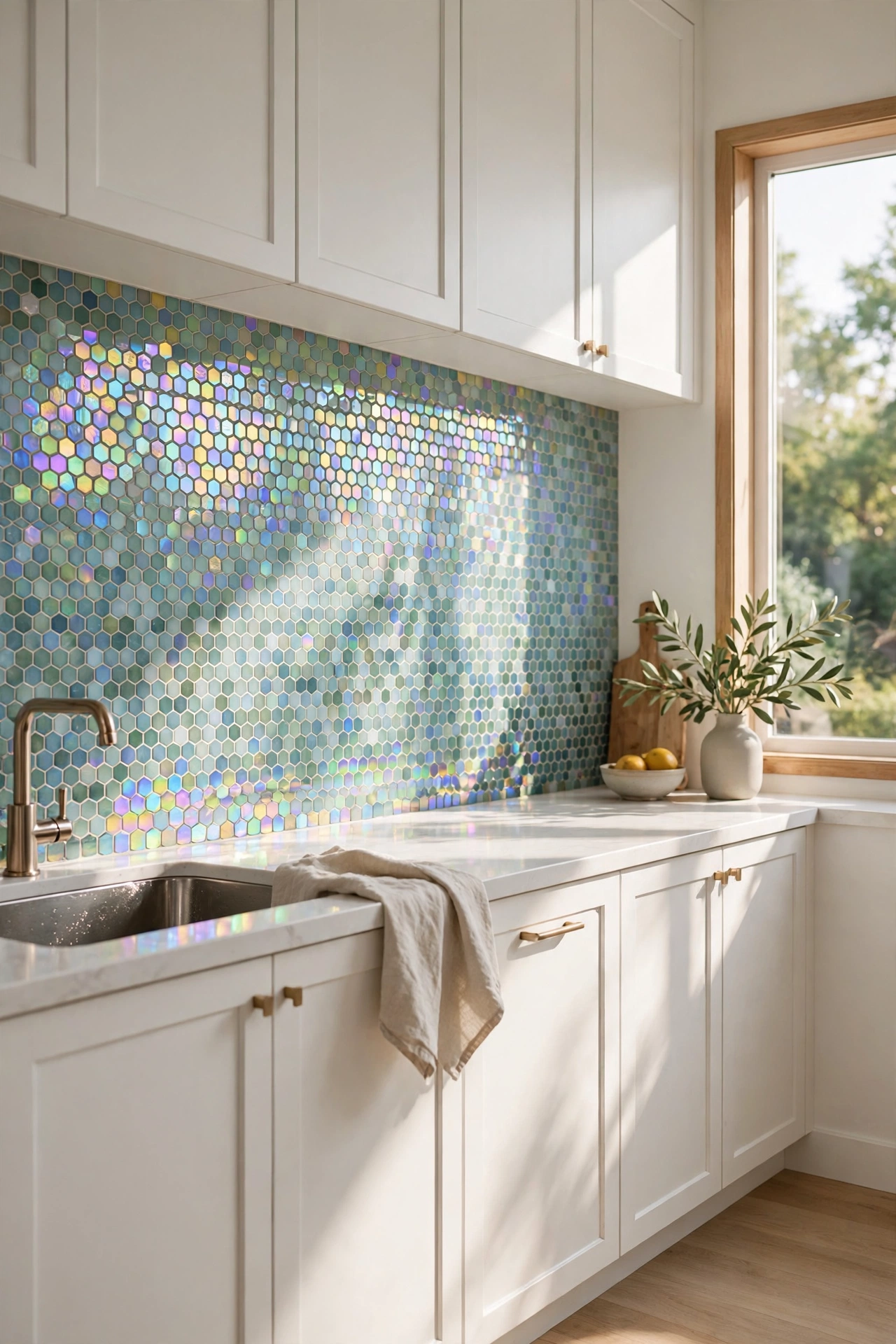
Glass tiles take the effect up a level. Iridescent glass mosaic tiles in a kitchen backsplash or a shower niche catch every flicker of light and make a small room feel larger, because the eye reads the shifting colour as depth. Keep the palette of the tiles tight, one base tone such as sea glass or champagne, and let the iridescence supply the variety. A backsplash that mixes five different holographic colours will exhaust you within a month.
Then there is paint. A few speciality paint brands now sell pearl or interference topcoats that you glaze over a base colour, and the effect on a ceiling or inside a bookshelf is remarkable. The trick is placement: iridescent paint wants low, raking light or an unexpected location. The inside of a pantry, the ceiling of a powder room, or the back wall of open shelving all qualify. Full walls in main living spaces are the gamble; reserve them for small rooms you visit briefly, not rooms you live in all day.
Try this: Before committing to tile or paint, tape a large sheet of iridescent gift wrap (the matte-backed kind) to the wall for a week. It is a crude preview, but living with the colour play for a few days tells you more than any sample board.
One caution for renters and the commitment-shy: true iridescent wall treatments are hard to undo. Film and furniture give you 80% of the effect with zero regrets. If you own and you are confident, a backsplash or a powder room ceiling is the sweet spot.
Furniture With a Shimmer: When to Go Bigger
 Save
Iridescent furniture is the boldest play in this trend, and it works best as a single statement in an otherwise calm room. One shimmering piece has presence. Three shimmering pieces have a theme-park quality. The rule is simple: let the iridescence be the loudest thing in the room, and keep everything around it quiet.
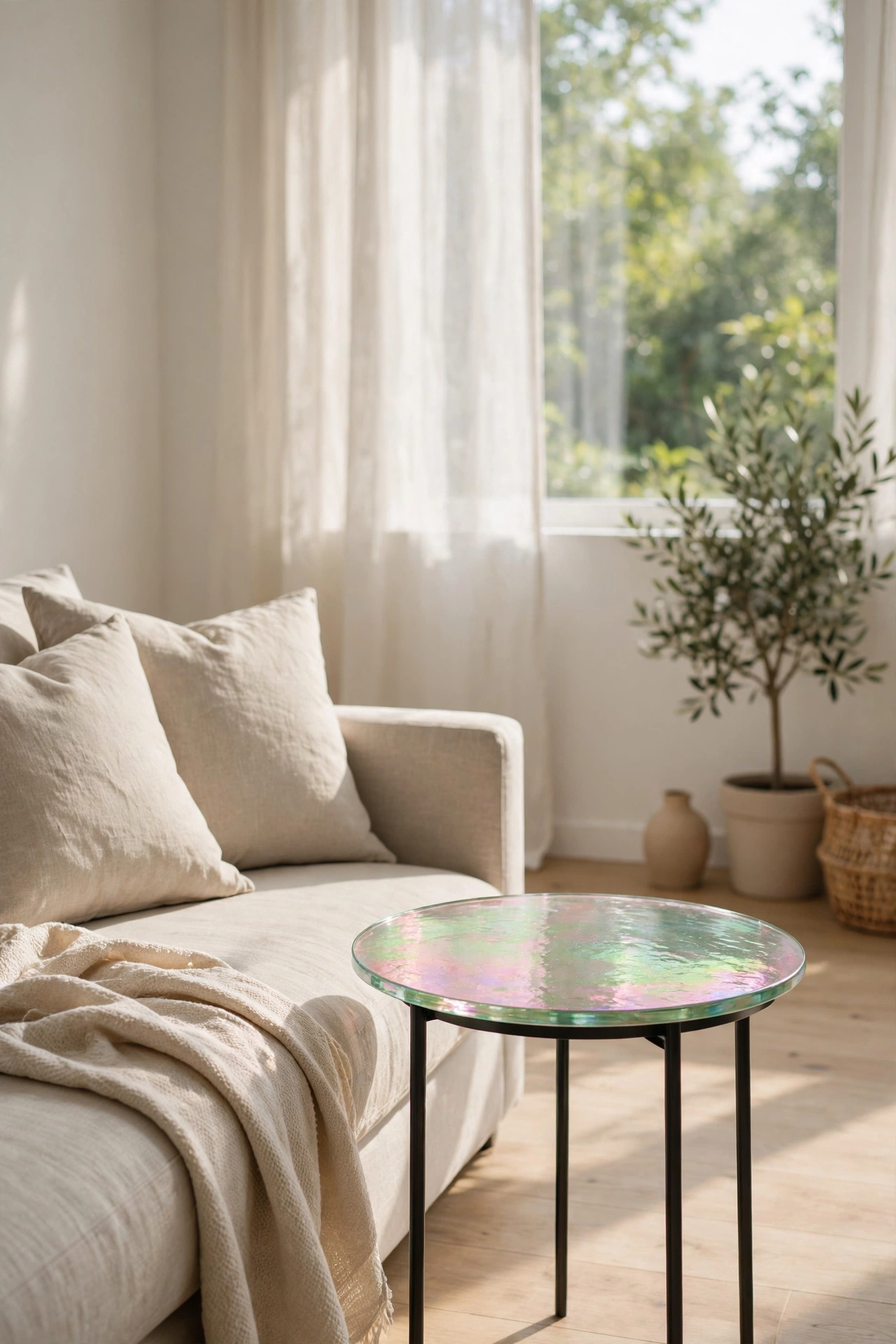
Side tables and drink tables lead the pack. A small round table with an iridescent resin or glass top tucks beside a sofa and earns its keep every time the afternoon sun hits it. Because it is small, you can afford to be brave. Look for pieces where the iridescence is baked into the material, such as dichroic glass, rather than sprayed on. Baked-in finishes age gracefully; sprayed ones chip and peel, and a peeling holographic table is sadder than a plain one.
Dressers and console tables with iridescent drawer fronts are the next step up. These read best in bedrooms and hallways, where the light is softer and the piece is seen at an angle rather than head-on. Pair them with matte surroundings: a linen-upholstered bench, a wool rug, bare plaster or matte-painted walls. Matte textures absorb light; the iridescent piece reflects it. That contrast is the whole trick.
Chairs are the wildcard. A single iridescent accent chair, perhaps a translucent polycarbonate shell with an opal coating, can anchor a reading corner beautifully. But chairs take daily wear, and iridescent finishes show scratches more readily than solid colour. Reserve them for low-traffic corners rather than the dining set the whole family uses.
Styling tip: If your iridescent furniture piece feels too loud on its own, throw a matte textile over part of it, a folded throw on the chair, a linen runner on the console. Covering a third of the shimmer makes the visible two-thirds look deliberate instead of accidental.
Sourcing matters more with furniture than with accessories. Mass-produced iridescent furniture floods discount sites, and the difference between a good piece and a cheap one is usually the substrate. Glass and resin hold the effect; thin plastic film over particleboard does not. If the price seems too good for real glass, it probably is film, and film bubbles in sunlight. Buy the real material or skip it.
Pairing Iridescence With the Rooms You Already Have
 Save
The fear that iridescent decor only suits ultra-modern spaces is misplaced. Because iridescence is essentially a light effect rather than a colour, it adapts to whatever surrounds it. The key is choosing pieces that echo something already in the room.
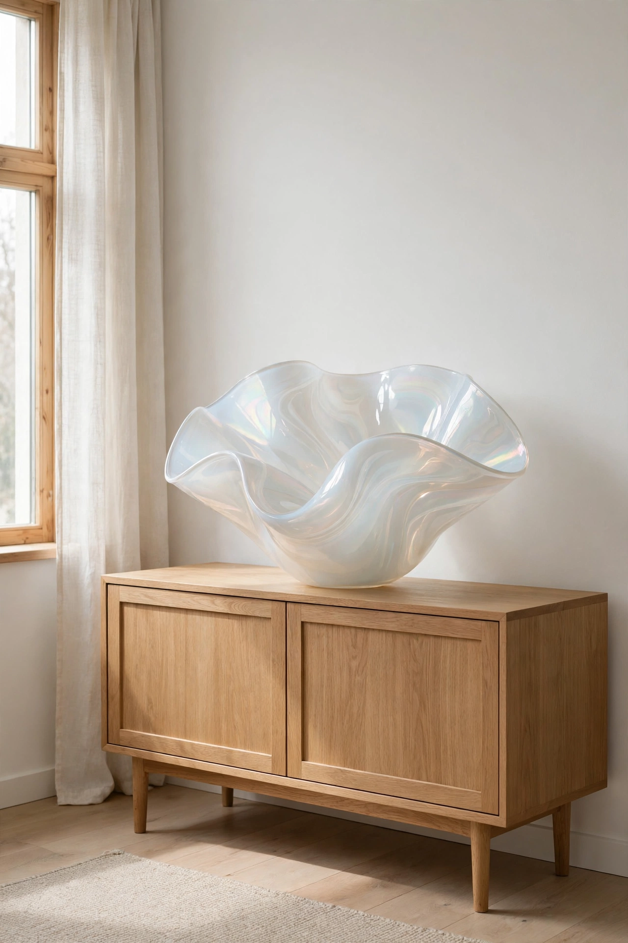
In a neutral, minimalist interior, iridescence replaces art. A single large opalescent bowl on a low oak credenza does the work of a painting, drawing the eye without adding visual clutter. Keep the shapes simple and the surrounding palette to two or three quiet tones, and the piece reads as sculpture.
Traditional and vintage-heavy rooms take to iridescence surprisingly well, because the effect has ancestors: mother-of-pearl inlay, carnival glass, lustreware ceramics. An iridescent glass compote on a mahogany sideboard looks like a collector’s piece, not a trend purchase. Lean into those historical cousins and the new piece feels inherited rather than imported.
In bohemian or maximalist spaces, iridescence becomes one texture among many, and here is the one place you can use slightly more of it. It sits happily beside velvet, rattan, warm metallics, and plants, because busy rooms absorb novelty. Just keep one finish dominant per vignette: if the shelf already has brass candlesticks and a mirrored tray, add the iridescent vase to a different shelf.
| Your room’s style | Best iridescent move | What to avoid |
|---|---|---|
| Minimalist / Scandinavian | One sculptural glass piece as art | Multiple small shimmery objects that read as clutter |
| Traditional / vintage | Carnival-glass-style compotes, pearl-inlay trays | Ultra-modern geometric shapes that fight the furniture |
| Bohemian / maximalist | Layered small pieces among plants and textiles | Letting iridescence become the only texture in the room |
| Coastal / light-filled | Sea-glass tones, opal blues and greens | Warm gold-pink shifts that clash with cool daylight |
| Dark / moody | A single glowing accent against matte black | Large iridescent surfaces that flatten the drama |
Coastal and light-filled rooms are the natural habitat of this trend. Sea-glass greens, opal blues, and pearl whites look like they grew there. If you love that cool palette, our frosty blue winter decor ideas show how to build a whole room around it. If your home leans warm and dark, choose iridescent pieces with a champagne or copper base so the colour play harmonises with the room instead of arguing with it.
Keeping It Tasteful: Where to Draw the Line
 Save
Every trend has a line, and with iridescence it is the line between luminous and loud. The good news is that the line is easy to see once you know what to look for. The bad news is that most of the cheap versions of this trend live on the wrong side of it.
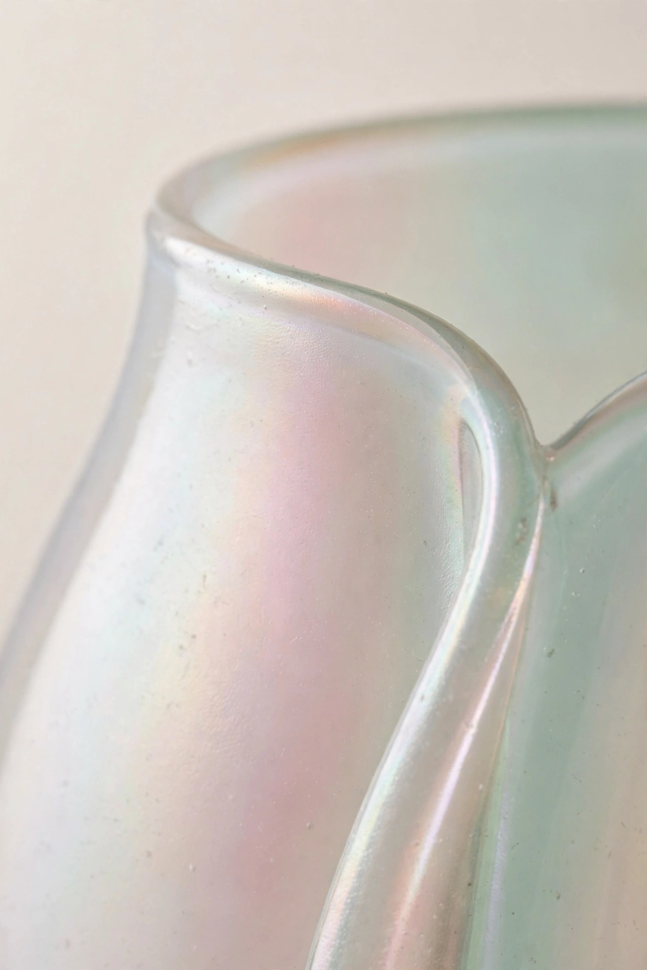
Colour count is the first filter. Good iridescent decor shifts between two or three related tones, pearl to blush to pale gold, or dove grey to sea green. Cheap holographic finishes cycle through the entire rainbow in high saturation, and that full-spectrum blast is what reads as kitsch. When you are shopping, hold the piece under a shop light and turn it slowly. If you see a tasteful blush-to-mint drift, you are safe. If you see a disco ball, walk away.
Finish quality is the second filter. Run your eye along the edges. On good pieces the iridescence is in the material, consistent right up to the rim. On bad ones it is a film or spray that stops short, peels at corners, or pools in the crevices. The edges tell the truth about everything.
Scale and placement form the third filter, and this one is entirely in your control. Iridescence works as jewellery for a room: a brooch, not a ball gown. The moment it covers a sofa, a full wall in the living room, or every shelf at once, it stops being an accent and becomes a theme. One room can carry two or three iridescent pieces if they are different scales, a bowl, a lantern, a tray. It cannot carry ten.
The final filter is time. Trends that rely on novelty fade fastest when they are everywhere at once, so buy pieces you would still like if the trend label fell off. An opalescent vase you love for its shape will outlive the trend cycle. A holographic ottoman you bought for the wow factor will embarrass you in three years. Choose the vase.
Designer note: Photograph the room before you add iridescence and again a week later. The camera is honest about whether a piece elevated the space or just added noise. If you cannot tell the difference in the photos, the piece is not earning its place.
Bringing It All Together
Iridescent decor works when you treat it as light, not colour. Start with one or two small pieces, place them where the daylight moves, and let the effect do the talking. Graduate to a backsplash, a window film, or a single statement table only when the small pieces feel like they belong. Keep the colour shifts subtle, the finishes honest, and the count low, and you will get all of the magic with none of the kitsch.
The loveliest thing about this trend is how personal it becomes. No two homes catch the light the same way, so your iridescent corner will never look like anyone else’s. That is the opposite of a cookie-cutter trend, and it is exactly why this one deserves a place in a thoughtful home.
Frequently Asked Questions
Does iridescent decor look cheap?
It can, but only the cheap versions do. Pieces where the shimmer is baked into glass or resin look luxurious; pieces where it is a sprayed film over plastic look like party supplies. Check the edges and the material, keep the colour shifts subtle, and a single good piece will read as expensive.
What colours go with iridescent decor?
Because iridescence shifts, it pairs with almost anything, but it looks best against quiet backgrounds. Whites, warm greys, soft beiges, and matte blacks all let the colour play show. Avoid placing it against busy patterns or other high-shine finishes, which compete for the eye.
Is the holographic home trend already over?
Searches for opalescent interiors rose 115% and showrooms are still adding iridescent lines, so the trend is climbing rather than fading. It is still early enough that good pieces feel fresh, and the classic versions, mother-of-pearl tones and carnival-glass styles, never really leave.
Can I use iridescent decor in a small room?
Yes, and small rooms may be the best place for it. Iridescent glass tiles or a single shimmering accessory make a powder room or a narrow hallway feel larger, because the shifting light reads as depth. Keep it to one surface or one object so the effect stays elegant.
How do I clean iridescent glass and finishes?
Treat it like any fine glass: a soft microfibre cloth with warm water and a drop of mild soap, then buff dry. Skip abrasive pads and ammonia-based cleaners, which can dull interference coatings over time. For window film, a damp cloth is enough; never use a squeegee blade on it.