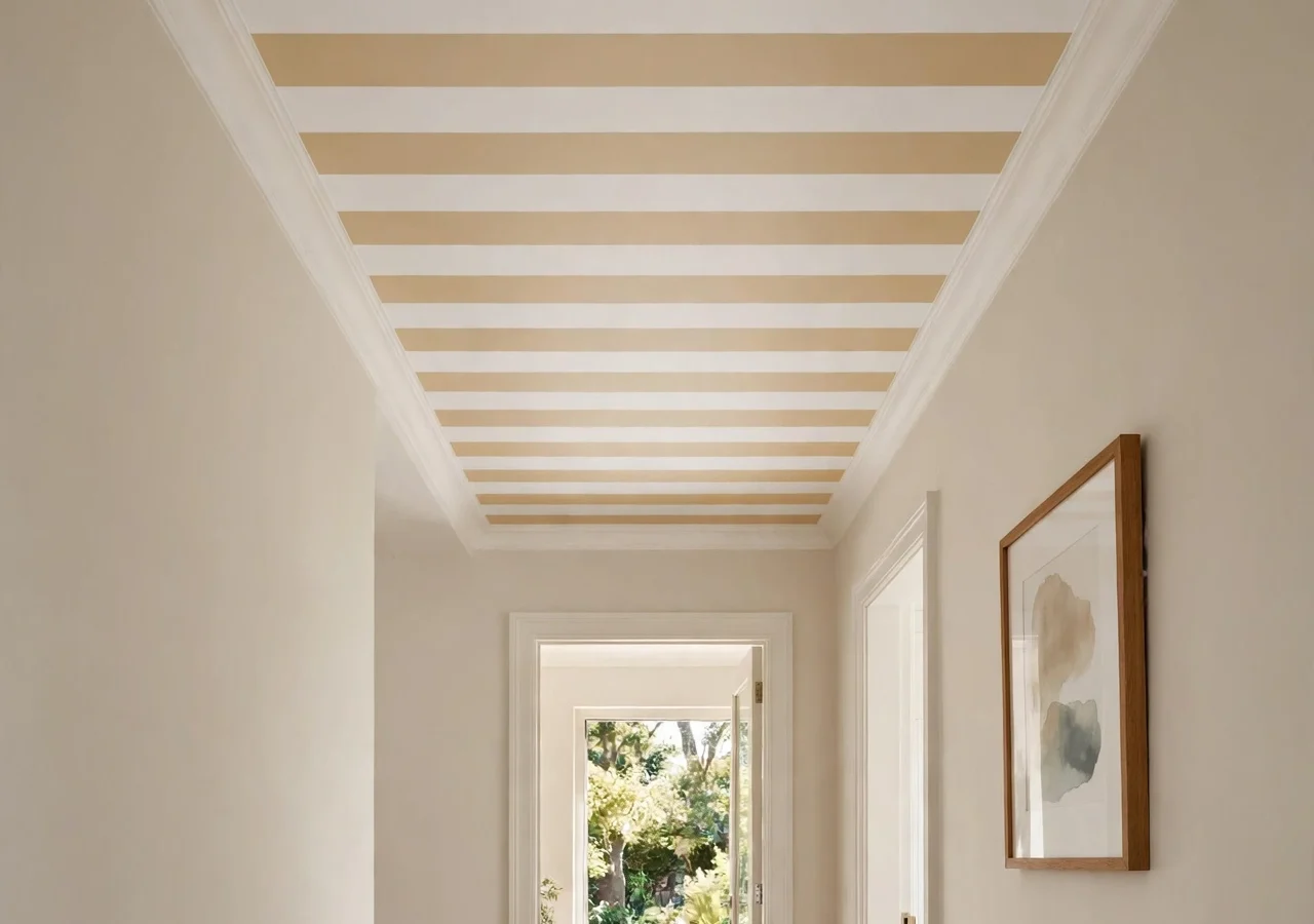
Every room has a fifth wall, and almost everyone ignores it. We agonise over wall colour, we layer rugs, we hunt for the right sofa, and then we leave the ceiling in the same flat builder-white it arrived in. It is the largest uninterrupted surface in the room, and it gets the least thought.
The result is rooms that feel almost there but never quite land. Everything at eye level sings, and above it there is just blank. A striped ceiling closes that gap in a single move. It draws the eye upward, gives the room a sense of intention, and it can make a space feel taller, cosier, or more formal depending on how you stripe it. Done well, it is the difference between a room that is decorated and a room that is designed.
A striped ceiling is exactly what it sounds like: alternating bands of colour or tone carried across the overhead surface. It sounds bold, but it is one of the most forgiving pattern plays in decorating, because a ceiling is rarely studied head-on the way a feature wall is. You get pattern without pressure, and most of these ideas cost little more than a couple of tins of paint. Here are twelve ways to do it, from whisper-soft tonal stripes to full drama.
Before you pick up a paintbrush
- Measure the room first. Stripe width should relate to room size: modest bands in a small room, generous bands in a big one. Tiny stripes in a grand room look fussy; giant stripes in a box room feel like a circus tent.
- Test colours on a large board held up against the ceiling, never on the wall. Ceilings catch different light, and a shade that reads warm on a vertical surface can turn grey overhead.
- Decide where the stripes start and stop before you tape anything. Running them wall to wall is the classic move; stopping them at a cornice or picture rail gives a framed, tailored finish.
- Flat paint hides lumps and roller marks; satin or eggshell bounces light around. For a tonal stripe, where the contrast comes entirely from sheen, pick finishes at least two steps apart.
- Renting? Peel-and-stick striped wallpaper or pinned fabric panels give you the look with zero paint and full deposit protection.
| Room size | Ceiling height | Stripe width that tends to work |
|---|---|---|
| Small bedroom or hallway | Under 2.6 m | 10–15 cm |
| Average living room | 2.6–3 m | 15–25 cm |
| Grand room or long hallway | Over 3 m | 25–40 cm |
1. The Classic Wide Awning Stripe
 Save
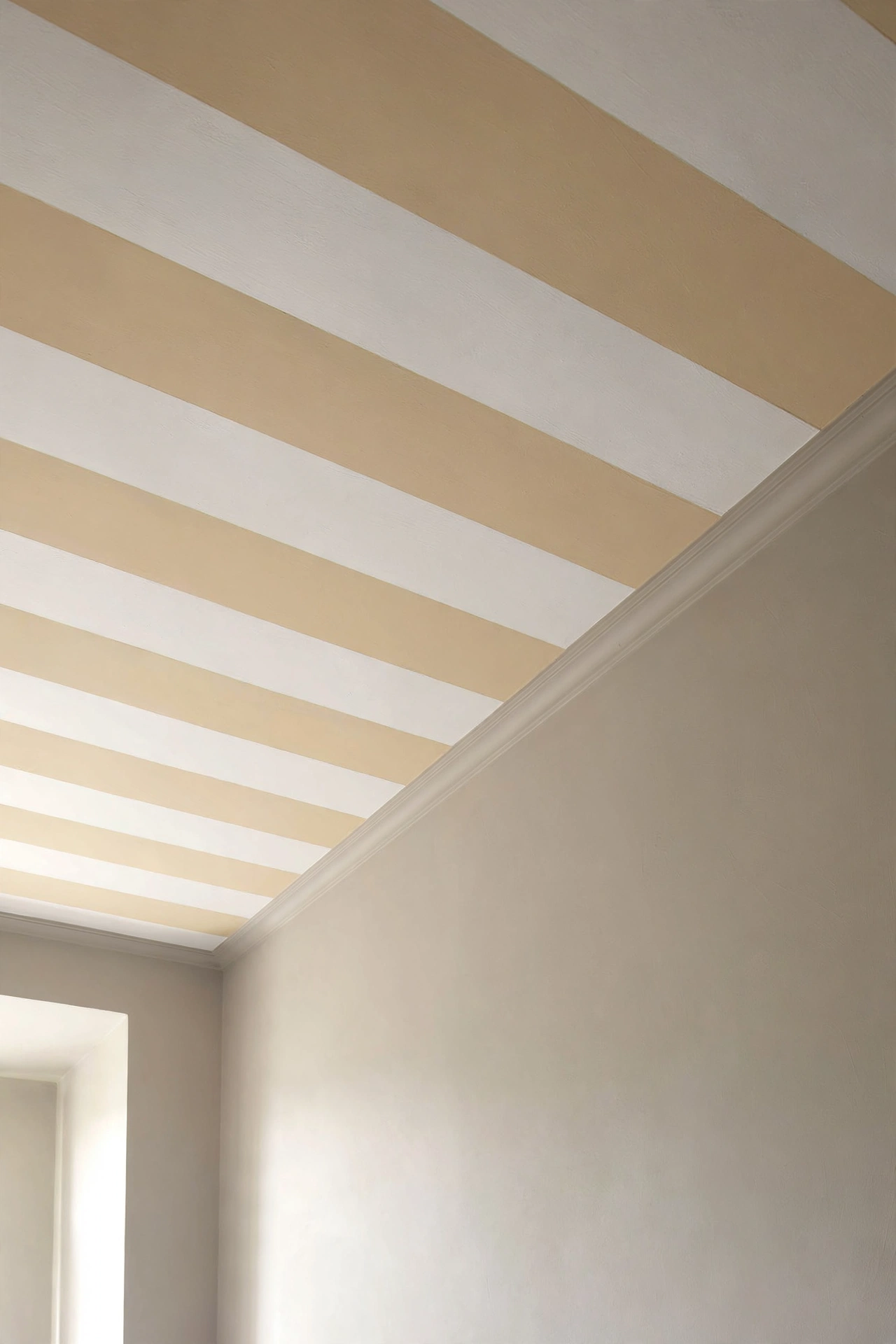
Start where the stakes are lowest: the hallway. Alternate soft white and warm cream in broad 25 cm bands running the length of the corridor. The awning stripe reads cheerful and classic, like a striped deck chair or a seaside shopfront, and it turns a long passage into a destination rather than somewhere you hurry through.
Run the stripes the long way to stretch the space, or across the width to make a narrow hall feel broader. Paint the lighter colour across the whole ceiling first, let it cure, then tape off the bands and roll on the deeper shade. Ceilings drink paint, so budget for two full coats plus touch-ups, and use a small roller on an extension pole rather than a brush. Your neck will thank you.
2. The Tonal Stripe
Same paint colour, two finishes: flat and eggshell, side by side. From below, the ceiling reads as one solid colour; when daylight moves across it, soft bands appear and disappear. It is the perfect stripe for commitment-phobes, and for rooms where the walls are already doing a lot of visual work.
Designer note: The sheen gap is everything here. Flat and matte are too close to read; flat and eggshell give a gentle ripple; flat and satin give a clear, confident stripe. Ask the paint desk to mix the identical colour in two finishes so the hue matches exactly.
3. The Narrow Regency Stripe
 Save
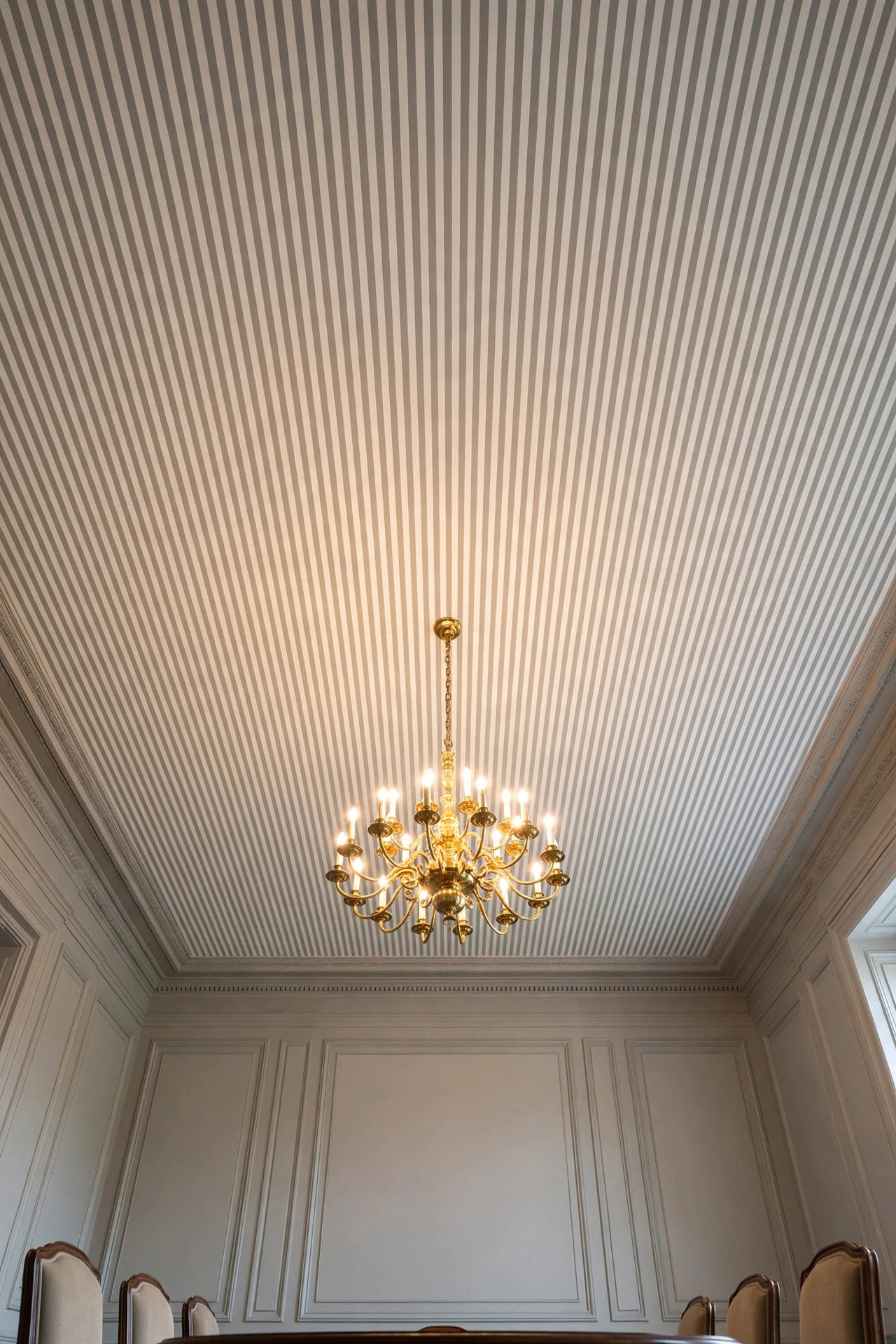
For formal dining rooms, go narrow and tailored: 7–10 cm bands of ivory and soft stone grey, with a brass chandelier hanging at the centre. The narrow stripe reads like pinstripe suiting, crisp and grown-up, and warm metal against it glows in a way chrome never would.
This is a natural home for the brass-and-geometry spirit of Neo Deco styling, where symmetry and shine do the talking. Keep the table setting simple when the ceiling is this dressed up; let the overhead pattern be the jewellery and keep everything below it quiet.
4. Black-and-White, Full Drama
 Save
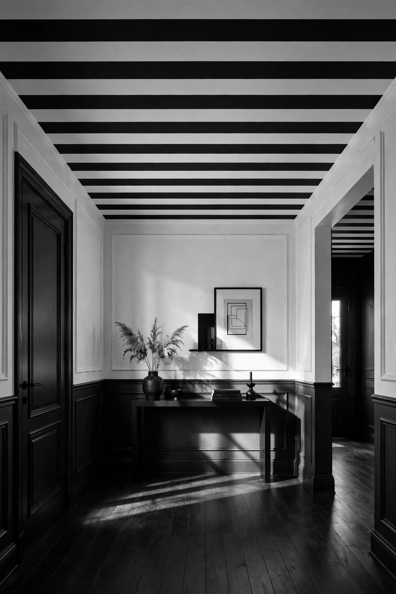
The loudest option on this list is also the most forgiving. Equal bands of true black and bright white, about 20 cm wide, across an entryway or a small study. High contrast hides slightly wobbly tape lines at a glance, and the graphic punch means the rest of the room can stay almost bare.
Keep the walls simple and the floor plain, and let the ceiling be the art. One caution: black ceilings absorb light, so this works best in a space with decent natural light or strong overhead lighting. In a dark hallway, swap the black for charcoal and the white for warm ivory to keep it from closing in.
The drama does not have to stop at the entry. Carrying the same black-and-white bands into an adjoining cloakroom or down a short corridor ties the spaces together, and because the pattern is so strong, even a square metre of it makes a tiny utility room feel deliberate.
5. Soft Pastel Stripes for the Bedroom
Blush and cream, or powder blue and white, in wide soft bands above the bed. It is calming and a little dreamy, especially with white bedding below echoing the lighter stripe. Bedrooms are where stripe width matters most: keep the bands generous, 25 cm or more, so the pattern feels restful rather than busy.
Styling tip: Carry one of the stripe colours into the bedding or curtains. When the ceiling, the quilt, and the curtains all share a shade, the room feels considered instead of decorated in isolated pieces.
If the bedroom already has patterned wallpaper or a busy headboard, keep the pastel stripe very close in tone, barely-there contrast. Two patterns can share a room happily as long as one of them whispers. A blush-and-cream ceiling above a floral headboard works; a sky-blue-and-white one above it would compete.
6. Green-and-Cream in the Sunroom
 Save
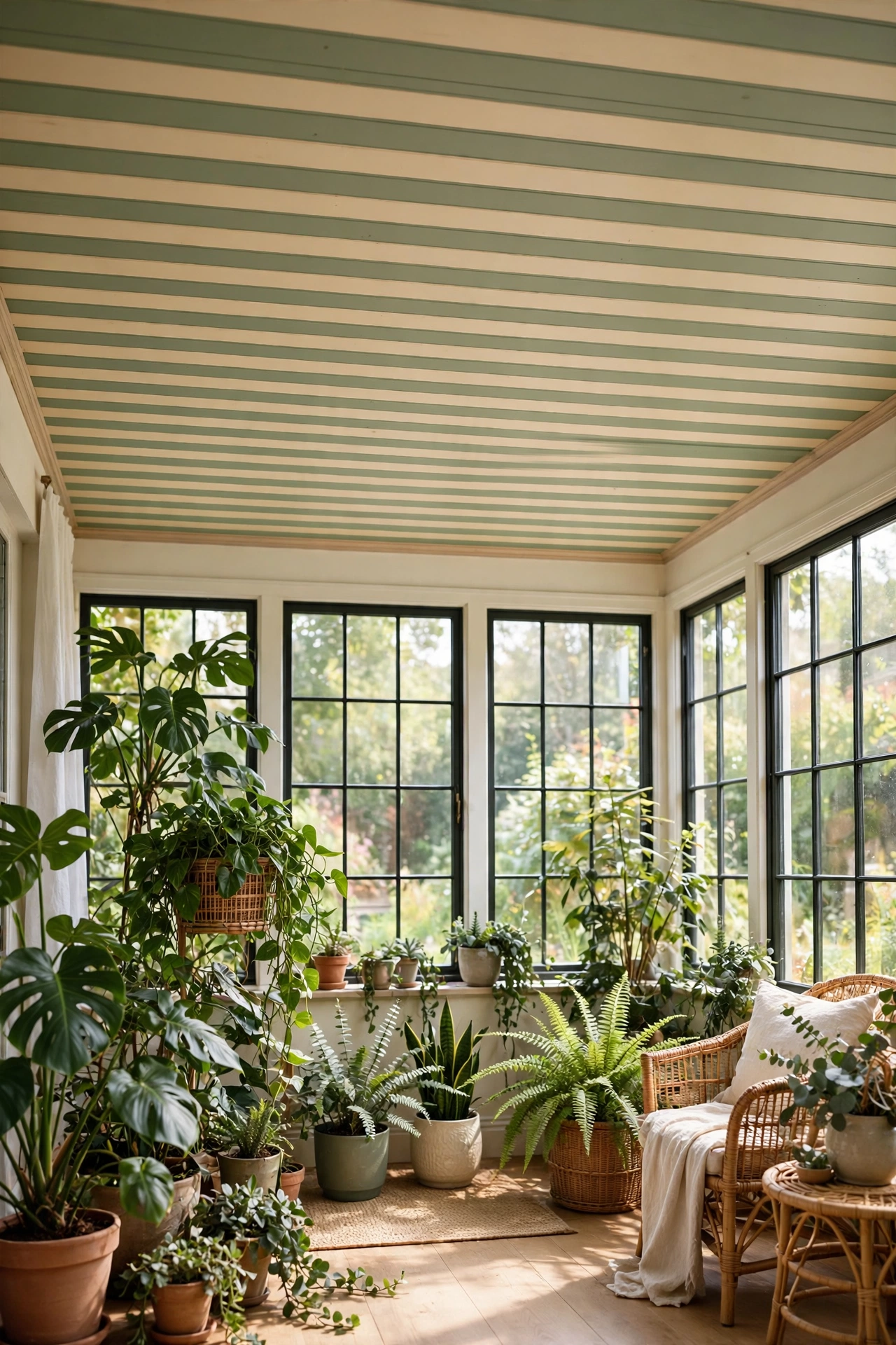
Sage or eucalyptus green alternating with warm cream suits a sunroom or a plant-filled corner beautifully. It reads garden-like without a single leaf motif, and real plants sitting beneath it look instantly more intentional.
Sunrooms get fierce midday light, so choose a green with grey in it rather than a clean, bright one; a pure grass green can go neon at noon and restful at dusk, which is distracting. Test your swatch at midday, not just in the soft morning light when everything looks flattering.
7. Blue-and-White Nautical Stripe
 Save
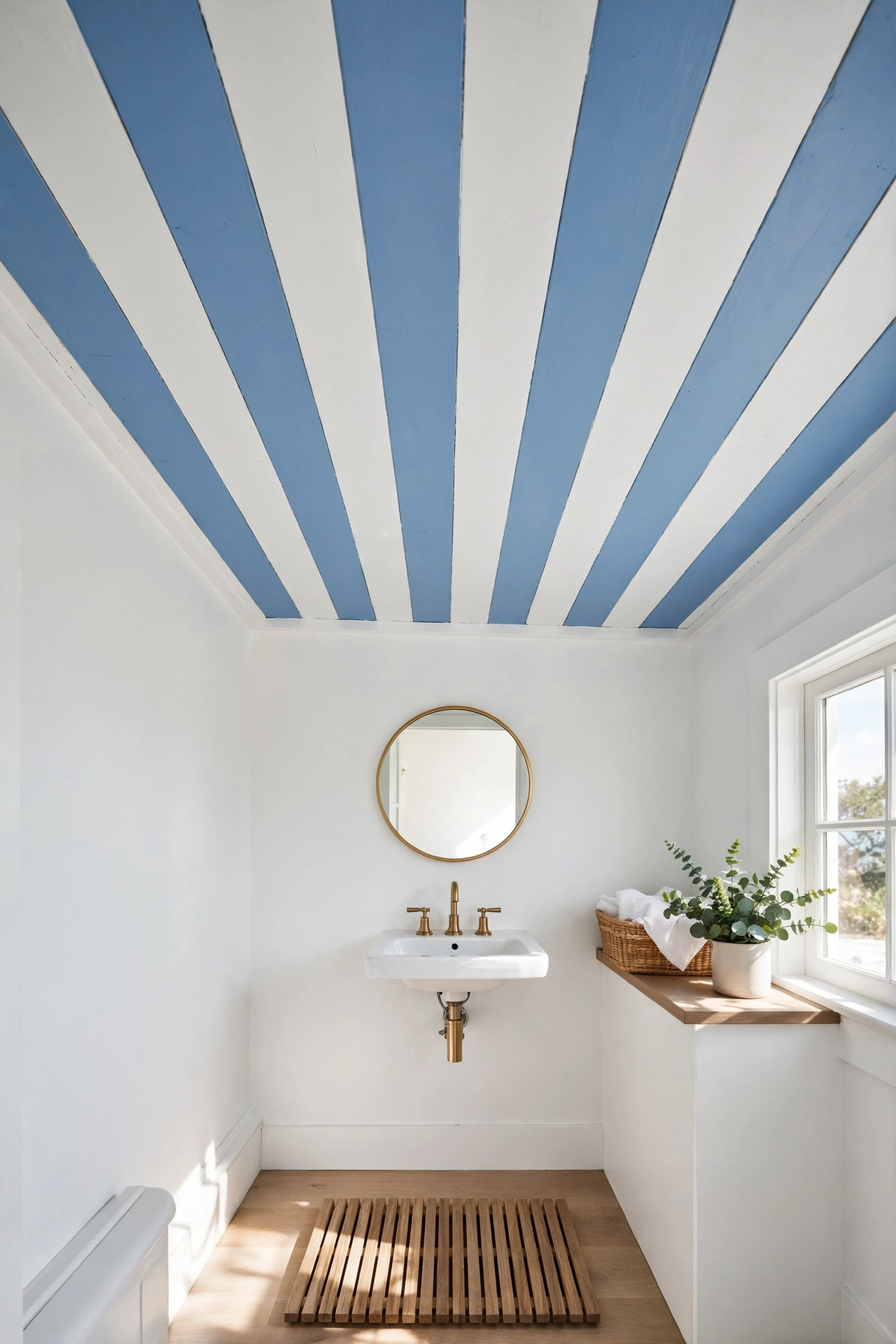
Cornflower or soft navy with white is the classic coastal move, and it works wonderfully on a bathroom ceiling. Bathrooms are often the most neglected room in the house decor-wise, and a stripe overhead makes a small white bathroom feel designed rather than default.
Use a proper moisture-resistant bathroom paint, and keep the bands on the wider side so the small room does not feel striped to within an inch of its life. Pair with plain white sanitaryware and one natural texture, like a wooden bath mat or a woven basket, to keep the seaside reference fresh rather than themed.
Direction matters in a bathroom: run the stripes toward the window or the main light source and the eye follows them, which makes the room feel brighter than it is. Stripes running away from the light can flatten the effect, so stand in the doorway and check the sightline before you tape.
8. Stripes Over Colour: The Bold Backdrop
Instead of striping over white, paint the ceiling a deep colour first, ink navy, forest green, or terracotta, then stripe over it in a lighter tone of the same family. The tonal contrast is softer than black-and-white but far richer than pastels, and it gives small rooms a cocooned, enveloping feel.
If you liked the FunHaus trend’s love of broad stripes, this is their quieter cousin: same energy, half the volume. It also photographs beautifully, because the deep base colour makes the lighter bands glow by comparison.
9. Striped Wallpaper, No Paint Required
 Save
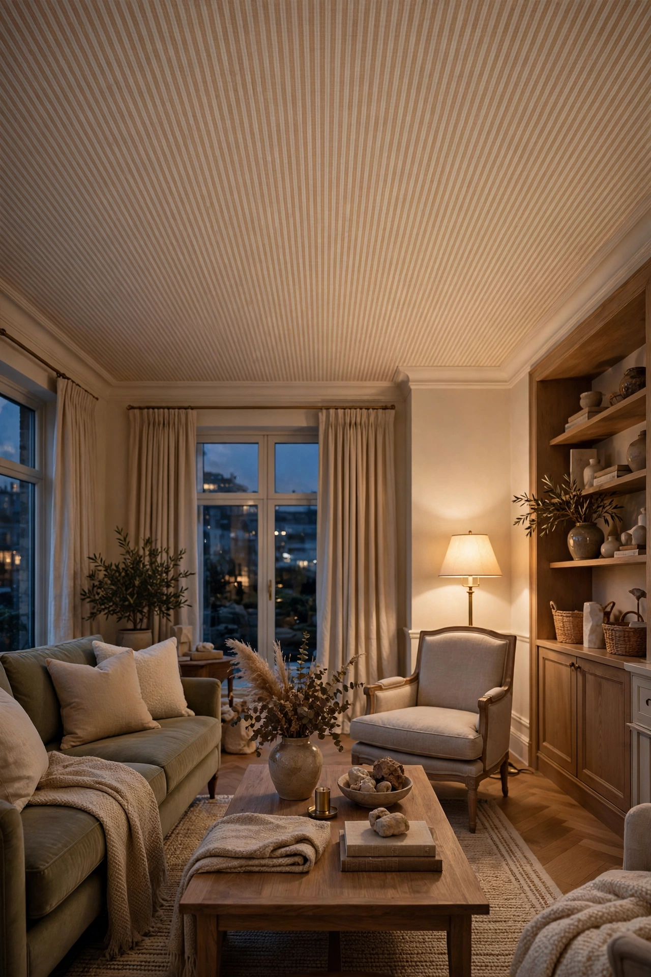
Wallpaper on the ceiling sounds intimidating until you realise its stripes are perfectly straight in a way hand-painted bands rarely are. A grasscloth-look or a simple printed stripe gives a tailored finish, and for renters a peel-and-stick version means zero paint and zero deposit anxiety.
This is a two-person job, so recruit help and choose a paste-the-wall paper to make it manageable. Line the paper up from the room’s centre line outward, not from a wall, because walls are rarely perfectly straight and starting from one edge can send the whole pattern drifting by the far side.
Scale the stripe to the room the same way you would with paint: narrow pinstripes suit a small study or a powder room, while broad bands suit a living room. And check the pattern repeat before you buy; a stripe with a short repeat wastes less paper on a ceiling than a large motif would, which keeps the project affordable.
10. Painted Beams, Alternating Tones
 Save
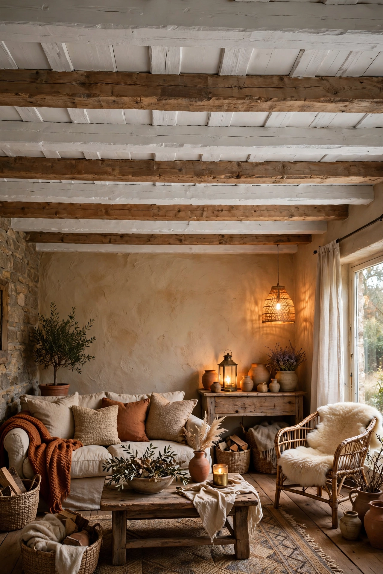
In a rustic room with exposed beams, paint alternate beams, or the ceiling boards between the beams, in two tones. You keep all the texture and character of real timber, but the rhythm of the stripes stops the ceiling feeling heavy or haphazard. White beams against a soft putty ceiling is the gentle version; deep charcoal beams against warm white is the dramatic one.
Budget swap: If painting the beams themselves feels too permanent, paint only the ceiling between them. It is easier to reverse, and the unpainted wood keeps its warmth while the painted bands add order.
11. Radial Stripes Around a Light Fitting
Instead of running stripes in parallel lines, radiate them outward from the ceiling rose like a sunburst. It turns the light fitting into the centrepiece of the room and gives a dining room or entryway a proper moment of theatre. Measure from the centre fitting outward with a length of string and a pencil, then tape the wedge shapes and paint alternate segments.
Keep the rest of the ceiling plain white beyond the sunburst so the pattern reads as a medallion rather than a takeover. A brass or black pendant hanging at the centre anchors the whole thing; the fitting becomes the full stop at the end of the sentence.
If freehand wedges feel too ambitious, a large-scale striped wallpaper medallion gives the same sunburst effect with none of the measuring. Centre it on the light fitting, trim the outer edge into a clean circle, and it reads as a bespoke plaster detail from below.
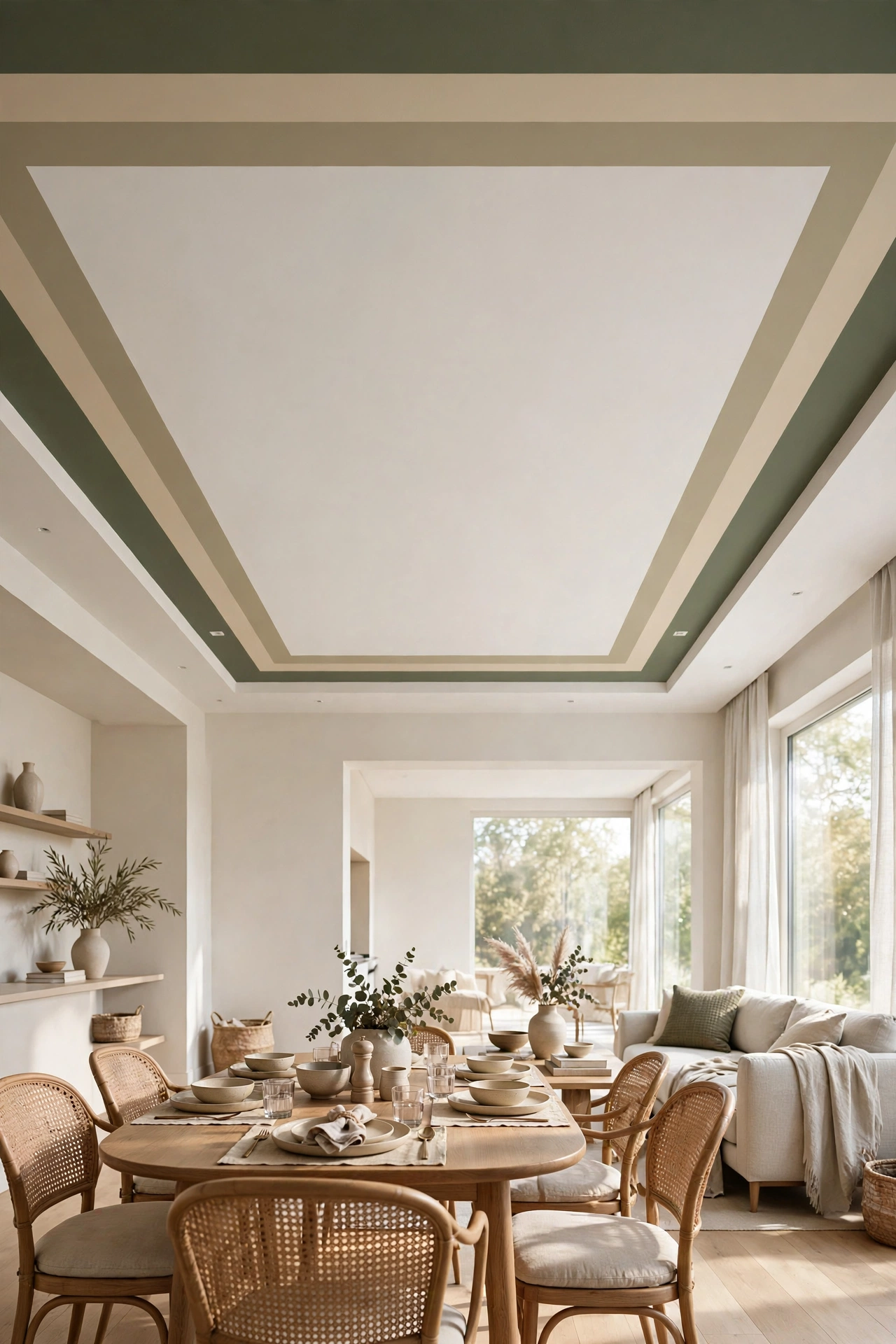
12. The Two-Tone Border Stripe
 Save
Rather than striping the whole ceiling, paint a wide border band around the perimeter, like a rug for the ceiling. It frames the room, and in an open-plan space it quietly defines the dining or seating zone without a single piece of furniture moving.
Measure in from each wall by the same distance, snap chalk lines, and tape carefully; the border lives or dies on straight edges. Two tones work best: border in colour with the centre left white, or the reverse for a bolder look. In a dining area, echo the border colour in the table linen for a pulled-together feel.
Bringing It All Together
The ceiling is the last frontier of the decorated room, and stripes are the friendliest way to claim it. Start with one room, a hallway is the perfect low-risk trial, and keep the bands wide, the colours considered, and the tape straight. You will be surprised how finished the whole house starts to feel once the fifth wall finally joins in.
For more on working warm metals into a striped scheme, see how to style warm metallic accents so the ceiling and the details speak the same language.
Frequently Asked Questions
Will a striped ceiling make my room feel smaller?
It depends on contrast and direction. Low-contrast stripes in wide bands, run along the longest dimension, usually make a room feel airier because the eye travels further. Bold, high-contrast stripes across the short dimension can make a ceiling feel lower, which is cosy in a bedroom but cramped in a small study. When in doubt, keep the contrast gentle.
What is the easiest stripe for a beginner?
The tonal stripe, same colour in flat and eggshell, or a peel-and-stick striped wallpaper. Both forgive wobbly edges: the tonal version because the contrast is subtle, the wallpaper because the stripes arrive pre-printed and perfectly straight.
How do I get clean lines on a textured ceiling?
Textured ceilings are the enemy of crisp tape lines. Seal the tape edge by brushing a thin coat of the base colour over it first and letting it dry; this fills the tiny gaps under the tape so the stripe colour cannot bleed through. Then paint your stripe. It adds a step, but it is the difference between sharp and fuzzy.
Are there rooms where I should skip the stripe?
Very low ceilings with bold, dark stripes can feel pressing, so keep contrast low there. Rooms with ornate original plasterwork or ceiling roses also deserve caution: the architecture is already the star, and a stripe can fight it. In those rooms, a single painted colour is usually the better tribute.
Can I do this in a rental?
Yes. Peel-and-stick striped wallpaper is the obvious route and removes cleanly. Alternatively, stretch striped fabric over lightweight wooden frames and mount them to the ceiling with removable hooks; from below they read as upholstered ceiling panels, and they come down without a trace.


2 thoughts