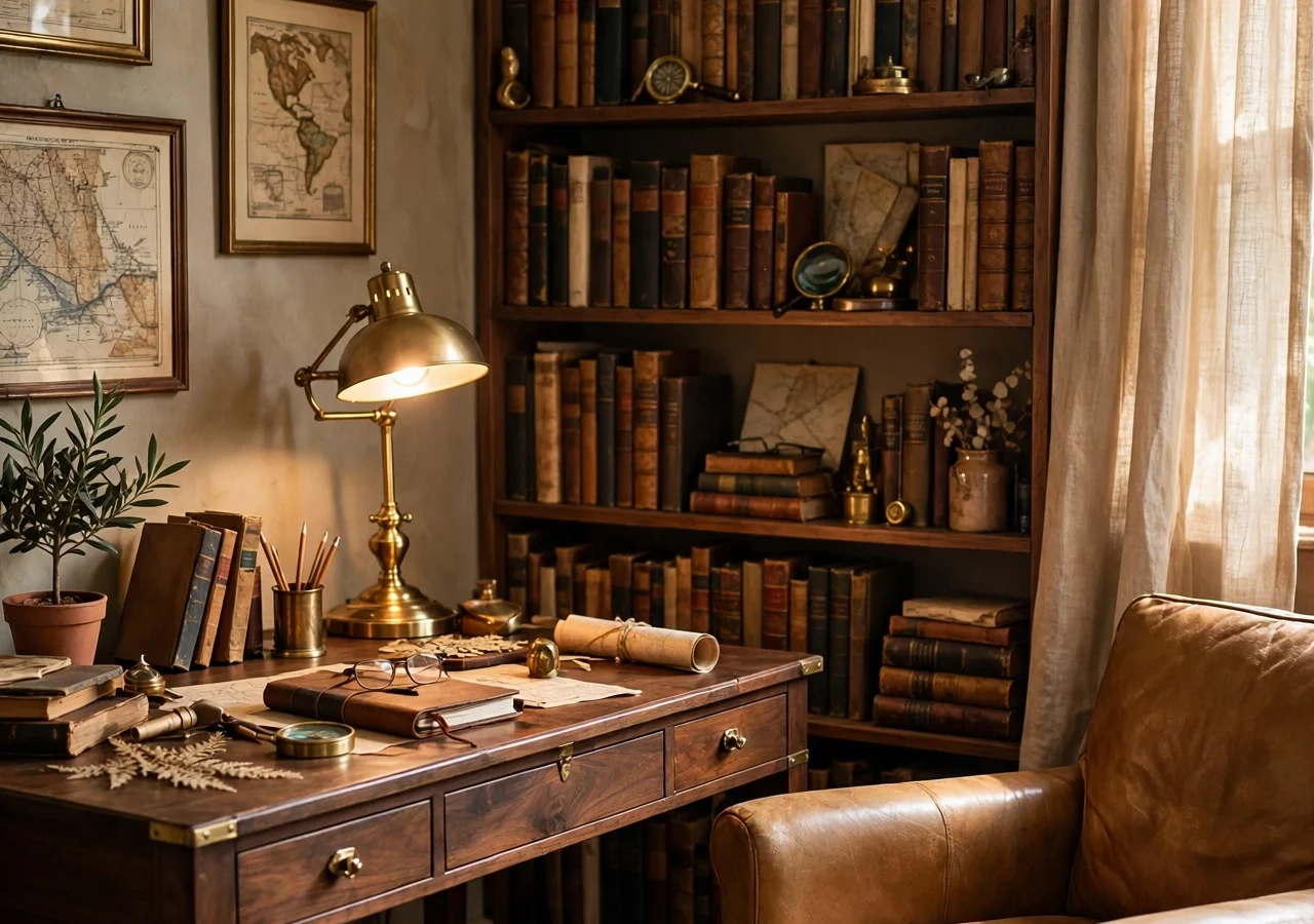
There is a particular kind of room that feels like it has stories to tell before you have even sat down in it. Dark wood, worn leather, a brass lamp throwing warm light over a stack of old books, and khaki walls that look sun-baked rather than painted. That is the heart of khaki coded decor, a style that borrows from the explorer’s study: the well-travelled room where every object looks chosen on a journey rather than bought in one afternoon.
The risk with this look is that it slides into theme-park territory. Too many maps and the room feels like a film set. Too much dark wood and it feels heavy and closed in. The trick is restraint: pick the khaki and wood as your base, add brass in small doses, and let one or two collected pieces do the talking while the rest of the room stays calm.
This guide gives you eight khaki coded decor ideas that build an explorer study at home, whether you have a whole spare room or just one corner to work with. Each idea stands on its own, so start with the one that fits your space and budget, then add the next when you are ready.
Quick Tips Before You Start
- Keep khaki warm, never grey: look for shades with a yellow or olive undertone, not a cold stone one.
- One dark wood hero piece per room is enough; pair it with lighter linen and pale walls so the room breathes.
- Brass should repeat in small touches (handles, a lamp base, a frame) rather than arriving as one big shiny object.
- Buy the lamp before the chair: good light makes the whole study work, and a bad lamp ruins it.
1. A Dark Wood Desk That Anchors the Room
 Save
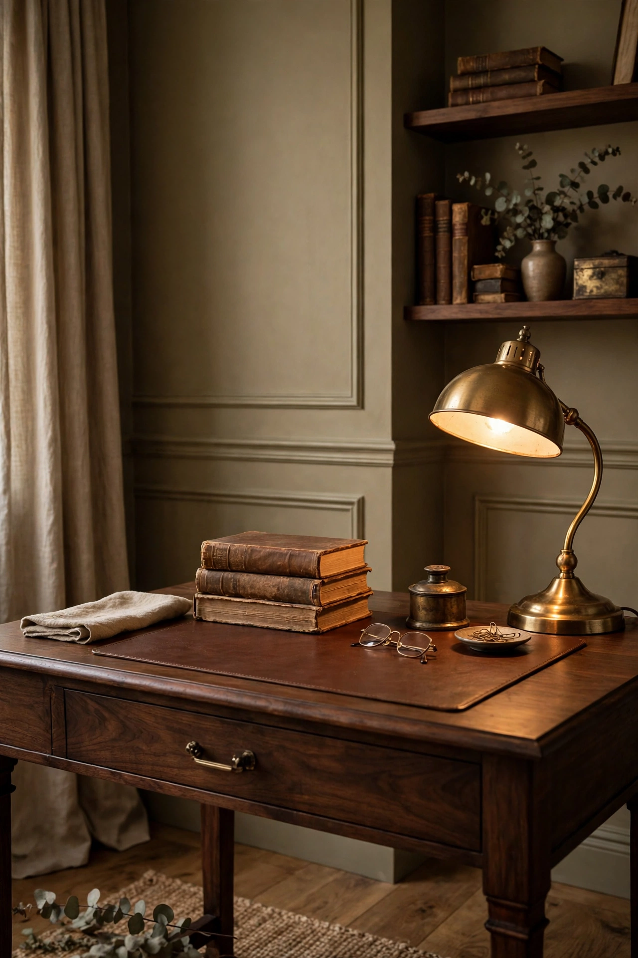
Every explorer study needs a desk, and the desk is the piece that sets the tone for everything else. A solid walnut or mahogany desk with visible grain does more for this style than any accessory. It does not need to be an antique. A well-made reproduction or a second-hand find with a few scuffs will look better than a flat-pack desk pretending to be old, because the style is about patina, not perfection.
Size matters more than style here. A desk that is too small looks lost against a khaki wall, while one that is too deep eats the walkway. Measure the wall, then leave at least 90 centimetres of clear floor in front of the desk so the chair can pull out without hitting anything behind it. If the room is narrow, a writing desk with slim legs works better than a pedestal desk, and a leather desk mat in tan or oxblood softens the wood without hiding it.
| Desk | Best when | Watch |
|---|---|---|
| Pedestal desk | Wide wall, lots of storage needed | Needs 90 cm of clear floor in front |
| Writing desk, slim legs | Narrow room, lighter feel | Less drawer storage |
| Second-hand desk, re-oiled | Tight budget, you want patina | Check the top is flat and sturdy |
Placement: against the longest wall, centred under a window if you can, so daylight falls across the work surface from the side rather than from behind you.
Colour: walnut, mahogany, or dark-stained oak; keep the finish matte or satin, never high gloss.
Swap: a dark wood dining table cut down to desk height, or a second-hand desk sanded back and re-oiled, gives you the same presence for a fraction of the price.
Keep the desktop edited. A brass lamp, a pen pot, one stack of books, and a small tray for keys and coins is enough. A desk buried under paper looks like an office, not a study, and the whole point of the explorer look is that the room feels curated rather than cluttered. Our guide to dark academia reading corners covers the same desk-first thinking for a cosier, book-led corner if your study leans more literary than expeditionary.
2. Khaki Walls with a Warm, Sun-Baked Tone
 Save
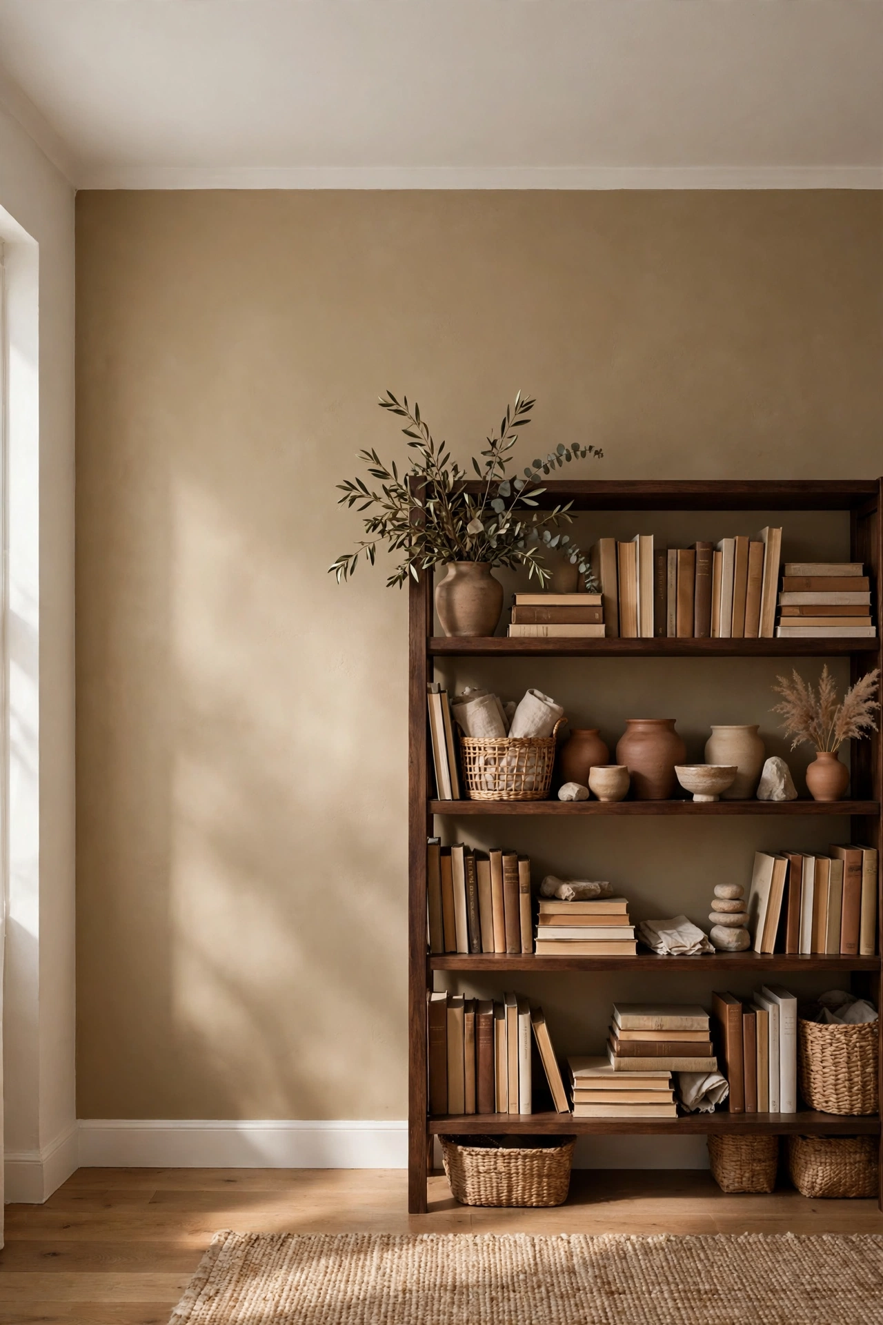
Khaki is the colour this whole look is named for, and getting it right is the difference between a room that feels like a safari lodge and one that feels like an army barracks. The shades that work are warm and dusty: a khaki with a yellow base, an olive-khaki that leans toward sage, or a sandy khaki that reads almost like pale caramel in afternoon light. Paint a test patch at least a metre square and live with it for two days before you commit, because khaki shifts a lot between morning and evening light.
| Khaki shade | Undertone | Pairs with |
|---|---|---|
| Yellow-base khaki | Warm yellow | Tan leather, dark walnut |
| Olive-khaki | Green, leaning sage | Olive leather, brass |
| Sandy khaki | Pale caramel | Warm off-white walls, brass touches |
One wall is often enough to carry the colour. Paint the wall behind the desk or the bookshelves khaki and keep the other walls in a warm off-white, and the room gets the depth without the weight. If you want the full effect, paint all four walls but keep the ceiling white and the skirting in a soft cream, which stops the room closing in. A flat or matte finish suits khaki best; a sheen makes it look like paint, while matte makes it look like plaster or sun-dried earth.
Colour: warm khaki with a yellow or olive undertone; test in daylight and lamplight before buying the full tin.
Placement: the wall behind the desk or the main bookshelf, so the colour frames the room’s focal point.
Swap: if paint feels too permanent, a khaki linen curtain or a large khaki throw over the back of a chair gives you the tone without touching the walls.
Watch the undertones in your other pieces. Khaki with a green cast pairs well with olive leather and brass; khaki with a yellow cast pairs better with tan leather and dark walnut. Mix the two casts in one room and the walls will fight the furniture, so pick one family and stick to it. Our earthy browns and clay tones guide shows how the same warm, grounded palette works across a whole room if you want to push the natural colours further.
3. Brass Hardware and Lighting That Ages Well
 Save
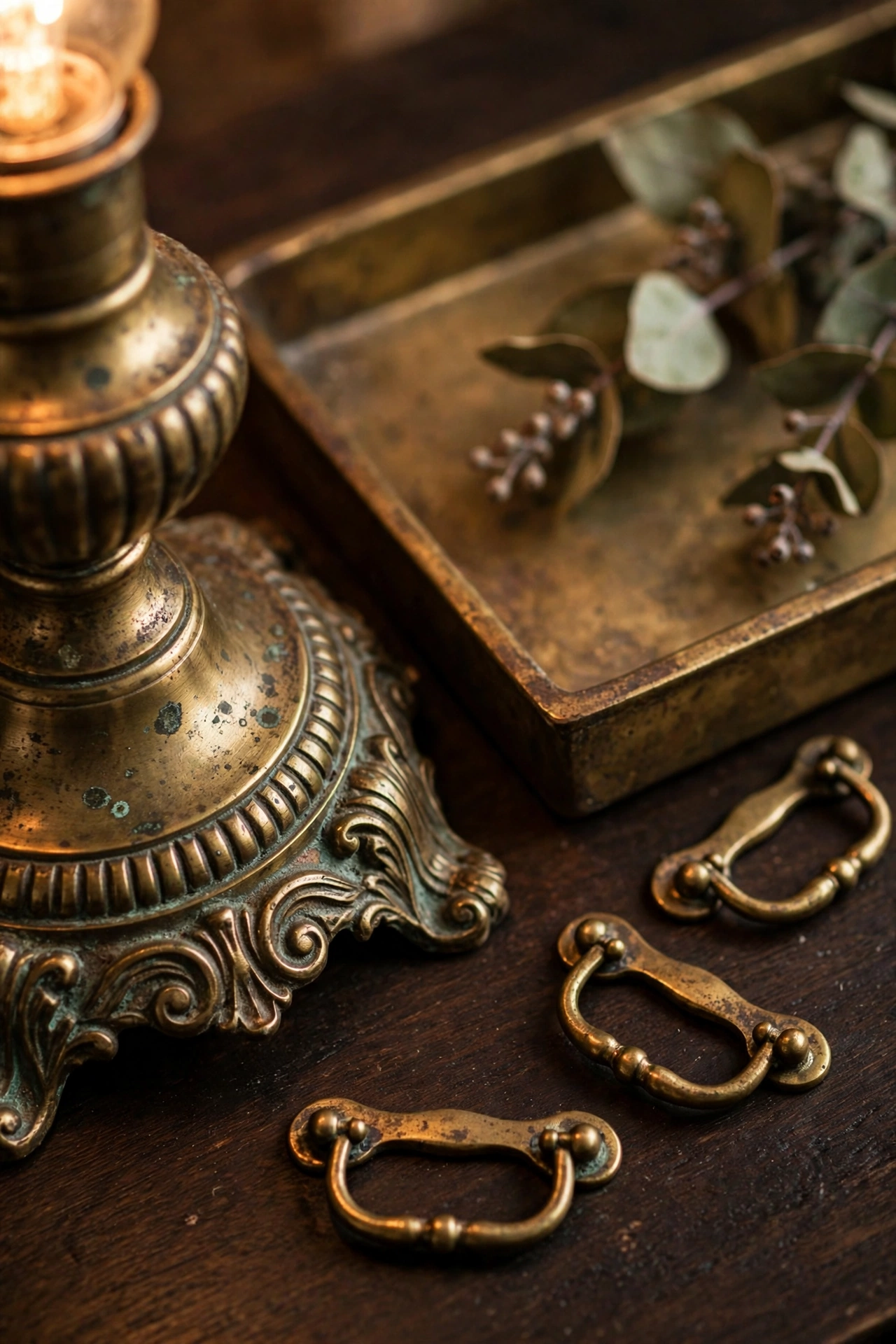
Brass is the metal of the explorer study, and it works because it ages. A new brass lamp base looks bright and a little stiff; the same lamp after a year of use has a soft, uneven glow that no new finish can fake. That is the quality to chase. Choose unlacquered or antique brass where you can, and let it darken naturally rather than polishing it back to a mirror shine every week.
Spread the brass around in small doses. A desk lamp with a brass base, brass drawer pulls on the desk, a brass picture light over the bookshelf, and a brass tray on the side table give you the metal at four different heights, which is what makes the room feel layered. One big brass object, like a giant brass floor lamp, tends to dominate; several small ones feel collected, which suits the style.
Placement: one brass piece at desk level, one at shelf level, and one higher up (a picture light or a wall sconce) so the metal catches light across the room.
Colour: antique or unlacquered brass; avoid bright polished gold, which reads more glamorous than expeditionary.
Swap: spray a plain metal lamp base or a set of drawer pulls with a brass-effect paint, then rub the high points back with fine sandpaper for a worn look.
Keep brass away from chrome and silver in the same room. Cool metals flatten the warmth that khaki and dark wood build, and the clash is obvious once you see it. If a piece you love comes in the wrong finish, swap its hardware or paint it; the fix takes an afternoon and it is worth doing. For more ways to use the metal, see our warm metallic brass ideas for styling that pairs naturally with dark wood and khaki walls.
4. Linen, Leather, and Natural Textures
 Save
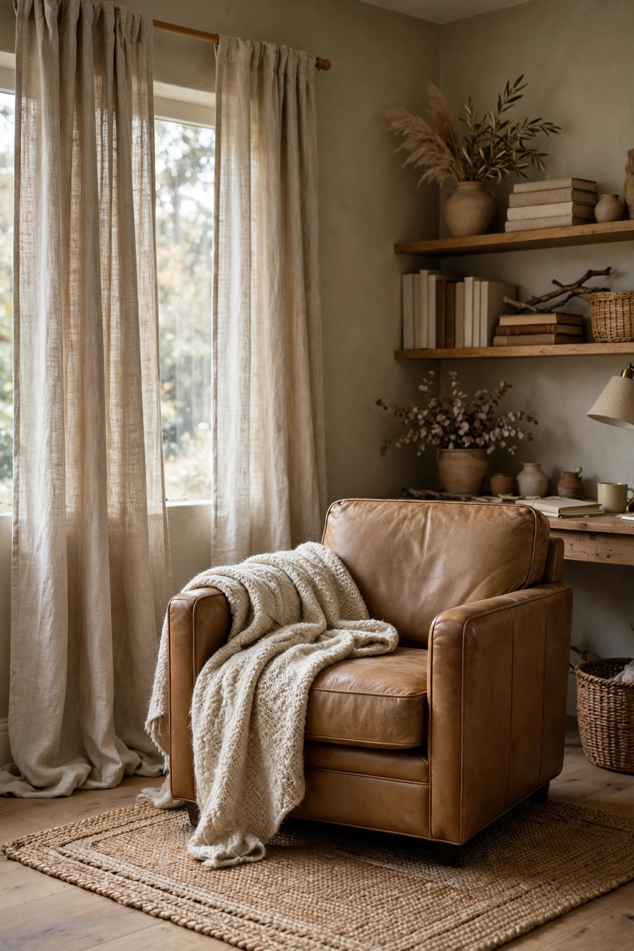
A study built only from wood and metal feels hard, and hard rooms are not rooms people linger in. Linen and leather are the softening agents. A linen armchair in natural flax, a pair of khaki linen curtains, a tan leather desk chair, or a leather-bound journal on the desk all add the touch and give the eye somewhere to rest. The rule is simple: every hard surface should have a soft one nearby.
Texture matters more than pattern here. Plain linen with a visible weave, full-grain leather that shows its creases, a wool throw with a chunky knit, and a jute or sisal rug underfoot give you four different textures without a single printed pattern. That matters because the explorer look is about materials that age, and a busy print fights that idea. If you want pattern, keep it to one piece, like a faded kilim cushion or a striped linen throw, and let the rest stay plain.
Texture: washed linen for curtains and upholstery, full-grain leather for the chair and small accessories, wool or jute for the floor.
Placement: linen at the windows and on the chair, leather on the seat you use most, the rug centred under the desk and chair so the two sit on it together.
Swap: a linen-look cotton slipcover over a plain armchair, or a leather-look desk mat, gives you the texture at a much lower price.
Care for the materials the way they deserve. Linen softens with washing, so buy it a shade darker than you want and let it fade into place. Leather needs a wipe with a damp cloth and an occasional condition, nothing fancy. A room where the materials look used and loved always beats a room where everything looks new.
5. A Gallery Wall of Maps, Prints, and Field Finds
 Save
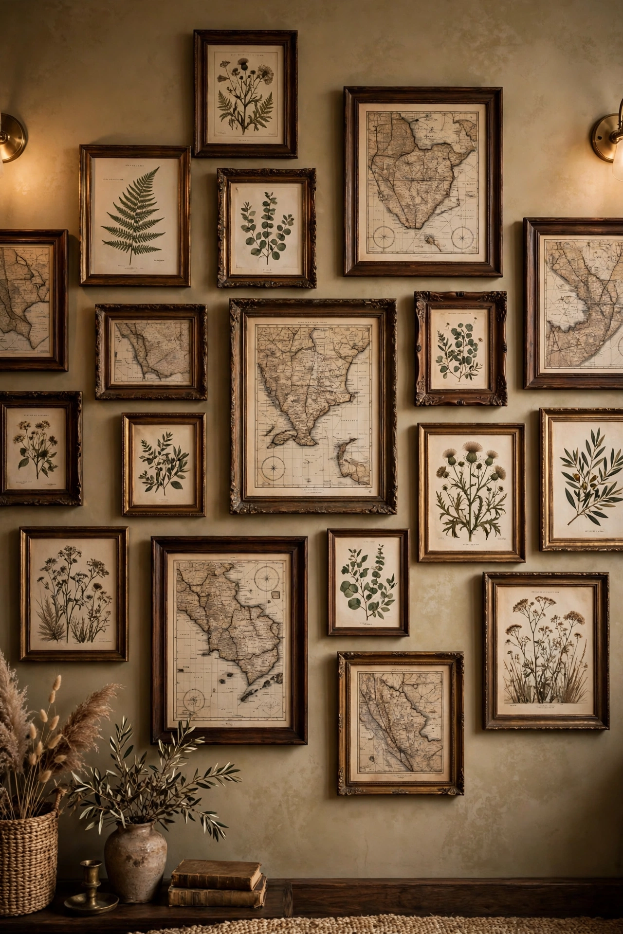
The walls of an explorer study should look like they were built up over years of travel, not ordered in one go. A gallery wall of old maps, botanical prints, black-and-white photographs, and framed postcards gives you that feeling, and it is the one place in the room where you can be generous. Mix frame sizes and frame finishes: dark wood, brass, and black lacquer all sit happily together when the art inside shares a muted, earthy palette.
Start with one anchor piece, a large framed map or a vintage travel poster, hung at eye level, about 145 centimetres from the floor to its centre. Build smaller pieces around it, keeping a consistent gap of about 5 centimetres between frames so the grouping reads as one composition rather than a random scatter. Lay the arrangement on the floor first and photograph it from above before you put a single nail in the wall; moving frames on the floor is free, moving them on the wall is not.
Placement: one wall only, ideally the wall you see when you sit at the desk, so the collection is part of your view rather than behind you.
Colour: muted greens, browns, and ochres in the art itself, so the frames and the pictures echo the khaki walls.
Swap: print public-domain maps and botanical illustrations on matte paper and frame them yourself; the frame carries the look, not the price tag.
Leave room to grow. A gallery wall that is full on day one has nowhere to go, while one with a deliberate gap invites the next find. Hang the frames you have, leave one empty hook, and let the wall collect its next piece on your next trip or market visit. That slow build is the whole spirit of the style.
6. Bookshelves That Look Collected, Not Staged
 Save
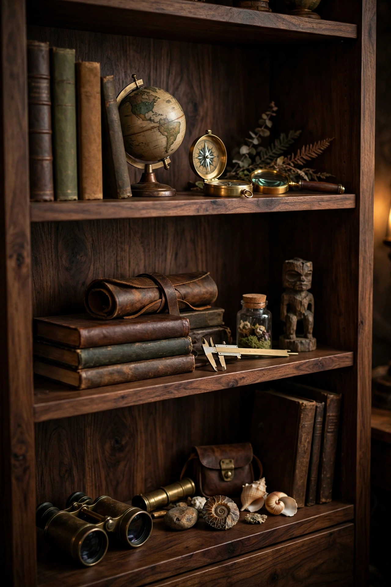
Bookshelves are where the explorer study proves itself, and the difference between a collected shelf and a staged one is visible from the doorway. A staged shelf has books sorted by colour and objects spaced like a shop window. A collected shelf has books grouped by subject, stacked both upright and flat, with a brass compass, a small globe, a framed photograph, or a stone from a trip tucked between the rows. The objects should look like they arrived one at a time, because they did.
Shelving in dark wood suits the look best, but a painted shelf in deep khaki or warm charcoal works too if the wood is out of reach. Keep the shelves deep enough for books plus one object in front, about 25 to 30 centimetres, so nothing has to sit in a single straight line. Vary the heights: a stack of three books lying flat breaks up a long row of spines, and a tall object like a brass telescope or a ceramic vase gives the eye a vertical anchor.
Placement: the tallest shelf unit against the wall opposite the desk, so the books are in view while you work but not crowding the desk itself.
Colour: dark walnut or mahogany shelves; if painted, deep khaki or charcoal with a matte finish.
Swap: a second-hand bookcase sanded and stained dark, or a set of wall-mounted dark wood shelves, gives you the same display for far less than a fitted unit.
Edit with a light hand. Take one thing off each shelf after you finish styling, then step back and look. If the shelf still reads, it is done; if it looks bare, put back only the piece you miss. Shelves that breathe look collected, while shelves that are packed to the edge look like storage.
7. A Reading Chair and a Proper Lamp
 Save
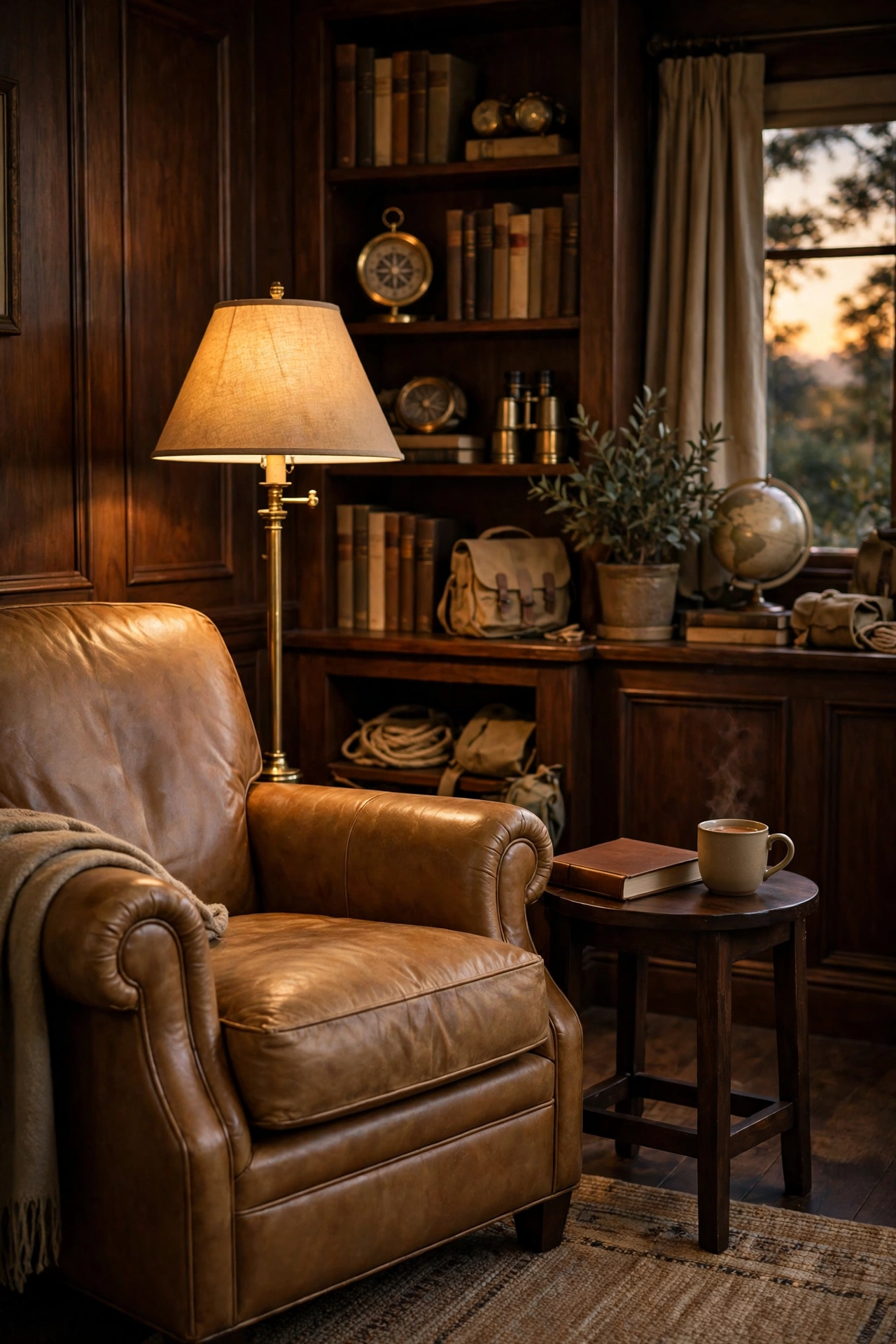
No study is complete without a chair that is not the desk chair. A leather armchair in tan or oxblood, a linen-covered wingback in natural flax, or a dark wood chair with a thick wool cushion all work, as long as the chair invites you to sit for an hour rather than perch for five minutes. Test it before you buy: sit, put your feet up, and check that the arms are at a height that lets you hold a book without hunching.
| Chair | Feel | Best when |
|---|---|---|
| Tan leather armchair | Softens with use, warm | You read for an hour at a time |
| Linen wingback | Soft, calm, light | The room needs softening |
| Dark wood chair, wool cushion | Firm, upright | A small corner with less floor space |
The lamp beside it is just as important as the chair. A brass floor lamp with a linen shade, or a brass table lamp on a small side table, gives you warm light at shoulder height, which is exactly where reading light should fall. A cool white bulb will flatten the khaki walls and make the leather look grey, so use a warm bulb around 2700K and, if you can, a dimmer, so the light drops to a soft glow in the evening.
Placement: the chair angled toward the room, not flat against the wall, with the lamp on the side your reading hand favours and a small side table within reach.
Colour: tan or oxblood leather, natural linen, or dark wood with a wool cushion; warm brass for the lamp.
Swap: a second-hand leather chair reconditioned with leather balm, or a plain armchair with a linen slipcover, gives you the seat for a fraction of a new one’s price.
Add a small side table and a throw and the corner is finished. The side table holds a cup and a book; the throw lives folded over the chair arm, ready for a cold evening. A reading corner that is actually used always looks better than one that is only styled, so put the chair where you will genuinely sit in it.
8. Small Explorer Details That Finish the Look
 Save
The last idea is the smallest, and it is the one that makes the room feel personal rather than decorated. A brass compass on the desk, a vintage globe on the shelf, a leather-bound journal, a pair of binoculars by the window, or a wooden box holding letters and keepsakes all tell the same story: this room belongs to someone who goes places and brings things back. The key is that these objects should be real, or at least look like they could be.
Choose three or four details and place them where they will actually be seen and used, not hidden on a high shelf. The compass sits on the desk where you can pick it up. The globe turns on the shelf where you can spin it. The journal lives open on the desk or closed on the side table, not sealed in a drawer. Objects that are handled stay honest; objects that are only displayed start to look like props.
Placement: one detail on the desk, one on the shelf, one on the side table, so the story is told at three heights across the room.
Colour: brass, dark wood, tan leather, and aged paper; keep the palette narrow so the details feel like a set.
Swap: charity shops and flea markets are the best source for these pieces; a brass compass or a wooden box costs very little second-hand and looks better with age than any new replica.
Resist the urge to add more. A room with three well-chosen details feels like an explorer’s study; a room with fifteen feels like a gift shop. Stop when the room feels finished, live with it for a week, and only then decide if anything is missing. Our guide to interior design trends for 2027 shows how this grounded, collected style sits alongside the wider move toward walnut, oxblood, and botanical greens if you want to see where the look is heading.
The combination: one khaki wall, one dark wood desk, brass at three heights, and linen to soften it all. That is the explorer study, and the details can arrive slowly after.
Bringing It All Together
Khaki coded decor is not about buying a whole explorer’s study in one weekend. It is about choosing a warm khaki base, one dark wood hero piece, a little brass, and a few textures that soften the room, then letting the details arrive slowly. Start with the wall colour or the desk, live with it for a week, and add the next piece when you know what the room is missing.
The look rewards patience. A second-hand desk, a brass lamp found at a market, a linen chair that softens with use, and a map framed from a trip you actually took will always feel more like yours than a matching set bought in one afternoon. Build it slowly, keep one quiet surface in every corner, and the room will feel like a place with stories, not a set with props.
Frequently Asked Questions
What is khaki coded decor?
Khaki coded decor is a home style built around warm khaki tones, dark wood, brass, and linen, inspired by the explorer’s study. It mixes the feel of old travel, field notes, and well-used furniture into a calm, collected room that looks like it grew over years rather than arriving in one delivery.
Is khaki too dull for a whole room?
Not if you pick a warm shade and pair it with contrast. A khaki with a yellow or olive undertone looks sun-baked rather than flat, and dark wood, brass, and tan leather give it the depth it needs. Keep the ceiling white and add one pale rug so the room stays bright.
What wood works best with khaki?
Walnut and mahogany are the natural partners, because their deep brown tones sit well against warm khaki without clashing. Dark-stained oak works too. Avoid pale pine or ash in the same room, since light wood fights the grounded, expedition feel that khaki sets up.
Can I do khaki coded decor in a small room?
Yes, and it suits a small room well because the palette is calm rather than busy. Paint one wall khaki, use a slim-legged desk, and keep the brass to small pieces like drawer pulls and a lamp base. A large mirror in a dark wood frame will bounce light around and keep the room from feeling closed in.
How is khaki coded different from dark academia?
The two styles share dark wood and old books, but khaki coded leans toward travel and the outdoors: maps, brass instruments, linen, and sun-baked colour. Dark academia leans toward libraries and candlelight, with more black, deep green, and gothic detail. Many rooms borrow from both, and the overlap is part of the fun.