Every few years, the mood of home decorating shifts in a way you can feel before you can name it. Rooms that once felt bright and bare start to feel a little cold. The pale wood that looked fresh in photos starts to look thin in real life. You find yourself reaching for deeper colours, heavier fabrics, and furniture that looks like it will last.
That is where 2027 is heading. The forecast points away from stark, showroom-perfect rooms and toward spaces with warmth, depth, and a lived-in quality. Three ideas sit at the centre of it: walnut wood, oxblood red, and botanical greens. On their own, each one is strong. Together, they make a palette that feels rich without feeling dark, and grown-up without feeling formal.
This guide looks at how interior design trends 2027 are shaping up around those three anchors, and how to use them in a normal home, with normal light, normal budgets, and furniture you already own.
Walnut, Warmed Up: Dark Wood Without the Heaviness
 Save
Before you buy into any of these three anchors, check the room you already have. Note which way the windows face, whether the daylight runs warm or cool, and what wall colour and large furniture the new pieces must sit beside. Walnut turns cold under cool light, oxblood goes almost black in a dim corner, and greens wash out against cool grey, so the light and palette you start with decide how far each trend can go in your home.
Walnut is not new, but the way it is being used in 2027 is different. Instead of whole rooms panelled in dark timber, the trend is walnut used as an anchor: a coffee table with a visible grain, a set of open shelves, a bed frame, a sideboard that grounds a pale room. The wood does the warming, and everything else stays light enough to breathe.
The appeal is partly practical. Walnut hides everyday marks better than pale ash or bleached oak, and its grain gives a flat surface some movement without pattern or print. A walnut tray on a linen sofa, a walnut frame on a plain wall, or walnut handles on painted kitchen cupboards can change the temperature of a room in an afternoon.
Look for a mid to deep brown with warm undertones rather than a grey or ashy stain. Grey-toned walnut can turn cold under cool daylight, especially in north-facing rooms. Oil-finished walnut feels softer to the touch than high-gloss lacquer, and it ages more gracefully, developing a gentle sheen where hands rest over time.
Pair walnut with cream, oatmeal, and soft white rather than stark white. The contrast stays clear, but the room does not split into harsh light and dark blocks. In a small room, keep the walnut to one or two pieces and let the walls stay pale. The wood will still read as the hero, and the room will still feel open.
Styling tip: If you are buying one walnut piece, make it something you touch every day, like a dining table or a bedside table. Daily use is what makes a trend feel like home instead of a display.
This is also why walnut works so well alongside the softer side of current decorating. It gives structure to warm minimalist living rooms, stopping them from sliding into blandness, while keeping the calm that made minimalism appealing in the first place.
Oxblood Moves In: A Deep Red for Everyday Rooms
 Save
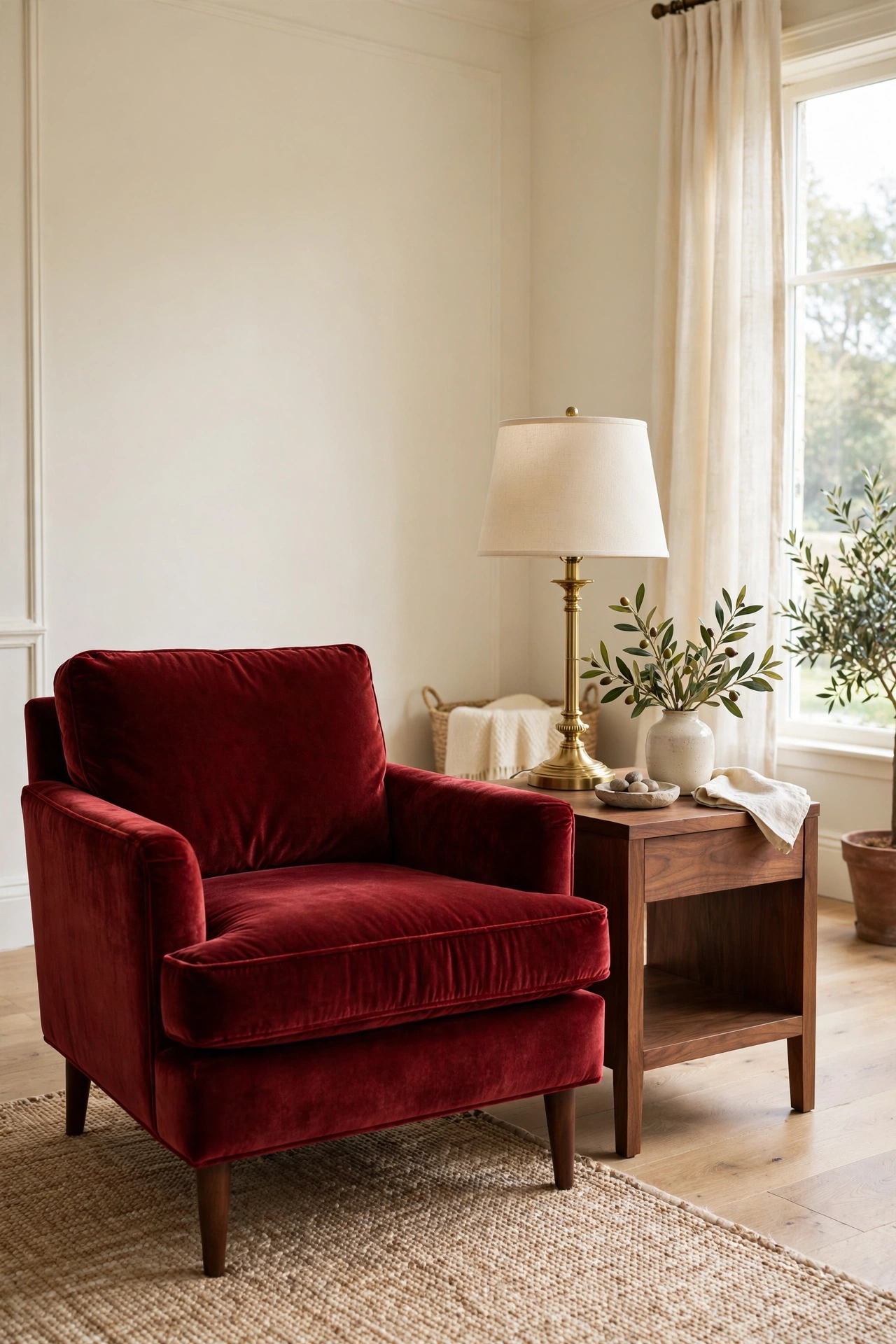
Oxblood is a deep, brownish red, closer to dried wine than to bright cherry or scarlet. It has been hovering at the edge of fashion and interiors for a while, and 2027 brings it firmly inside. Used well, it reads as luxurious and a little moody, but it never shouts.
The trick is dosage. Oxblood works best as a colour you sit with, not a colour that surrounds you on every wall. Think of a velvet armchair, a pair of curtains, a painted bookcase, or a rug with oxblood as its darkest thread. In a bedroom, oxblood bedding layered over cream linen gives depth without making the room feel heavy at night.
It pairs beautifully with walnut, which is part of why the two trends arrive together. Both have brown in their base, so they sit next to each other without clashing. Add brass or aged gold for a lift, and keep the rest of the room quiet: cream walls, natural linen, a plain wooden floor. The room will feel layered rather than decorated to within an inch of its life.
Be careful with lighting. Oxblood can look almost black in a dim corner, which wastes its richness. Put oxblood pieces where daylight or a warm lamp can reach them, and test a fabric swatch at home in the evening before you commit to a large piece. A swatch that looks plum in the shop can look brown at home, and vice versa.
Budget swap: A full oxblood sofa is a big commitment. Start with cushions in a mix of oxblood velvet and a lighter rust or terracotta, then add a throw in the same family. You get the colour story for a fraction of the price, and you can change it later without regret.
Oxblood also suits people who like depth but do not want a fully dark room. It gives the same drama as the dark romantic rooms that have grown popular in recent years, but in a smaller, more flexible dose that works in a rented flat as well as a owned house.
Botanical Greens, Layered Like a Garden
 Save
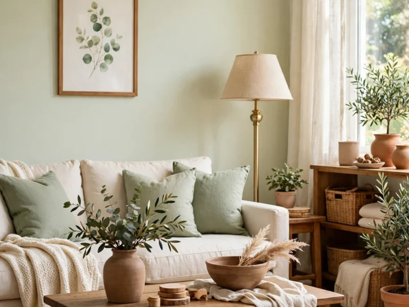
Botanical greens are the third anchor, and they stop the walnut and oxblood combination from feeling too autumnal. These are not neon greens or pale mint. They are the greens you see in a real garden: sage, olive, moss, eucalyptus, and a deeper forest green used sparingly.
The 2027 version layers several greens at once instead of picking one and repeating it everywhere. A sage sofa, olive cushions, a moss-green throw, and a couple of plants with different leaf shapes will look more natural than a room where every green matches exactly. Nature does not match, and rooms that copy that looseness feel calmer for it.
Paint is the easiest place to start. A single wall in sage or olive can anchor a bedroom or a study, especially behind a walnut bed frame or a wooden desk. If painting feels like a step too far, start with textiles: bedding, curtains, or a large piece of art with green as its main colour. You can test the shade for a season and repaint or swap it later.
Plants matter here, but they do not have to be fussy. A tall olive tree in a terracotta pot, a trailing pothos on a shelf, or a bunch of eucalyptus in a jug will do more for a botanical room than a shelf of tiny plants that need constant care. Choose plants that suit your light, and let a few leaves go a little wild. Perfectly pruned plants can make a room feel like a shop display.
Designer note: Keep greens away from cool grey walls if you can. Greens look richer against warm white, cream, or a soft plaster tone. Grey can make sage look washed out and olive look muddy.
For bedrooms in particular, green is a forgiving colour. It works with wood, linen, and white bedding, and it photographs well in morning light. If you want ideas for building the look around plants rather than paint, plant-filled bedrooms show how much difference leaf shape and placement can make.
Colour Pairings That Make the Three Work Together
 Save
Walnut, oxblood, and botanical green sound strong on paper, and they are. The skill in 2027 decorating is not choosing them, but balancing them so no one colour bullies the others. A useful rule is to let one colour lead in each room, let a second support it, and let the third appear only in small touches.
In a living room, walnut might lead through the furniture, green might support through the sofa and plants, and oxblood might appear only in two cushions and a piece of art. In a bedroom, green might lead through bedding and paint, walnut might support through the bed frame, and oxblood might appear in a single throw. The palette stays the same from room to room, but the balance shifts, so the house feels connected without feeling repetitive.
| Room | Lead colour | Support colour | Small accent |
|---|---|---|---|
| Living room | Walnut furniture | Botanical green sofa and plants | Oxblood cushions |
| Bedroom | Botanical green bedding | Walnut bed frame | Oxblood throw |
| Dining room | Walnut table | Oxblood chairs or cushions | Green centrepiece |
| Study | Walnut desk and shelves | Green walls or art | Oxblood lamp or chair |
Neutral colours do the quiet work in this palette. Cream, oatmeal, warm white, and natural linen keep the deep tones from closing a room in. If a room starts to feel heavy, the answer is usually more cream, not less colour: a cream rug, cream curtains, or a cream lampshade will lift the whole scheme without breaking it.
Brass, aged gold, and natural rattan also help. A brass lamp on a walnut table, a rattan basket beside a green sofa, or a gold frame on a cream wall adds a warm glint that stops the deep colours from looking flat. Keep metals to one finish per room where possible, so the glint feels deliberate rather than scattered.
Try this: Before you buy anything, gather swatches of your walnut, oxblood, and green in one pile, then add a cream fabric swatch. If the pile looks like a garden in late summer, with wood, leaves, and a deep flower, the balance is right. If one colour jumps out and hides the rest, pull it back to a smaller item.
Curves, Fluting and Soft Shapes Carry the Mood
 Save
Colour alone does not make a 2027 room. Shape matters just as much, and the shapes for 2027 are softer than the sharp, boxy furniture of a few years ago. Rounded sofa arms, curved headboards, arched mirrors, and fluted panels all soften the impact of dark wood and deep red, so the room feels welcoming rather than severe.
Fluting, those vertical grooves you see on sideboards, bed frames, and wall panels, is especially useful with walnut. It catches light and shadow, so a plain walnut panel gains texture without extra colour or pattern. A fluted walnut sideboard can be the most interesting piece in a room even when everything around it is plain.
Curves also help in small rooms. A round coffee table is easier to walk around than a rectangular one, a curved chair fits into a corner without sharp edges, and an arched mirror makes a narrow hallway feel taller. The trend is not about buying a whole new suite of curved furniture. One curved piece per room is usually enough to change the feeling.
Avoid mixing too many shapes at once. A curved sofa, a round rug, an arched mirror, and a scalloped headboard in the same room can start to feel like a theme park. Pick the curve that matters most, usually the largest piece, and keep the rest of the furniture simple and straight.
Styling tip: If your sofa is straight and boxy, soften it with round cushions, a curved floor lamp, or a round side table. You do not need to replace the sofa to join the trend.
Natural Materials and Honest Finishes
 Save
Underneath the colour trends, 2027 favours materials that look like what they are. Real wood with a visible grain, linen that wrinkles a little, wool that feels thick, stone with natural variation, and clay pots with an uneven glaze all fit the mood. The opposite, shiny plastic that pretends to be marble, or printed wood grain that repeats every few centimetres, feels out of place.
This is good news for budgets, because honest materials do not have to be expensive. A solid pine table stained walnut, a second-hand wooden chair sanded and oiled, a linen-look cotton throw, or a handmade ceramic vase from a local market will all read as genuine. What matters is texture you can feel, not a brand name or a high price tag.
Mixing materials also stops the palette from feeling flat. Walnut next to linen, oxblood velvet next to rough wool, green cotton next to a clay pot: each contrast gives the eye something to rest on. A room made entirely of smooth, matching surfaces can feel cold even in warm colours.
Care is part of the trend too. Oiled wood needs re-oiling once or twice a year, linen needs a shake rather than a perfect press, and wool throws need airing. These small routines suit the 2027 mood, which values rooms that are used and looked after, not rooms kept pristine for guests who never come.
Budget swap: Instead of replacing a whole sofa, re-cover two cushions in a natural fabric and add a wool throw. The texture change alone can make an old sofa feel part of the new palette.
Small Rooms, Big Trends: Scaling 2027 Down
 Save
Deep colours and dark wood can sound risky in a small flat, but they work if you scale them carefully. The rule for small rooms is simple: keep the walls light, keep the floor visible, and put the deep colours where you can see them at eye level, not above or below.
A walnut bedside table, an oxblood cushion, and a green plant on a windowsill will give a small bedroom the full 2027 palette without painting a single wall dark. A walnut shelf, a green tea towel, and an oxblood mug can do the same in a kitchen. Small doses, repeated in a few places, read as a scheme rather than a single accident.
Mirrors and light help enormously. A mirror opposite a window doubles the daylight, and a warm bulb in a table lamp will make walnut glow and oxblood look rich in the evening. Avoid cool white bulbs in rooms with this palette. They make walnut look grey and oxblood look dull, and they undo the warmth you have built with colour and wood.
Storage matters more in small rooms, because clutter competes with deep colours. A walnut basket, a green fabric box, or a wooden crate can hide everyday clutter while adding to the palette. If every surface is covered, even the best colours will look messy, so leave at least one surface in each room completely clear.
Try this: Stand in the doorway of a small room and count the deep-coloured items you can see. Three to five is a good number. More than seven, and the room may feel crowded. Fewer than three, and the trend may not read at all.
What to Skip: Trends Fading as 2027 Arrives
 Save
Every forecast has a quiet side: the looks that are fading. For 2027, the clearest fade is the all-grey room. Cool grey walls, grey sofas, grey rugs, and grey bedding, once a safe choice, now make a room feel dated and cold next to walnut, oxblood, and green. If your room is mostly grey, you do not need to start again. Warm it up with walnut accessories, a green throw, or cream cushions, and the grey will recede into a background instead of leading the room.
Overly matched sets are fading too. A sofa, armchair, coffee table, and side tables all bought as one set, in one finish, can look like a showroom. Mixing one walnut piece with a painted piece, or one velvet chair with a linen sofa, looks more personal and more current. The goal is a room collected over time, not delivered in one afternoon.
High-gloss finishes and very bright accent colours are also losing ground. A glossy white kitchen next to a walnut table can still work, but glossy red or glossy black accessories tend to fight the soft, natural mood of 2027. Matte and satin finishes, in wood, paint, and fabric, sit more comfortably with this palette.
| Fading look | Why it fights 2027 | Swap it for |
|---|---|---|
| All-grey room | Reads cold next to walnut and green | Walnut accessories, a green throw, and cream cushions |
| Matched furniture set | Looks like a showroom | One walnut piece mixed with a painted piece |
| High-gloss bright accents | Fight the soft, natural mood | Matte or satin finishes in wood, paint, and fabric |
Finally, skip trends that do not suit your light or your life. A deep green wall in a dark basement room, an oxblood velvet sofa in a house with muddy dogs, or a walnut dining table in a flat with no dining space will frustrate you no matter how fashionable they are. The best 2027 rooms are not copies of a forecast. They are normal homes where one or two forecast ideas have been fitted to real rooms, real light, and real routines.
For a broader look at where colour is heading next year, the 2027 colours of the year round-up covers the paint shades behind these trends, including the soft sages and grounded neutrals that pair so well with walnut and oxblood.
The combination: one lead colour per room, a second in support, the third in small touches only, and warm cream neutrals holding the whole palette together.
Bringing It All Together
Walnut, oxblood, and botanical greens give 2027 a clear, warm direction, but they do not demand a full redecoration. Start with one anchor in one room: a walnut piece you will use every day, an oxblood cushion you can live with for a season, or a green wall you can test behind a bed. Live with it for a few weeks, see how it looks in morning and evening light, and then add the next colour in a small dose.
Keep the neutrals warm, the shapes soft, and the materials honest, and the palette will do most of the work for you. A room that feels rich, calm, and a little bit garden-like is not a trend to chase. It is a room you will still like when the next forecast arrives.
Frequently Asked Questions
Is walnut too dark for a small room?
No, as long as you keep it to one or two pieces and keep the walls pale. A walnut coffee table or bedside table adds warmth without closing a room in, especially when paired with cream walls and a light rug. Avoid walnut wall panelling or a full walnut suite in a small space.
How do I use oxblood without making a room look Christmassy?
Keep oxblood away from bright red and bright green, and pair it with walnut, cream, and olive rather than festive shades. Oxblood velvet, leather, or wool reads as deep and muted, while bright red reads as festive. The finish matters as much as the colour.
Which botanical green is easiest to live with?
Sage is the safest starting point, because it works with wood, cream, and white, and it stays calm in both daylight and lamplight. Olive is richer and suits larger rooms, while forest green is best kept to one wall or a few accessories unless the room gets plenty of light.
Can I mix walnut, oxblood, and green in one room?
Yes, if you let one colour lead and keep the others in smaller doses. Try walnut furniture, green textiles, and oxblood in just two cushions or a throw. If all three appear in equal amounts, the room can feel busy, so pull one back until the balance feels calm.
Do these trends work in a rented home?
They work well, because none of them needs permanent changes. Walnut furniture, oxblood cushions and throws, green bedding, plants, and art can all move with you. If painting is not allowed, use removable wallpaper, fabric panels, or large pieces of art to bring green or oxblood onto the walls without damage.