Most kitchens and bathrooms play it safe. White subway tile, pale grout, a floor you barely notice. It works, but it rarely makes you smile when you walk in. A single bold tile choice can change that completely, and it does not require a full renovation or a designer budget to pull off.
The hesitation is understandable. Tile feels permanent in a way paint never does. Once it is set and grouted, you live with it every morning, so the fear of picking something you will hate in a year keeps a lot of people stuck on the safest option in the showroom. That caution is exactly why so many rooms end up looking polite but forgettable.
Statement tile ideas work best when one surface does the talking and everything else listens. Pick your star, give it room to breathe, and let the rest of the room stay calm. The seven approaches below cover pattern, colour, texture, and scale, so you can find the version that fits your room, your budget, and your tolerance for drama.
Patterned Cement Tiles That Carry the Whole Room
 Save
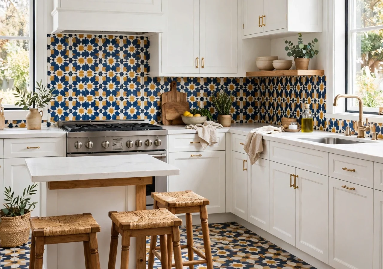
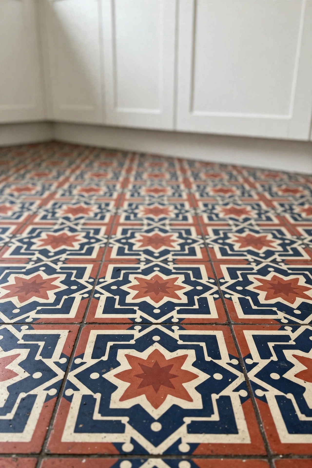
Patterned cement tile is the fastest way to give a plain room a personality. One repeating motif, laid across a floor or up a backsplash, creates a rug-like effect that no actual rug could survive in a wet room. The trick is committing to the pattern instead of apologising for it: a half-hearted border or a timid accent strip reads as indecision, while a full field of pattern reads as confidence.
In a kitchen, cement-look tile on the floor grounds the whole space, especially in an open-plan room where the cooking zone needs a visual boundary. Keep the cabinets plain and the worktops quiet, and the floor becomes the room’s artwork. In a bathroom, the same tile on the floor, paired with a simple white basin and plain wall tile, gives a small room a boutique-hotel feel without a single luxury fixture.
Styling tip: Choose a pattern with at least one colour already present in your room, even if it is only the wood tone of a stool or the brass of a tap. That shared colour is what stops a busy pattern from feeling random.
Cement-look porcelain is the practical stand-in for true encaustic cement. It delivers the same graphic punch, but it does not need sealing every year and it shrugs off kitchen spills and bathroom steam. If you love the real thing, budget for sealing and accept that it will age, softly and unevenly, which many people consider part of the charm.
Where pattern pays off most
- Entry-to-kitchen floors, where a patterned field marks the threshold beautifully
- Bathroom floors in rooms under 8 square metres, where one bold move beats several small ones
- A cooker backsplash run as a single framed panel, not a scattered accent
Glossy Zellige for Light and Movement
 Save
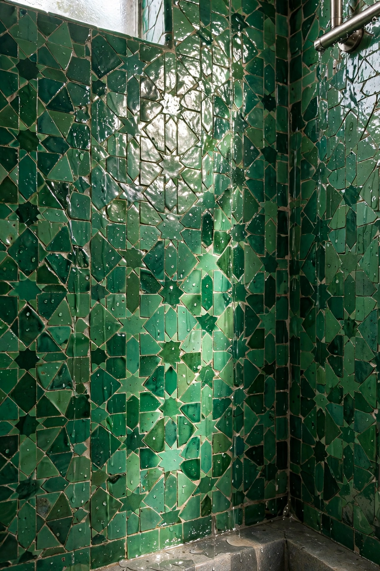
Zellige is the opposite of pattern: no printed design at all, just small handmade-look tiles whose glaze varies from piece to piece. Laid together, they shimmer. Light moves across the surface instead of sitting flat on it, which is why a zellige backsplash can make a dark kitchen feel alive even on a grey morning.
The variation is the point, so do not try to sort the tiles into matching shades before laying them. A good tiler mixes boxes and lets light and dark pieces fall where they fall. The result looks collected rather than manufactured, and that handmade quality is what keeps the look from dating the way a printed trend can.
Colour choice changes the mood completely. A soft sage or pale blue zellige feels calm and coastal, while a deep green or inky blue turns a bathroom wall into something moody and enveloping. If you are nervous about colour, start with a creamy white zellige: the glaze variation alone gives you the movement, and the colour stays neutral enough to live with for years.
Budget swap: Real Moroccan zellige is beautiful and pricey. A glazed ceramic tile with a deliberately uneven glaze gives you most of the shimmer at a fraction of the cost, and it is far easier to cut and clean.
Grout matters more here than with flat tile. A grout colour close to the tile keeps the surface feeling like one rippling sheet, while a contrasting grout chops it into a grid and loses the effect. Ask your tiler to show you a sample board with your grout choice before the whole wall goes up.
Large Marble-Look Slabs Without the Upkeep
 Save
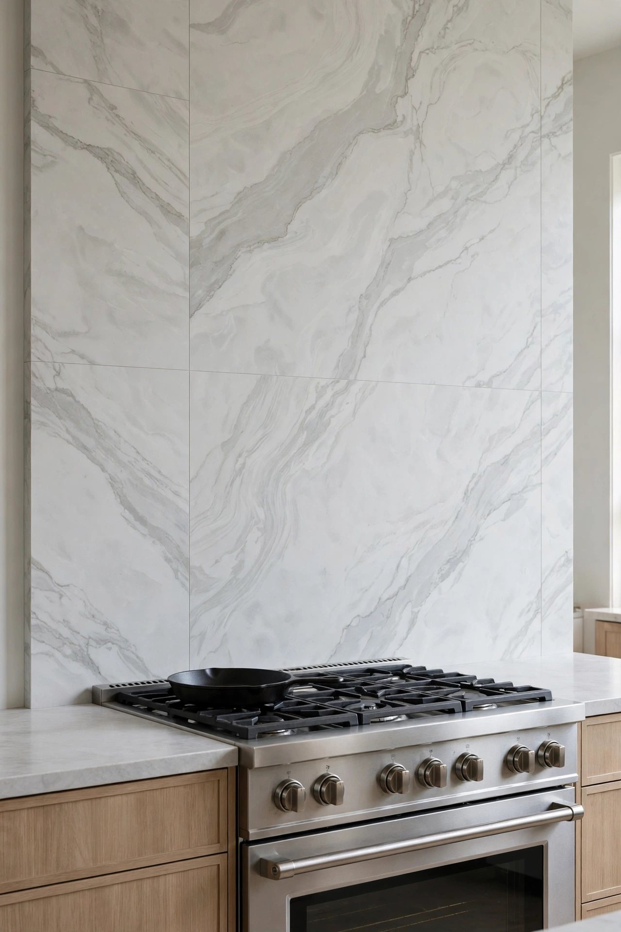
Real marble in a kitchen is a love affair with maintenance: lemon juice etches it, red wine stains it, and sealing becomes a recurring chore. Large-format porcelain slabs that mimic marble give you the veining and the drama with none of that anxiety, and the bigger the tile, the fewer grout lines break up the pattern.
Scale is what sells this look. A 600 x 1200 mm slab on a backsplash reads as a single sweep of stone, while small marble-look tiles read as a busy mosaic of veins that never quite line up. If your budget stretches to book-matched slabs, where two pieces mirror each other like an open book, the effect behind a cooker or a bath is genuinely show-stopping.
Keep the veining in proportion to the room. A wildly veined Calacatta-style slab suits a large kitchen island wall, but in a compact bathroom it can feel frantic. A softer, quieter vein pattern, with plenty of pale background, gives a small room the luxury without the visual noise.
Pairing this tile with limewash walls works surprisingly well: the soft, chalky plaster texture calms the crisp stone pattern, so the room feels layered rather than showroom-perfect.
Bold Colour in a Small Bathroom
 Save
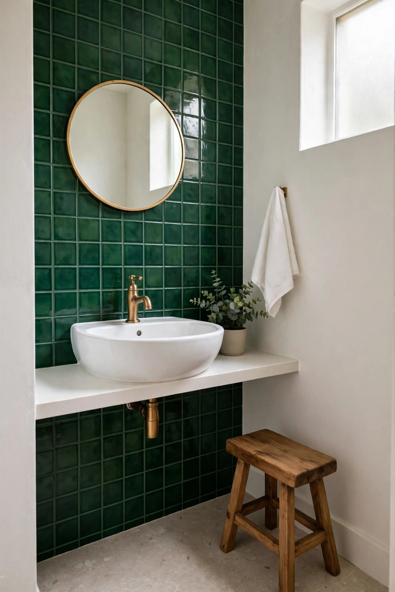
Small bathrooms are where bold colour earns its keep. A big room can absorb a statement; a small room needs one, or it risks feeling like a cupboard with plumbing. One wall of saturated tile, a coloured floor, or a shower niche lined in a jewel tone gives the eye somewhere to land the moment the door opens.
The safest bold move is a single colour, used generously. A bathroom tiled floor to ceiling in one deep green, with white sanitaryware and a timber stool for warmth, feels intentional and serene. The mistake is mixing three bold colours at once, which turns a small room into a sweet shop. Pick one hero colour, then let everything else be white, wood, or brass.
Gloss finishes help small rooms because they bounce light around, but they also show water marks, so keep a squeegee handy if you choose gloss for a shower wall. Matte finishes hide marks and feel more contemporary, though they absorb a little light. Either works; the choice is about how much cleaning patience you have, not about style rules.
Try this: If a full coloured wall feels like too much, tile just the shower wall in your bold colour and keep the rest of the room white. You get the drama every morning, and the room still feels open.
Terracotta and Handmade Warmth
 Save
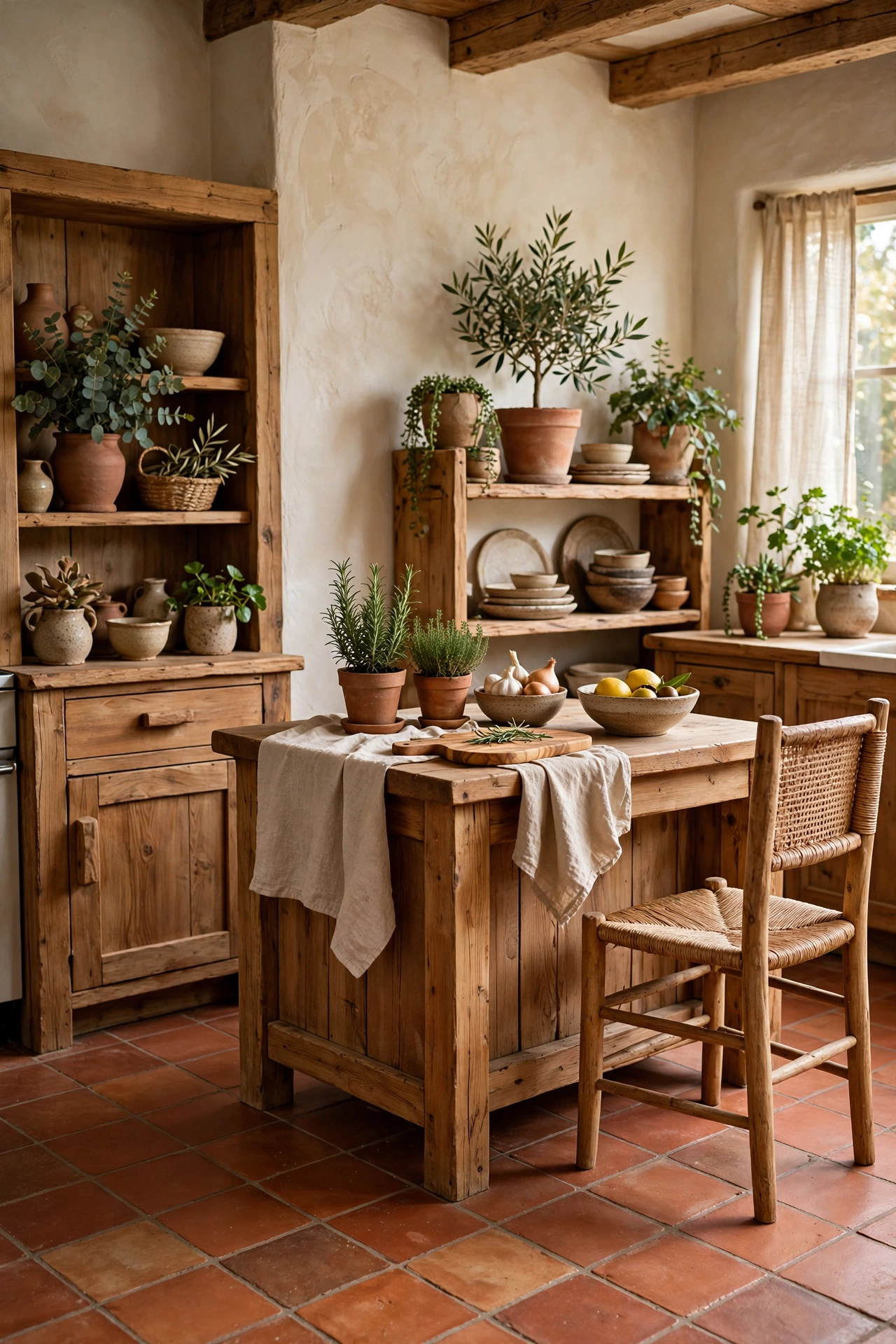
Terracotta brings a warmth that no printed tile can fake. Its reddish-brown tones, slight size variation, and matte surface make a kitchen feel grounded and lived-in, even when the cabinets are brand new. It pairs naturally with timber, linen, and plants, which is why it suits farmhouse kitchens and Mediterranean-style bathrooms equally well.
In a kitchen, terracotta floor tiles soften hard lines: stainless steel looks less clinical against them, and white cabinets look warmer. In a bathroom, terracotta on the floor with plain plaster walls and a wooden bath mat creates a spa feeling that has nothing to do with luxury fixtures and everything to do with natural materials underfoot.
Sealing is non-negotiable here. Unglazed terracotta drinks up water and stains, so it needs a good penetrating sealer before grouting and regular resealing after. If that maintenance sounds like a chore you will skip, choose a glazed terracotta-look porcelain instead. You keep the colour and warmth, and you lose the upkeep.
Terracotta also plays beautifully with metal. Warm brass taps and handles pick up the tile’s golden undertones, while black fixtures create a sharper, more modern contrast. Either direction works; brass leans cosy, black leans contemporary.
Checkerboard and Geometric Floors That Anchor a Kitchen
 Save
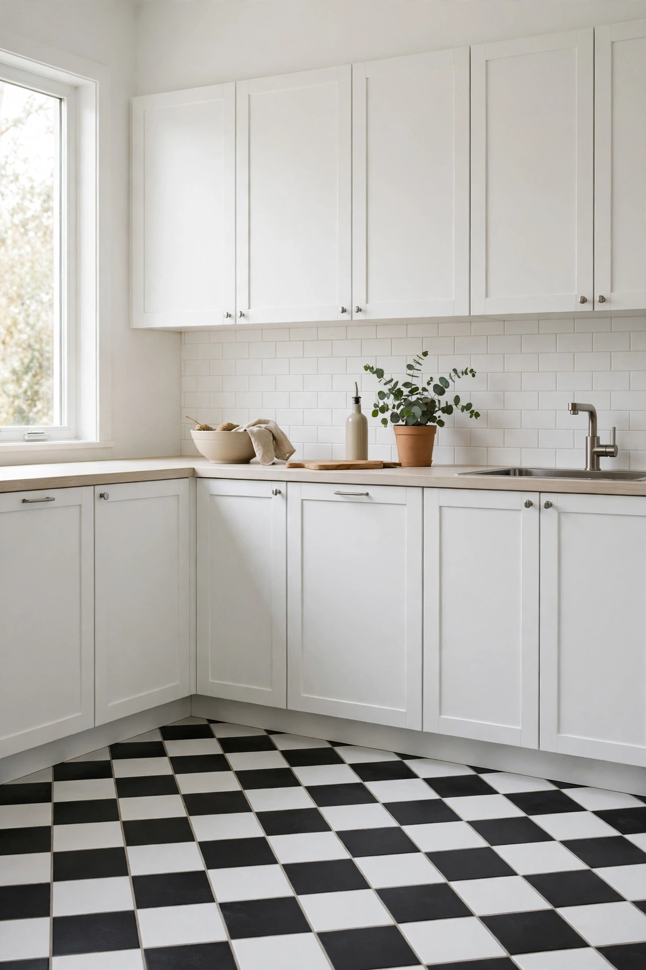
Checkerboard floors have survived every trend cycle for a reason: they are graphic, orderly, and they make a room feel finished. The classic black and white version suits period homes and retro kitchens, but the look has moved on. Try charcoal and cream for a softer take, sage and white for a country kitchen, or terracotta and cream for warmth without the stark contrast.
Tile size changes the character completely. Large 300 mm squares feel grand and calm, and they suit bigger kitchens. Smaller 150 mm squares feel busier and more vintage, and they can make a small kitchen feel like a Parisian bistro. Lay the pattern on the diagonal if you want the floor to feel more dynamic, or straight if you prefer a calmer, more formal grid.
Geometric tiles go beyond the checkerboard. Hexagons, fish scales, and Moroccan star patterns all create movement underfoot, but they demand a confident tiler and a bigger cutting budget, since every edge piece needs shaping. If your budget is tight, a checkerboard in standard square tiles gives you 90 percent of the graphic impact with none of the specialist cutting costs.
Designer note: Keep the rest of the kitchen quiet when the floor is this loud. Plain cabinet fronts, a simple worktop, and open shelving with a few calm pieces let the floor do its job without competition.
Pairing Bold Tile With Quiet Surfaces
 Save
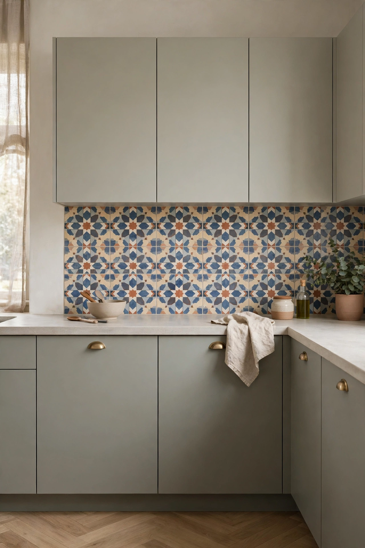
This is the rule that holds every idea in this article together: bold tile needs quiet neighbours. When the tile is loud, the paint, worktop, cabinets, and textiles should step back. That does not mean everything must be white, but it does mean nothing else should be fighting for attention.
A good test is the squint test. Stand in the doorway, squint, and notice what jumps out first. If it is the tile, you have the balance right. If three things jump out at once, something needs toning down, and it is rarely the tile that should go. Usually it is a patterned blind, a busy worktop, or a second accent colour that crept in during shopping.
Paint is your best friend here. A single wall colour pulled from the tile itself, even a pale version of it, ties the room together without adding a new voice. This is the same logic behind colour drenching, where one colour carried across walls and woodwork makes a bold choice feel deliberate rather than accidental.
The same restraint applies to texture. If your tile is glossy and patterned, choose matte paint and plain timber. If your tile is matte and handmade, a little shine from brass or glass adds contrast. One texture leads, the others support, and the room feels curated instead of crowded.
| Tile type | Best for | Upkeep | Grout advice |
|---|---|---|---|
| Patterned cement-look porcelain | Kitchen floors, bathroom floors | Low, no sealing needed | Mid-tone grout hides dirt |
| Glossy zellige-look ceramic | Backsplashes, shower walls | Low, wipe clean | Match grout to tile colour |
| Large marble-look porcelain | Backsplashes, feature walls | Very low, stain resistant | Minimal grout lines by design |
| Glazed terracotta-look porcelain | Kitchen floors, bathroom floors | Low, no sealing needed | Warm grey or sand grout |
| Classic checkerboard ceramic | Kitchen floors, hallways | Low, hardwearing | White grout on light tiles only |
Bringing It All Together
Bold tile is not about being brave for its own sake. It is about choosing one surface to love, giving it the room it deserves, and letting the rest of the room stay calm enough for it to shine. Start with the room you use most, pick the tile idea that made you pause while reading, and test it with a sample board in your actual light before you commit.
Live with the samples for a few days. Look at them in morning light and evening light, next to your cabinets and your floor, with the mess of real life around them. The tile that still makes you smile on day four is the right one, and it will keep making you smile long after the novelty wears off. For a softer wall treatment to balance a bold floor, fluted wall panels add texture without adding another pattern to compete with the tile.
Frequently Asked Questions
Can I use statement tile in a rental?
Yes, with a workaround. Peel-and-stick tile panels mimic cement, zellige, and checkerboard looks convincingly from a normal viewing distance, and they remove without damaging the wall underneath. They suit backsplashes and accent walls best; avoid them on floors and inside showers, where moisture and foot traffic shorten their life.
How much statement tile do I actually need?
Less than you think. One feature wall, one floor, or one backsplash panel is usually enough to transform a room. Covering every surface in a bold tile is the fastest way to make a room feel smaller and harder to live with, so start with a single surface and add more only if the room still feels plain.
Does bold tile hurt resale value?
A well-executed, classic bold choice like checkerboard floors or a marble-look backsplash rarely hurts resale, because buyers read it as a finished, designed room. Very personal or extremely bright choices can narrow appeal, so if resale is a near-term concern, keep the boldest tile to a surface that is easy to change, like a backsplash, rather than a whole floor.
Should the floor tile match the wall tile?
No, and it usually should not. Matching floor and wall tile exactly can make a room feel flat and boxy. A better approach is to share one colour or tone between them: a green floor with a white wall tile that has a green undertone, or a terracotta floor with a cream wall tile. The connection is there, but each surface keeps its own character.
What grout colour should I choose for bold tile?
Match the grout to the tile when you want the pattern to read as one surface, as with zellige, and choose a mid-tone grout when you want the tile shape to stand out, as with a checkerboard. Avoid bright white grout on floors, since it shows dirt within weeks, and always test your grout colour on a sample board before the full installation.