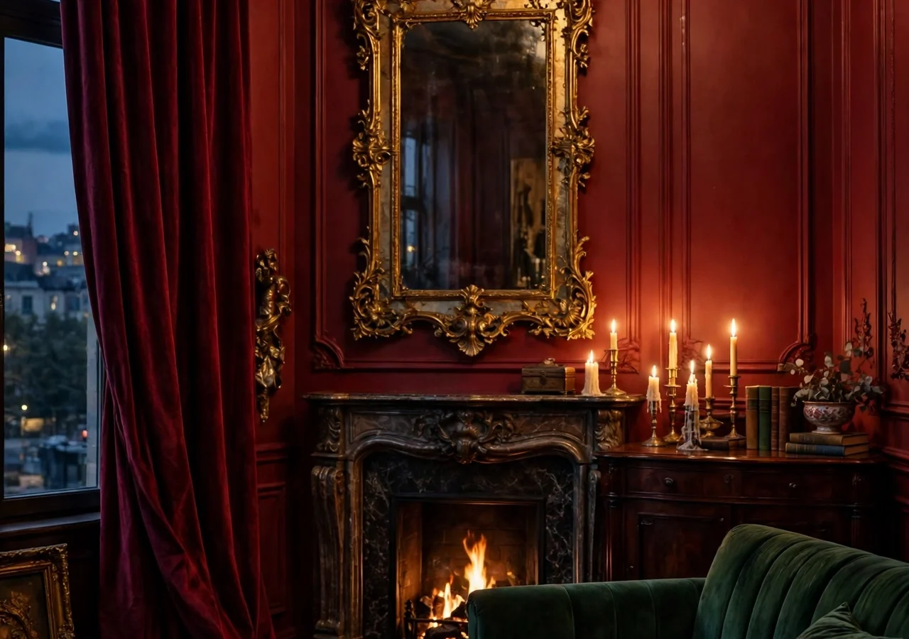
Some rooms whisper. An operaesthetic room does not whisper. It walks in wearing deep red velvet, catches the light on a gilded frame, and makes an ordinary Tuesday evening feel like the interval of a grand performance. The look comes from the opera house itself: rich colour, heavy fabric, candlelight, and a touch of ceremony in everyday corners.
The tricky part is keeping all that drama from tipping into costume. A room full of red velvet and gold can feel like a stage set rather than a place to live, and nobody wants to eat breakfast inside a prop cupboard. The fix is balance: one or two bold moves per room, then quieter pieces that let the drama breathe.
This guide gives you eight operaesthetic decor ideas that bring theatre glamour home without turning your living room into a set. Each one works on its own, so start with the idea that excites you most and build from there.
Quick Tips Before You Start
- Pick one hero colour (deep red or emerald) and let gold be the accent, never a second hero.
- Velvet, silk, and heavy linen carry the look; keep at least one matte surface in every vignette so the shine has somewhere to rest.
- Test candlelight at night before you commit to a lighting plan; operaesthetic rooms are judged after dark.
- Buy the curtain rod first and the curtains second; heavy drapes need a rod rated for their weight.
1. Deep Red Walls That Set the Stage
 Save
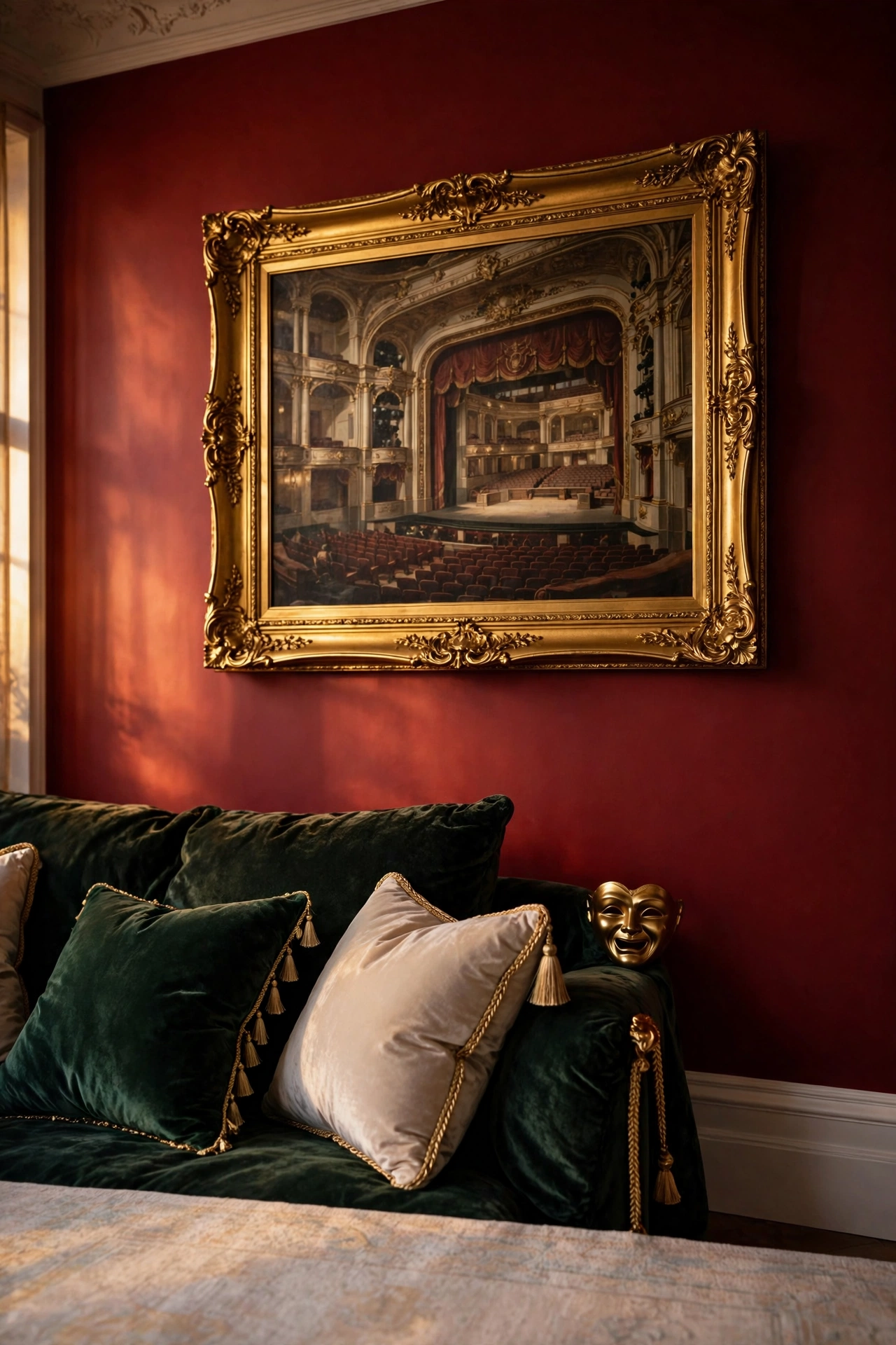
Nothing says opera faster than a wall in deep, wine-dark red. Oxblood, burgundy, and claret all work, and the right one feels warm rather than loud once it is on the wall. Paint one wall, not the whole room, if you are trying the look for the first time. A single red wall behind a sofa or a bed gives you the drama while the other walls stay calm enough for everyday life.
Colour choice matters more than brand. Hold swatches against your sofa in daylight and again under lamplight, because red shifts a lot between the two. A shade with a brown undertone reads richer and older; a shade with a blue undertone reads cooler and sharper. For a living room that gets evening use, the brown-leaning reds tend to feel more welcoming.
| Red undertone | Reads as | Choose it when |
|---|---|---|
| Brown-leaning red | Rich, warm, older | The room gets most use in the evening |
| Blue-leaning red | Cool and sharp | The room has strong daylight to balance it |
| Neutral red | Balanced, neither warm nor cool | You are painting a single wall for the first time |
Colour: oxblood or claret with a warm brown base, in a matte or eggshell finish so the wall absorbs light instead of reflecting it.
Placement: the wall behind the main seating or the headboard wall, so the colour frames the room’s focal point.
Swap: if paint feels too permanent, try a deep red removable wallpaper in a damask or plain textured finish on the same single wall.
Keep the trim simple. White skirting and a white ceiling stop the red from closing the room in, and a pale rug underfoot keeps the floor light. Designer note: hang one large framed print on the red wall and leave the rest bare; a crowded red wall looks busy, while one strong piece looks curated.
2. Emerald Velvet in Layers
 Save
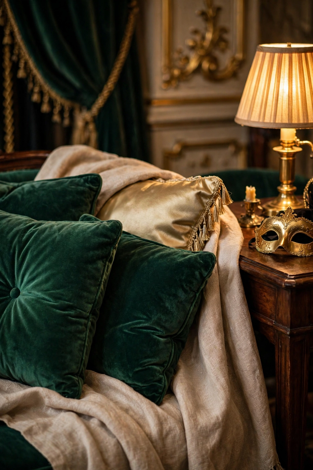
If red is the opera’s leading lady, emerald velvet is her understudy waiting in the wings. A deep green velvet sofa, two emerald cushions on a neutral chair, or a velvet throw folded over a bed all bring the same lush, light-catching texture. Velvet changes colour as you move past it, which is exactly why it suits this style: the room never looks flat.
Layering is the skill here. Pair the velvet with a smooth silk cushion, a linen throw, and one piece of dark wood so the textures argue with each other in a good way. Two velvet pieces in the same shade look matched; two in slightly different greens look collected, which suits the operaesthetic mood better.
Texture: cotton velvet for cushions and throws, which holds its pile and cleans more easily than silk velvet.
Placement: the largest velvet piece goes on the biggest seat in the room, with smaller velvet accents echoing it across the space.
Swap: a velvet-look throw in deep green over a plain arm gives you the colour for a fraction of a new chair’s price.
Watch the light. Emerald velvet looks its best near a lamp with a warm bulb, around 2700K, which brings out the green without turning it teal. If your room runs cool and north-facing, add a brass lamp base nearby; the warm metal pulls the green back toward the rich side. Our guide to dark romantic decor covers the same moody layering in more depth if you want to push the palette further.
3. Gilded Gold Accents That Catch the Light
 Save
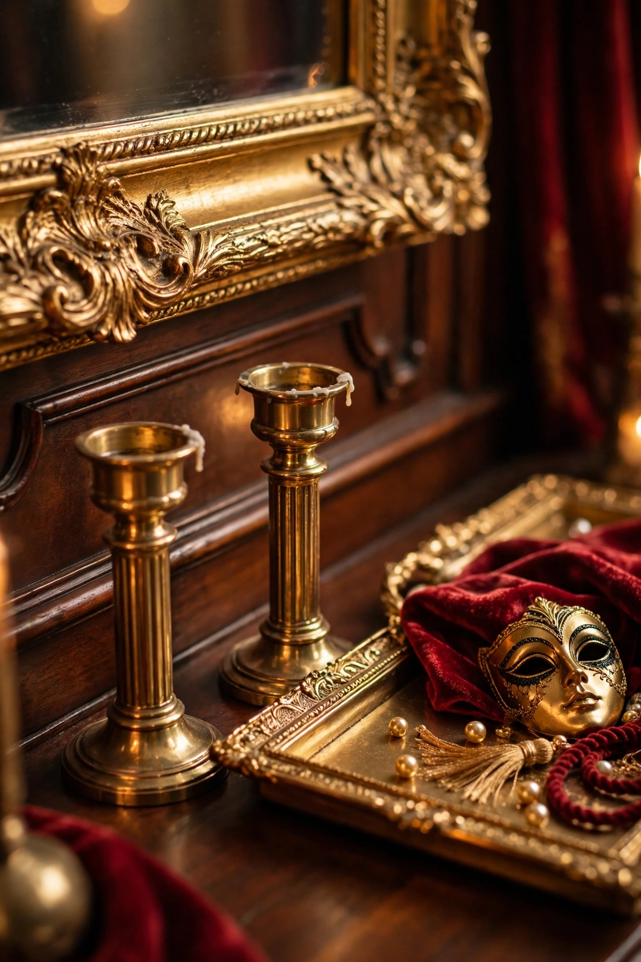
Gold is the operaesthetic accent, and the word accent is doing real work there. A gilded mirror frame, brass candle holders, a gold-trimmed tray, or brushed-gold curtain rings give you the glint without the glare. Spread small gold pieces around the room rather than grouping them in one spot, so the eye travels and finds a sparkle wherever it lands.
Mix your metals on purpose. Antique brass, brushed gold, and one polished piece can live together if they share the same warm tone. What looks wrong is gold next to chrome or silver, which cools the whole scheme down. If a lamp or a frame you love comes in the wrong finish, a tin of gold leaf or a small pot of metallic paint can fix it in an afternoon.
Colour: antique brass and brushed gold, kept warm; avoid polished chrome in the same room.
Placement: one gold piece at each height in the room, low on a coffee table, mid-level on a shelf, high on a mirror frame.
Swap: spray-paint a plain wooden frame gold for a gilded look at a fraction of a vintage frame’s cost.
The mirror is the piece to spend on if you can. A large gilt mirror over a fireplace or a console doubles the candlelight in the room and makes a small space feel grand, which is the whole operaesthetic trick in one object. For more ways to use the metal, see our brass decor ideas for warm metallic styling that pairs naturally with deep red and emerald.
4. A Statement Chandelier or Candelabra Glow
 Save
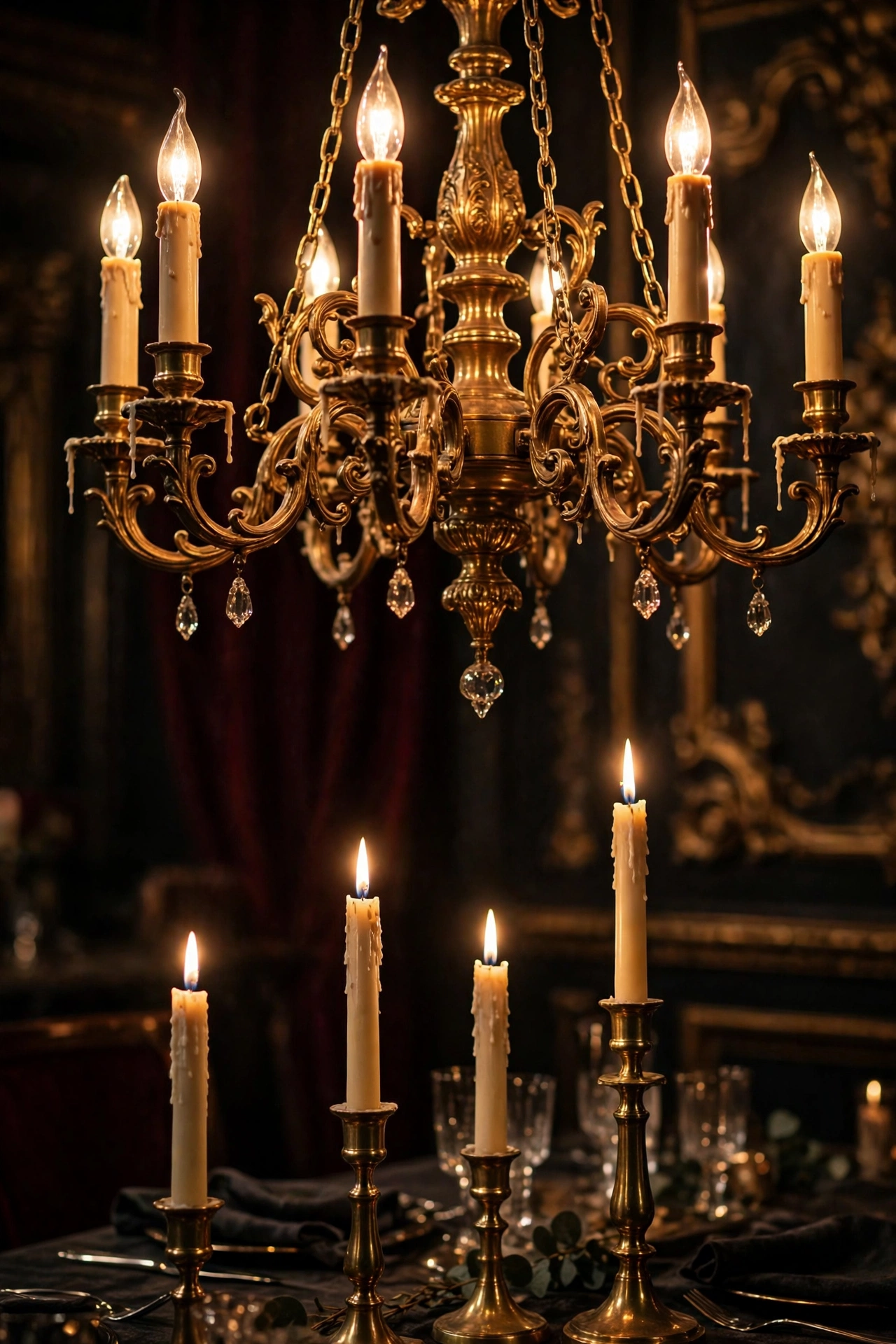
Opera houses are lit from above, and your room can borrow the idea at a smaller scale. A chandelier does not need to be a crystal palace piece; a modest brass chandelier with six candle-style bulbs, or a black metal candelabra-style fitting, gives the same upward glow. The point is the shape: arms reaching out, light coming from several small points instead of one flat ceiling panel.
If a chandelier is out of reach, candelabras do the same work on a sideboard or a dining table. A pair of tall brass candlesticks with ivory tapers, lit at dinner, changes the whole room for the price of a takeaway. Keep a lighter or long matches in the same drawer as the candles so lighting them becomes a habit rather than a chore.
| Light source | Best when | Needs |
|---|---|---|
| Chandelier | Centred over a dining table or seating area | A wired fitting and a dimmer |
| Candelabras | Sideboard or dining table, lit at dinner | A stable surface away from curtains |
| Plug-in sconce | A rented room or a quick change | A socket nearby, no electrician |
Placement: centre the chandelier over the dining table or the middle of the seating area, hung so its lowest point sits about 75 to 90 centimetres above a table surface.
Colour: warm-white bulbs, 2700K, with a dimmer switch so you can drop the light to candle level in the evening.
Swap: a plug-in wall sconce with a candle-style bulb gives the glow with no electrician needed.
Safety stays part of the look. Real candles belong on a stable surface, away from curtains, and never left burning in an empty room. Battery tapers with a flicker setting work well inside tall glass hurricanes, where nobody can tell they are not real from across the room.
5. Heavy Drapes and a Curtain Moment
 Save
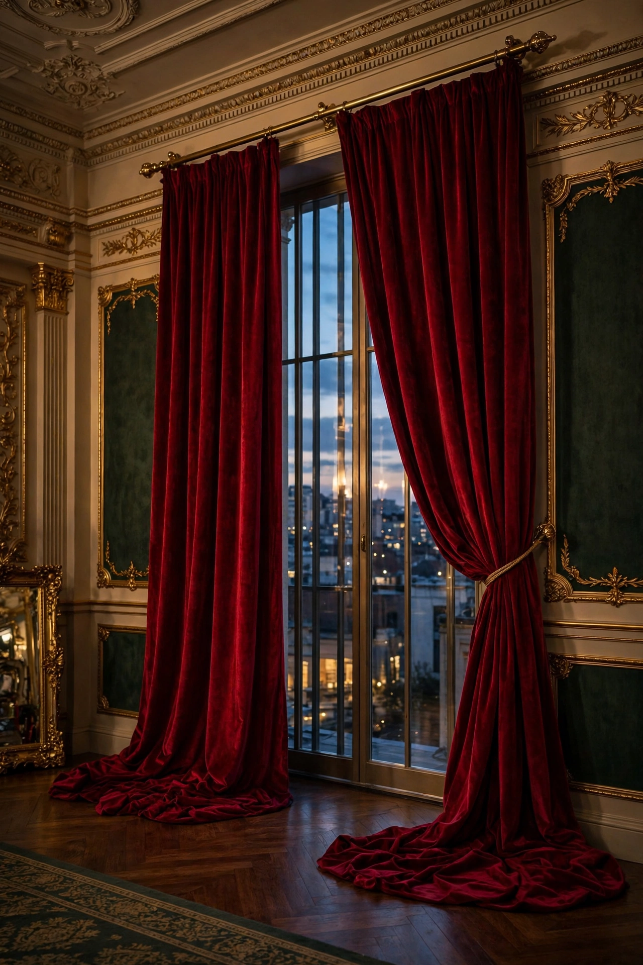
Theatre has a curtain, so an operaesthetic room needs one too. Floor-length drapes in velvet, heavy linen, or a thick cotton drill change a window from a hole in the wall into an event. Hang them high, close to the ceiling, and let them pool just slightly on the floor; the extra length is what makes them look grand instead of merely functional.
Colour follows your hero choice. Deep red drapes against pale walls give you the stage; emerald drapes against a red wall give you a rich clash that works when both colours are equally deep. If both feel too much, a heavy neutral drape in charcoal or warm taupe still gives you the weight and the drama of the fabric, while the colour comes from cushions and art instead.
| Drape fabric | Feel | Best when |
|---|---|---|
| Velvet | Heavy and grand, holds its folds | The main living room window |
| Heavy linen | Relaxed weight, softer drape | A bedroom window |
| Thick cotton drill | Sturdy and matte | You want the grand look on a smaller budget |
Placement: rod mounted 10 to 15 centimetres above the window frame and 15 to 20 centimetres wider on each side, so the open drapes clear the glass completely.
Texture: velvet or heavy linen with a blackout lining, which also helps the drapes hang straight.
Swap: ready-made velvet curtains in a standard drop, hemmed by a local tailor, cost far less than made-to-measure and look nearly as good.
Tiebacks finish the job. A brass tieback, a length of velvet ribbon, or a simple tassel cord holds the drape in a soft curve and shows off the window behind it. Our colour drenching guide explains how one bold colour carried across walls and drapes can make a small room feel deliberate rather than dark.
6. Theatrical Mirrors and Framed Art
 Save
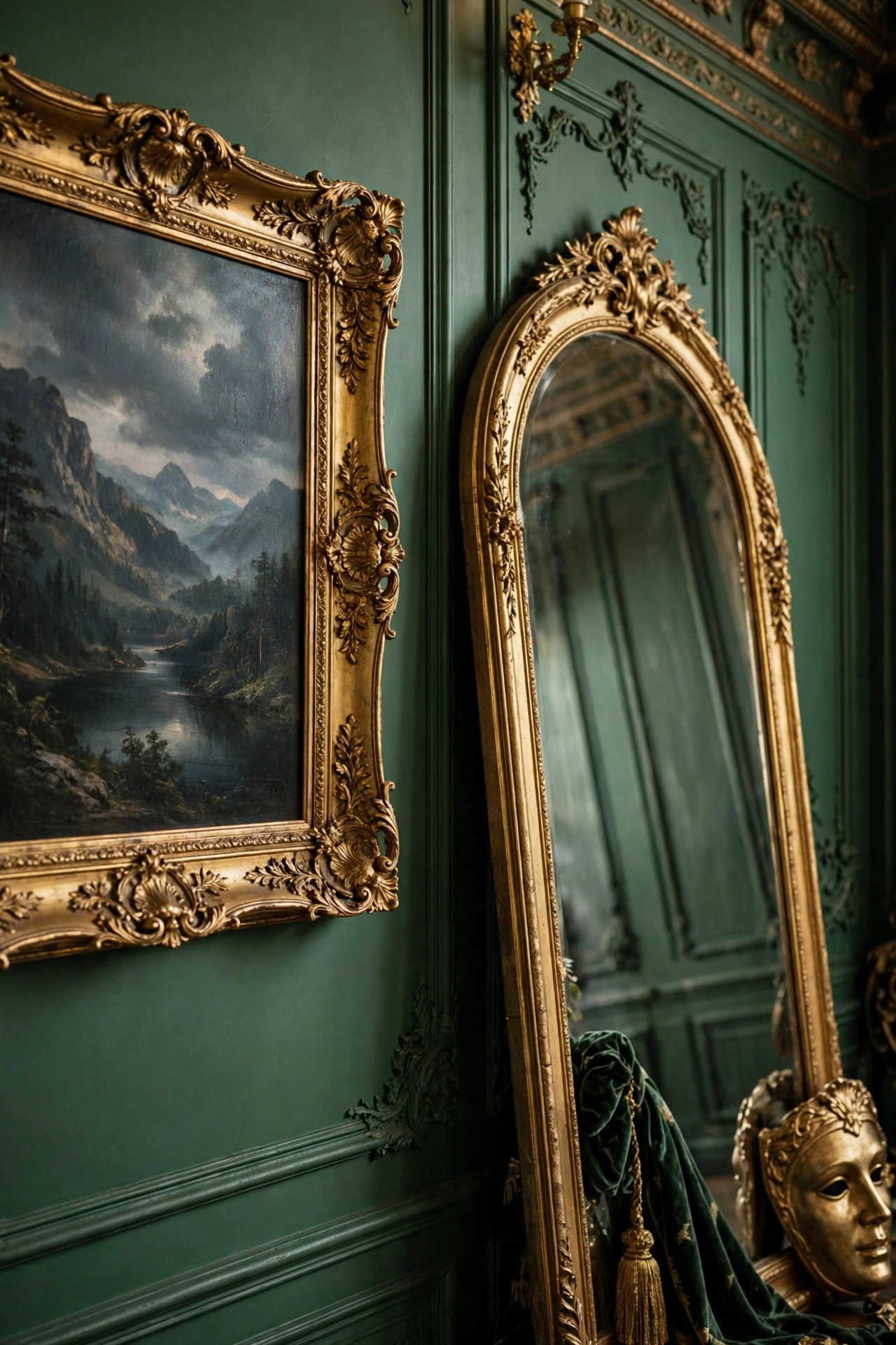
Opera is visual, and the walls should behave like a gallery. One oversized gilt mirror, a pair of matching framed prints, or a small cluster of vintage-style portraits gives the room its story. The frames matter as much as the art: ornate gold, dark wood with a gold inner edge, or black lacquer all suit the look, and mixing two frame styles in one grouping looks collected rather than messy.
Choose art with a sense of occasion. A moody landscape, a still life with dark fruit and a brass jug, a black-and-white photograph of an old theatre, or a botanical print in deep tones all fit. Avoid bright modern posters and anything with text; the room should feel like it predates the poster era.
Placement: hang the largest piece at eye level, about 145 centimetres from the floor to its centre, and build smaller pieces around it.
Colour: deep greens, reds, and golds in the art itself so the frames and the pictures echo the room.
Swap: print a public-domain painting on matte paper and frame it yourself; the frame carries the look, not the price tag.
A leaning mirror deserves a mention too. A tall arched mirror leaned against a wall in a bedroom or hallway adds height and catches light from a window across the room. Anchor it properly if you have children or pets, and keep the floor in front of it clear so the reflection stays clean.
7. A Bar Cart or Dressing-Table Vignette
 Save
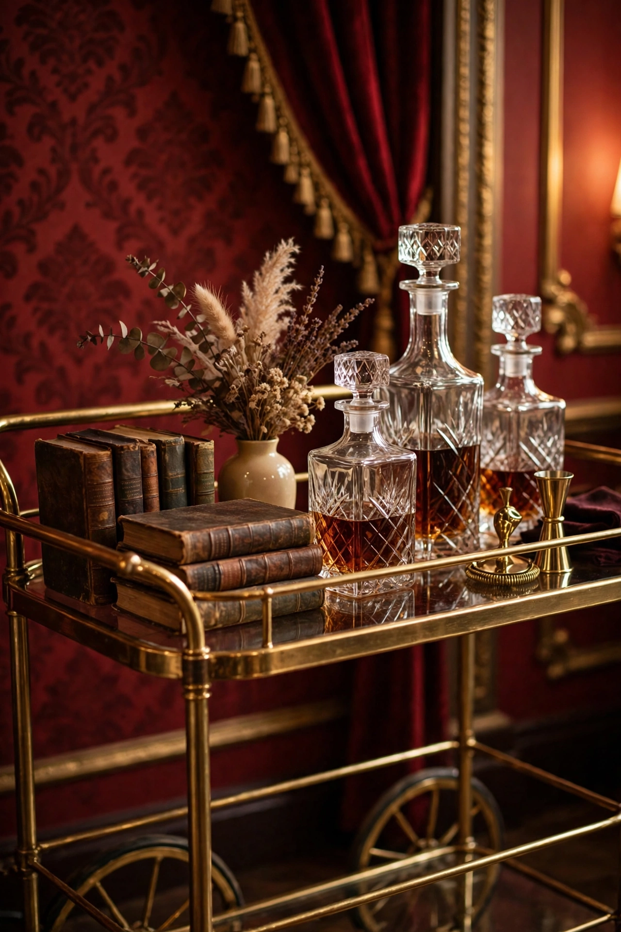
Every opera has an interval, and the bar cart is yours. A brass or dark-wood bar cart dressed with two or three decanters, a small vase of dried flowers, and a stack of old books becomes a little stage of its own. Style it in odd numbers and leave one shelf half empty; a crowded cart looks like storage, while a cart with breathing room looks like a set piece.
A dressing table works the same way in a bedroom. A vintage-style mirror, a perfume tray, a small dish for jewellery, and a single candle turn a functional corner into a vignette. The trick is editing: take one thing away after you finish styling, then look again. If the scene still reads, it is done.
Placement: the cart against a wall near the seating area, not blocking a walkway; the dressing table near a window for natural light.
Colour: brass or dark walnut for the cart, with glass and crystal catching the light on top.
Swap: a small side table with a tray on top does the same job if a full cart will not fit.
Stock it for real use, not just for show. A bottle you actually pour from, glasses you actually drink from, and a candle you actually light keep the vignette honest, and honest vignettes age better than dressed ones.
8. Moody Lighting and Candlelight Layers
 Save
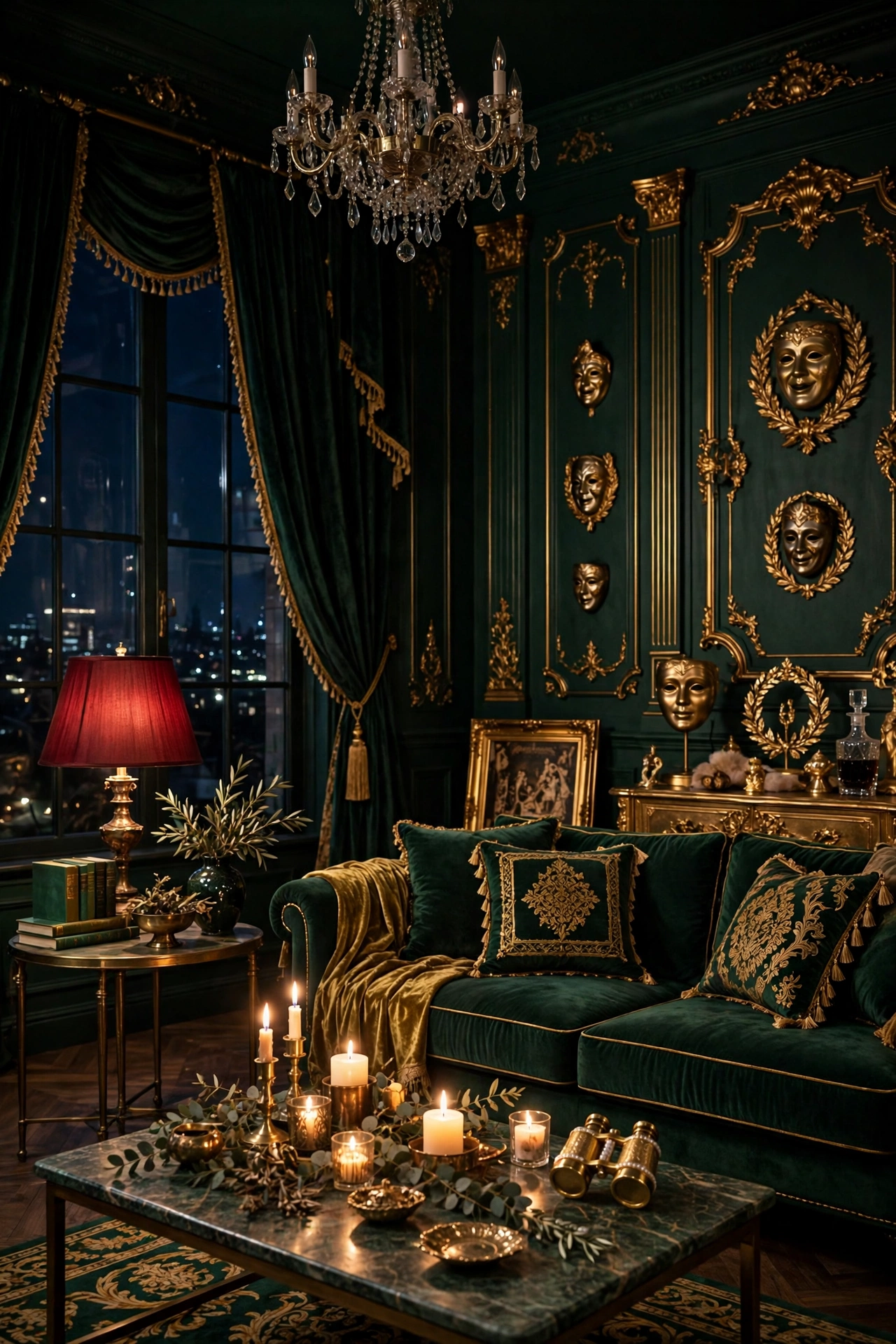
The last idea ties the other seven together, because operaesthetic rooms are lit in layers, never by one bright overhead bulb. Combine a dimmed chandelier or pendant, a table lamp with a fabric shade, and real or battery candles, and the room changes character as the evening goes on. Each layer should be switchable on its own so you can set the mood in seconds.
Lamp shades matter more than lamp bases here. A pleated fabric shade, a deep red or emerald shade, or a simple linen drum all soften the light and throw it sideways across the walls instead of straight down. Avoid bright white shades, which flatten the colours you worked so hard to build.
Placement: one light source at each level, low (candles on a table), mid (a lamp on a sideboard), and high (the chandelier or a wall sconce).
Colour: every bulb warm white, 2700K or lower, so the layers blend instead of clashing.
Swap: a plug-in dimmer on a standard lamp gives you the same control as a wired dimmer switch for a few pounds.
Test the room at night before you call it finished. Sit where you usually sit, light the candles, dim the chandelier, and look around. If one corner stays dark, add a small lamp there; if one spot glares, swap its bulb for a lower wattage. The test takes ten minutes and it is the difference between a room that photographs well and a room that feels good to sit in. Our Neo Deco guide has more on layered lighting and gilded detail if you want to push the glamour further.
The combination: one deep wall or drape, one velvet layer, gold at three heights, and candlelight after dark. That quartet is the opera house in one room.
Bringing It All Together
Operaesthetic decor is not about buying a whole new room. It is about choosing one bold colour, one rich texture, and one piece that catches the light, then letting the rest of the room support them. Start with the idea that made you smile, the red wall or the velvet cushions or the candelabra on the sideboard, and live with it for a week before you add the next one.
The look rewards patience. A gilt mirror found at a flea market, a pair of brass candlesticks from a charity shop, and a set of velvet curtains hemmed to fit will always feel more like yours than a matching set bought in one afternoon. Build the drama slowly, keep one quiet surface in every corner, and the room will feel like a performance you get to live in.
Frequently Asked Questions
What is operaesthetic decor?
Operaesthetic decor takes its cues from the opera house: deep red and emerald, velvet and gold, candlelight, heavy drapes, and ornate frames. It is a maximal, theatrical style that treats a room like a stage, with rich colour and layered light instead of pale minimalism.
Is operaesthetic decor too dark for a small room?
Not if you keep one wall or one large piece light. Paint a single wall deep red, use pale curtains or a light rug, and add a large mirror to bounce the light around. The drama comes from the colour and texture, not from making the whole room dark.
What colours work best for operaesthetic decor?
Deep red (oxblood, burgundy, claret) and emerald green are the two hero colours, with antique brass and gold as the accent metal. Warm neutrals like cream, taupe, and charcoal keep the scheme grounded, and a touch of black adds definition.
Can I do operaesthetic decor on a budget?
Yes, and it suits a budget well because the look rewards second-hand finds. Velvet cushions, brass candlesticks, gilt frames, and heavy curtains all turn up cheaply in charity shops and flea markets. Spend on the piece you touch most, like curtains or a sofa throw, and thrift the rest.
How is operaesthetic different from dark romantic decor?
The two styles share a moody palette, but operaesthetic leans theatrical and gold: chandeliers, drapes, gilt frames, and a sense of performance. Dark romantic leans softer and more gothic, with dried flowers, candlelight, and vintage romance. Many rooms borrow from both, and the overlap is part of the fun.