
Most homes play it safe with colour, and then their owners wonder why the rooms feel flat. The walls are a polite grey, the sofa is a careful beige, the cushions match everything and excite nobody. Nothing is wrong with the room, exactly. It is tidy, it photographs fine, and it never gives you a lift when you walk in after a long day.
The trouble is that safe choices pile up. One neutral decision leads to another, until the whole house reads as one long pause. You stop noticing the rooms at all, because there is nothing in them to notice. Guests say the place looks nice, and you agree, while privately thinking it could belong to anyone.
Dopamine decor takes the opposite route. It uses bold colour and playful pattern on purpose, in doses you can live with, to make rooms that feel cheerful, personal, and full of energy. This is not about painting every wall red or buying a sofa shaped like a banana. It is about choosing the colours that genuinely lift your mood, placing them where you will see them every day, and letting the rest of the room stay calm enough to let them shine.
Quick Tips Before You Start
- Pick colours you love wearing or looking at, not colours a trend list told you to love.
- Start with one bold move per room, then add a second only if the room still feels calm.
- Repeat each bold colour at least twice in a room so it looks deliberate, not accidental.
- Keep floors, ceilings, and large wood pieces neutral so bold colour has room to breathe.
- Test paint and fabric in daylight and lamplight before you commit to a full wall or sofa.
1. One Bold Wall, Not a Bold Room
 Save
Before you pick any bold colour, take stock of the room itself. Note how much daylight it gets, whether the light is warm or cool at the times you use the room most, and whether the space is large enough to hold a strong shade without feeling closed in. The same teal that glows in a bright, large room can look heavy in a small, dim one, so every choice in this guide starts from the light and size you actually have.
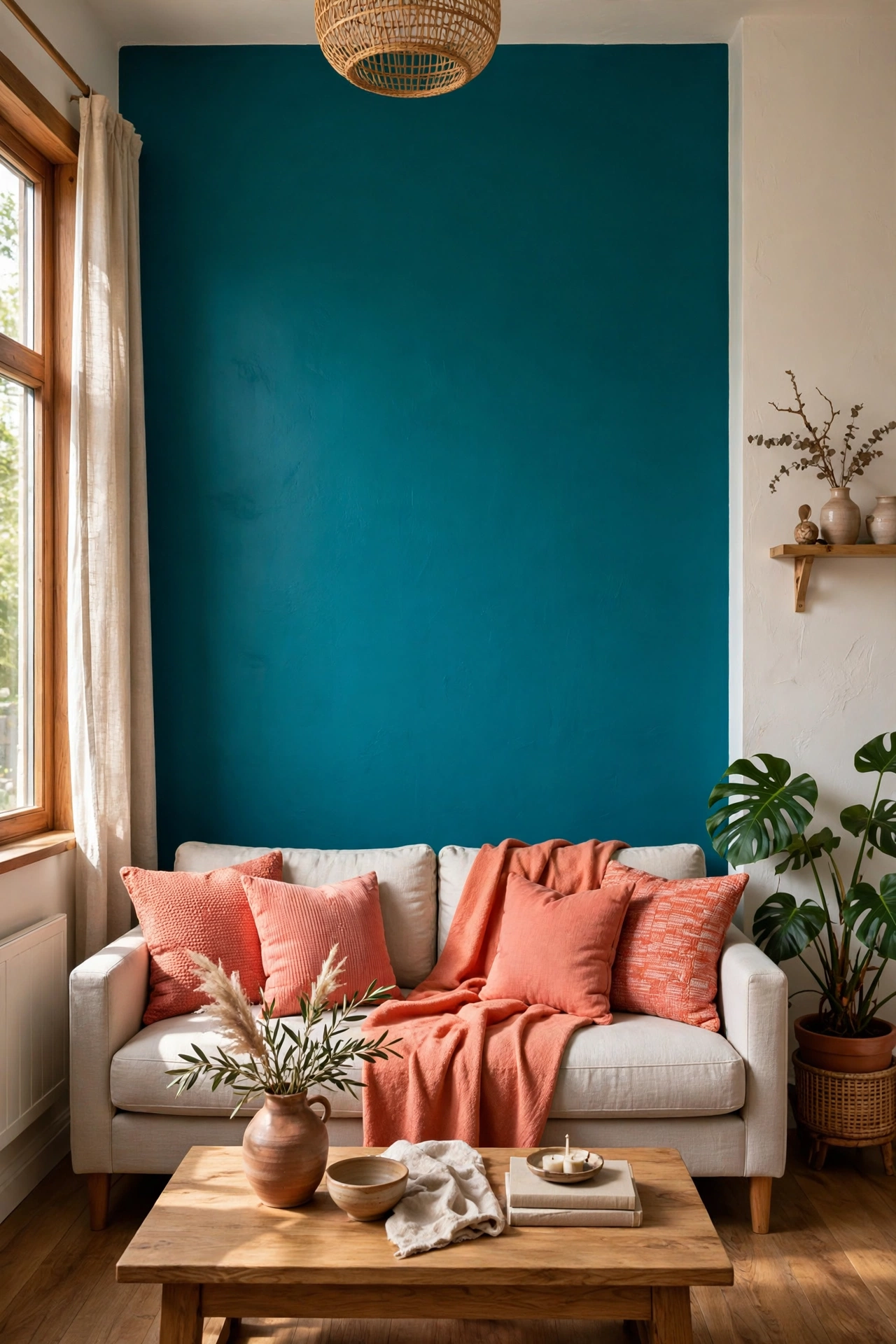
A single bold wall is the easiest way to test whether strong colour suits you. It gives a room a clear focal point, it costs one tin of paint, and it can be repainted in a weekend if you change your mind. A whole room in cobalt or tangerine is a much bigger commitment, and it can make a small space feel closed in.
Choose the wall your eye lands on first when you enter the room. In a living room that is usually the wall behind the sofa or the fireplace wall. In a bedroom it is the wall behind the bed. Paint it in a colour with some warmth and depth: a rich teal, a warm coral, a deep mustard, or a leafy green all hold up well over time, while very bright primary shades can tire the eye fast.
Balance the wall with plain neighbours. Keep the other walls warm white or pale cream, and let the sofa, rug, and curtains stay in quiet tones. Then echo the wall colour twice in smaller pieces, such as a cushion, a throw, a vase, or a framed print. Those echoes are what stop the wall looking like a leftover from a decorating phase. For a fuller take on going all in with one shade, read our guide to colour-drenched rooms and how a single colour changes a whole space.
Placement: the first wall you see from the doorway, never a wall broken up by lots of doors.
Colour: one saturated shade, echoed in two small accessories, with warm white on the other walls.
2. A Sofa in a Colour You Actually Love
 Save
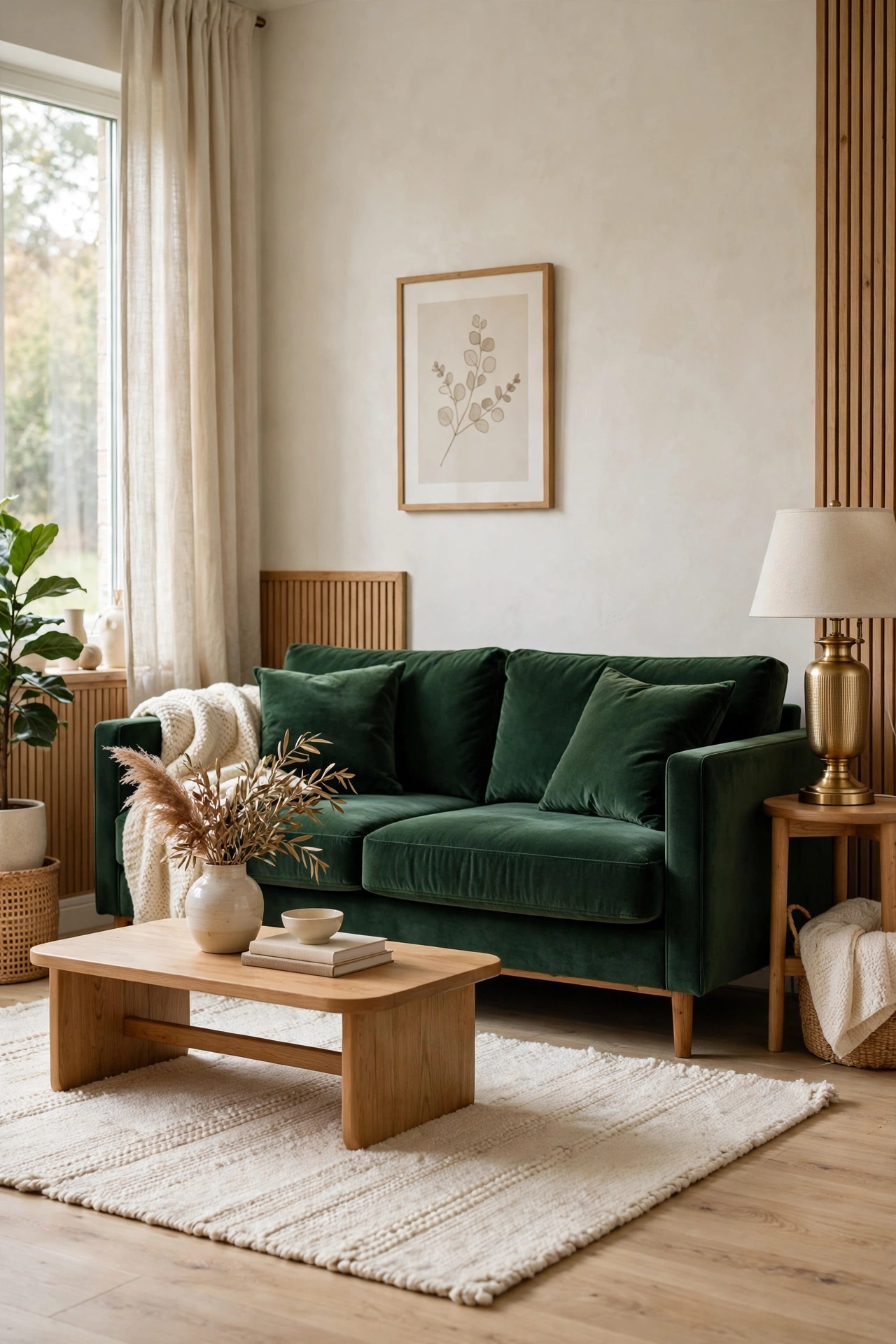
The sofa is the biggest block of colour in most living rooms, so a beige one sets a beige tone for everything around it. A sofa in a colour you truly like does the opposite. It becomes the anchor of the room, and every neutral around it suddenly looks intentional rather than cautious.
Mustard, burnt orange, deep green, and dusty rose are all strong choices that still work with everyday life. Mustard pairs well with navy and cream. Burnt orange sits happily with wood tones and warm white. Deep green suits brass, rattan, and natural linen. Dusty rose softens grey walls without turning the room pink. Pick the shade that makes you smile when you picture it, not the shade that looks best in a showroom photo.
Keep the rest of the seating area simple so the sofa can carry the room. A plain rug in cream or jute, cushions in two tones that pick up the sofa colour, and one contrasting cushion in a deep complementary shade are enough. If a coloured sofa feels too brave, start with a coloured armchair instead and live with it for a month. You will know quickly whether you want more colour or whether one chair is the right dose for you.
The 3-question gate: before you order a coloured sofa, answer three questions honestly. One, have you seen this exact shade in your room in both daylight and lamplight? Two, does it sit happily with the rug, wood, and cushions you already own? Three, have you lived with the colour for a month in a smaller form, such as an armchair or a throw? If any answer is no, run the smaller test first. A sofa you love after a month of testing is a sofa you will love for years.
Placement: sofa against the longest clear wall, with the rug pulled under its front legs.
Swap: a coloured armchair first, a full sofa second, once you trust the shade.
3. Stripes That Make a Room Feel Alive
 Save
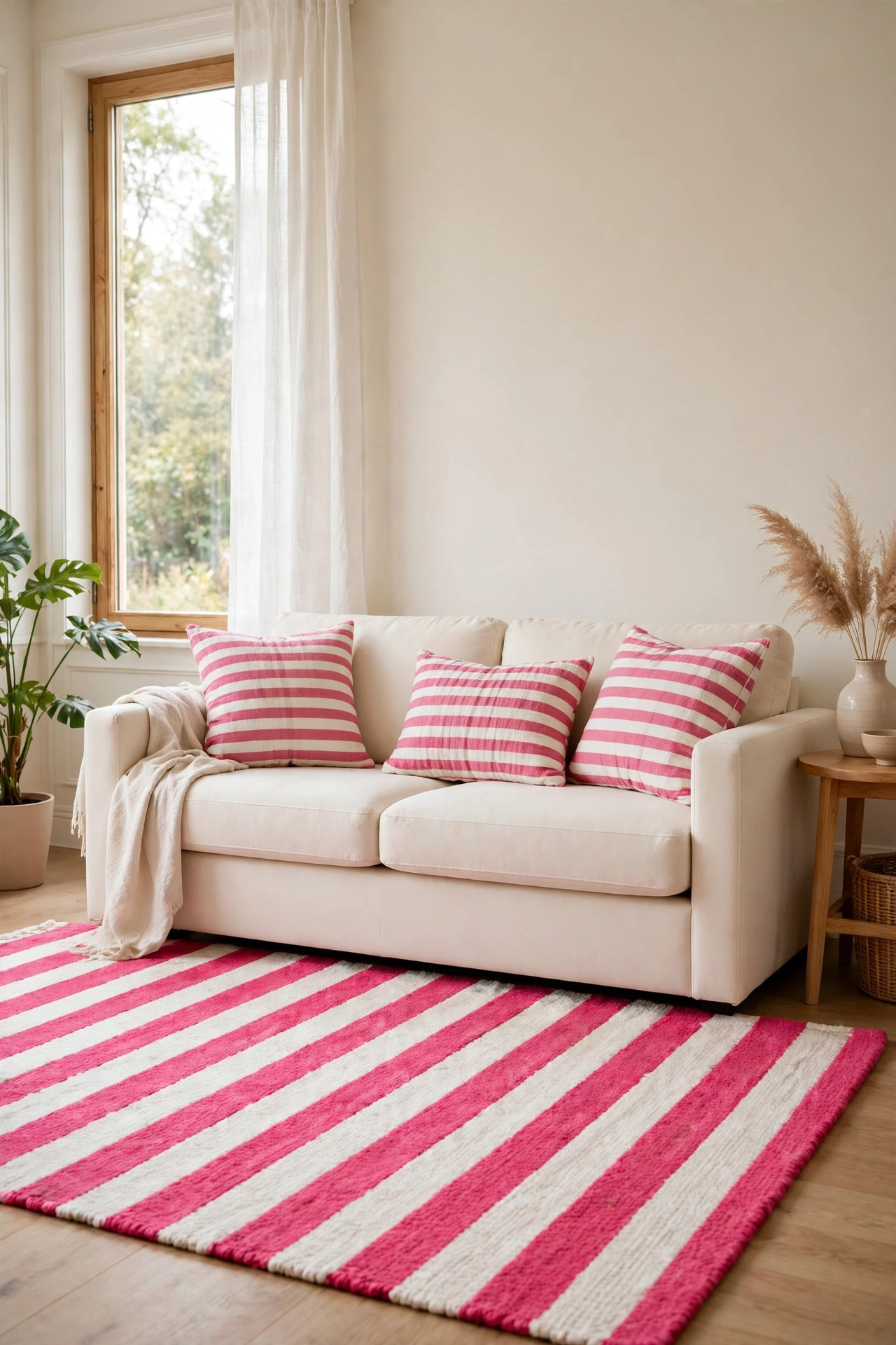
Stripes are the friendliest pattern in dopamine decorating. They add movement and rhythm without the fuss of a floral or a busy print, and they work in almost every room. A striped rug, a striped cushion, or a striped blind can wake up a plain room in an afternoon, with no paint and no commitment.
Scale matters more than colour here. Wide stripes in two colours feel bold and modern, and they suit a hallway runner, a sofa cushion, or a roman blind. Narrow stripes feel crisper and calmer, and they work well on bedding, a tablecloth, or a lampshade. Mixing one wide stripe with one narrow stripe in the same colour family keeps the room playful without turning it into a fairground.
Colour is where you get to have fun. Candy stripes in pink and white suit a bedroom or a bathroom. Green and cream stripes feel fresh in a kitchen. Navy and white stripes never really date, and they pair with rattan, wood, and brass without a fight. If stripes sound like your kind of pattern, our guide to bold striped rooms shows how far one strong stripe can carry a whole space.
Placement: one large striped piece per room, such as a rug or a blind, plus one small echo.
Colour: two colours only in each striped piece, so the pattern stays crisp.
4. Pattern Mixing With One Simple Rule
 Save
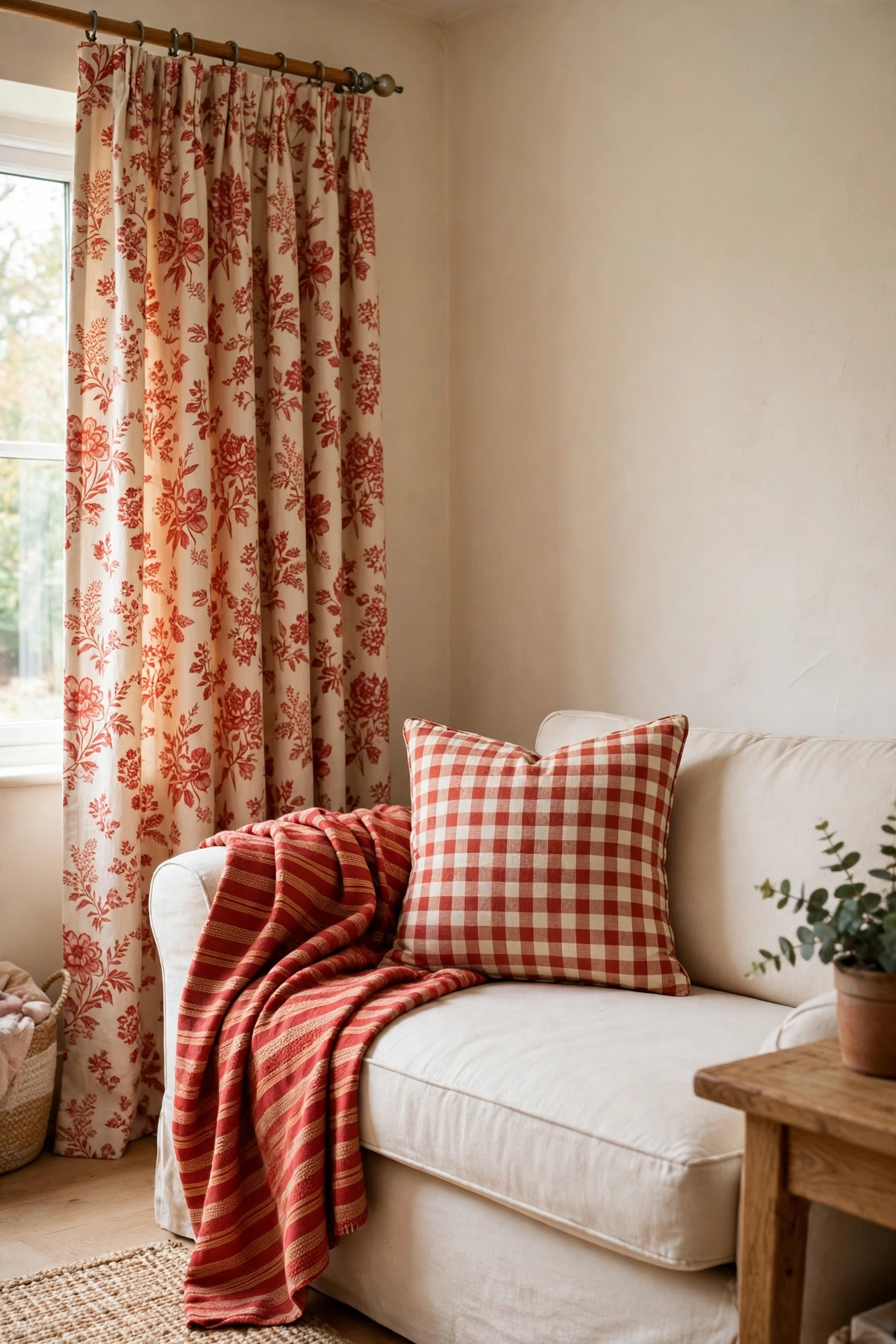
Pattern mixing is where dopamine decor goes wrong most often, and the fix is simpler than people think. Use one rule: every pattern in a room must share at least one colour. A floral cushion, a striped throw, and a checked chair can all live together if they all contain the same warm red or the same leafy green. Break that rule and the room starts arguing with itself.
Start with a hero pattern, the one you love most, and give it the biggest surface. That might be floral curtains, a patterned rug, or a bold cushion. Then add a second pattern at a different scale: if the hero is a large floral, the second pattern should be a small check or a narrow stripe. A third pattern, if you add one at all, should be the smallest and quietest of the three, such as a tiny dot or a plain texture with a woven pattern.
| Pattern role | Choose this scale | Example |
|---|---|---|
| Hero pattern | Largest scale | Floral curtains or a bold patterned rug |
| Second pattern | Medium or small scale | Narrow stripe or small check in the shared colour |
| Third pattern, if any | Smallest and quietest | Tiny dot or woven texture |
| Rest piece | Plain, no pattern | Solid cushion or plain throw between patterns |
Plain pieces are part of the mix, not a failure of nerve. A solid cushion between two patterned ones gives the eye a rest, and a plain throw draped over a patterned chair stops the pattern from taking over. Step back and squint at the room. If one pattern still shouts over the rest, swap it for a quieter version in the same colour and the whole mix will settle.
Placement: hero pattern on the largest surface, smaller patterns on cushions and throws.
Texture: mix at least two textures, such as velvet with linen, so patterns do not blur together.
5. Art That Shouts From One Wall
 Save
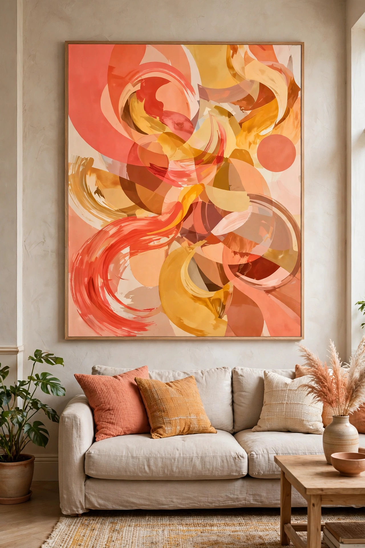
Big, joyful art is the fastest dopamine hit a room can get, because it adds colour and personality without changing a single piece of furniture. One large piece on a plain wall does more than six small prints scattered around a room, and it gives guests something to talk about the moment they sit down.
Choose art that uses the colours you want more of in the room. A large abstract print in coral and ochre, a bold botanical in green and pink, or a graphic poster in blue and yellow can set the whole palette for the cushions and throws around it. Hang it low enough to relate to the furniture below it: the centre of the piece should sit roughly at eye level when you are standing, and it should span about two thirds of the width of the sofa or console beneath it.
A gallery wall can work too, but keep it to one wall and one clear colour thread. Mix frame styles if you like, but keep the frames in two finishes at most, such as black and natural wood, so the art stays the star. If you love strong colour in wall art, our piece on bold African wall art shows how large, confident pieces change a plain room without a single paintbrush.
Placement: one feature wall per room, art centred over the main piece of furniture.
Colour: pull one or two art colours into cushions or a throw so the wall connects to the room.
6. A Kitchen That Wakes You Up
 Save
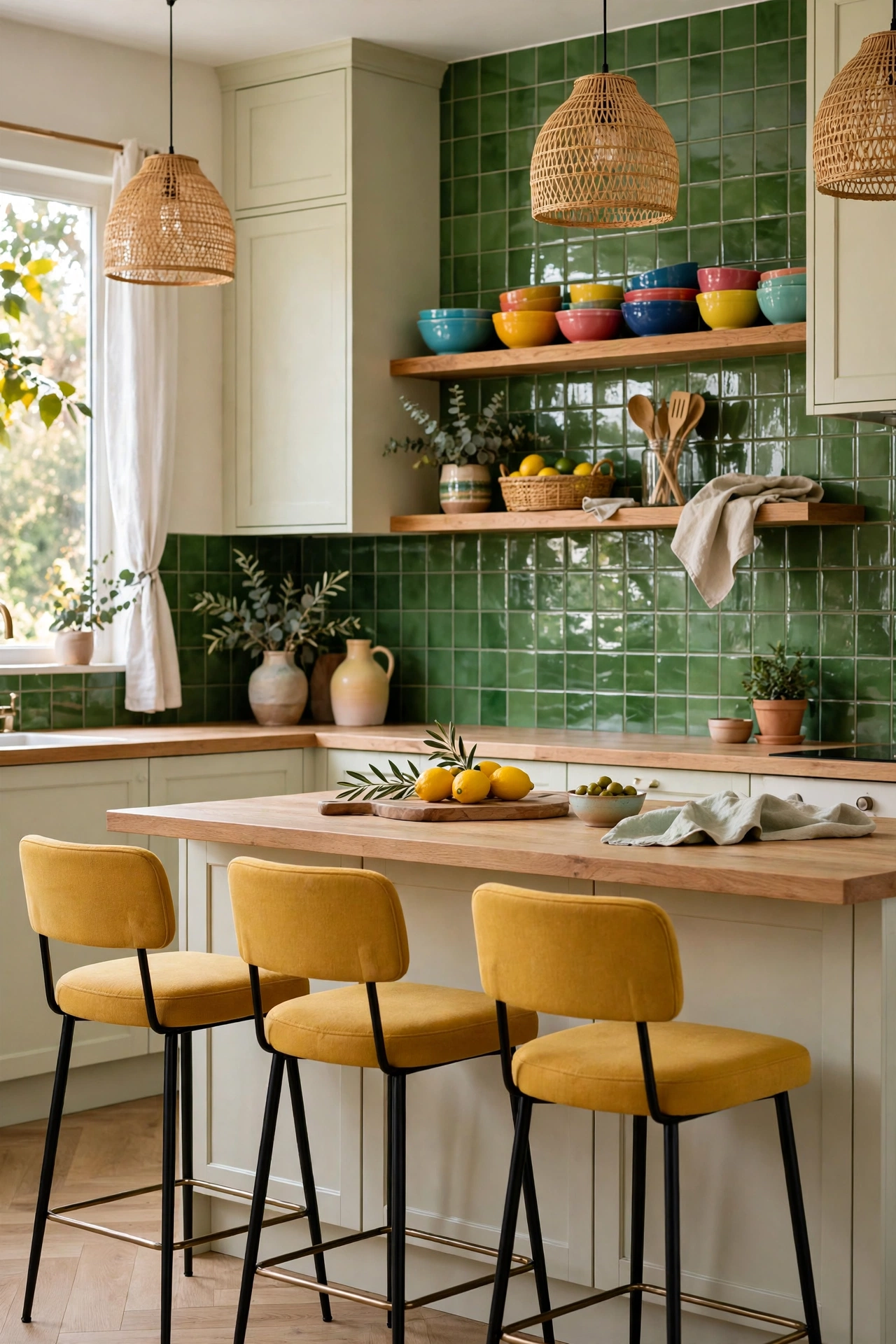
Kitchens are where most people spend their mornings, which makes them a perfect place for a colour lift. You do not need a full renovation to get one. Painted stools, a coloured kettle and toaster, a bright blind, or open shelving with colourful bowls can change the mood of the room before you have even made coffee.
Start with the pieces you touch every day. Bar stools in mustard or teal, a tiled splashback in a glossy green or terracotta, or a single run of lower cabinets painted in a deep shade all add colour where your eye actually goes. Keep worktops and upper cabinets pale so the colour does not crowd the room, and let the colour repeat in small, useful things: a tea towel, a fruit bowl, a plant pot, a set of mugs in the same shade.
Pattern works well in kitchens because the surfaces are hard and easy to wipe. A checked tea towel, a striped blind, and a patterned rug runner in one shared colour can carry a whole kitchen scheme without a single new cabinet. Keep the palette to three colours at most, with one of them a warm neutral, and the kitchen will feel lively in the morning and calm in the evening.
Placement: colour at stool height and splashback height, where the eye rests while cooking.
Swap: painted stools and textiles first, painted cabinets only once you love the shade.
7. Playful Finishes: Shine, Gloss, and Iridescence
 Save
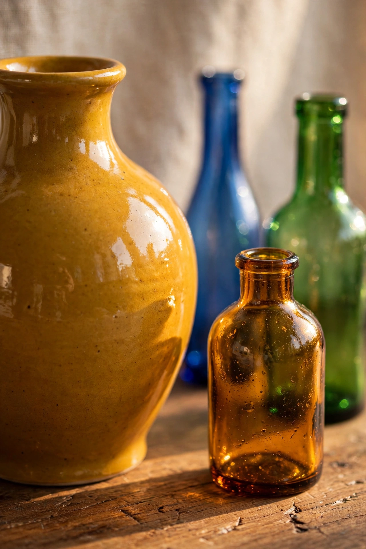
Colour is only half of dopamine decor. Finish does the other half. A matte mustard wall and a glossy mustard vase read completely differently, and the glossy one catches light, moves as you walk past, and feels more playful. Mixing finishes is a quiet way to add energy without adding another colour to the room.
Try pairing a matte wall with a lacquered tray, a velvet cushion with a glass vase, or a wooden table with a metallic lamp. Brass, chrome, and coloured glass all bounce light around a room, which matters most in small or north-facing spaces that can feel dull even with good colour. A mirrored tray on a coffee table, a glossy ceramic lamp, or a set of coloured glass bottles on a windowsill can lift a corner that paint alone would leave flat.
Iridescent finishes deserve a careful hand. One iridescent vase, one shimmering cushion, or one pearly lamp base adds a sense of fun, while a whole shelf of shimmering pieces starts to look like a display case. Keep iridescence to one piece per room, let it sit against plain textures, and it will read as a playful accent rather than a theme. For ideas on using shine without tipping into kitsch, see our guide to playful iridescent finishes and how light changes a room.
Placement: one glossy or shimmering piece per surface, never a whole shelf of shine.
Texture: pair every glossy piece with a matte neighbour, such as linen or raw wood.
8. Small Doses in Quiet Rooms
 Save
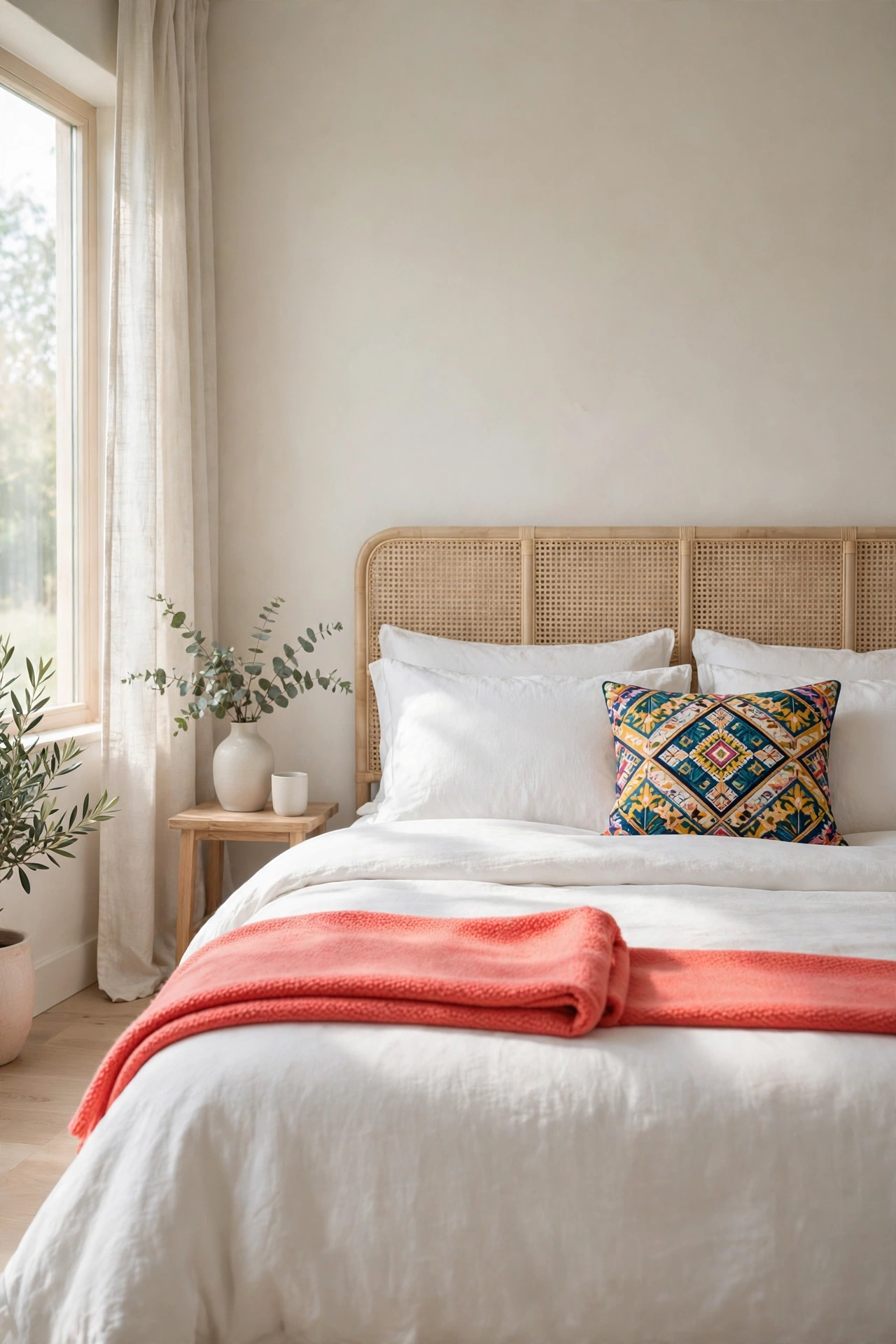
Not every room wants a full dopamine treatment, and that is fine. Bedrooms and bathrooms usually need to help you wind down, so the trick there is a small dose of joyful colour inside an otherwise calm room. You get the lift without losing the rest.
In a bedroom, try a bright headboard cushion, a patterned throw folded at the foot of the bed, or a single piece of bold art above a dresser, while the bedding stays white or cream. In a bathroom, a coloured shower curtain, a set of towels in one vivid shade, or a bright bath mat can change the whole room for very little money, and all three can be swapped in a season if your taste changes.
Children’s rooms and guest rooms are good places to be braver, since they are used for shorter stretches and guests enjoy a room with a bit of character. A striped wall behind a bed, a bright rug, or a painted bookshelf in a guest room makes the space feel considered rather than spare. The rule stays the same everywhere: one or two bold moves, repeated once, inside a calm frame.
Placement: colour on bedding, towels, or one piece of furniture, with walls kept pale.
Swap: towels, throws, and shower curtains are the cheapest colour experiments in the house.
The shortcut: one bold move per room, the same colour echoed twice, plain neighbours all around, and a month of living with it before you add more.
Bringing It All Together
Dopamine decor works best when it reflects what you actually like, not what a trend roundup says you should like. Pick one bold wall, one coloured sofa or chair, one pattern you enjoy living with, and one piece of art that makes you smile. Live with those choices for a few weeks before adding more. The rooms that feel happiest are rarely the loudest ones. They are the ones where a few strong colours sit inside a calm frame, repeated just enough to look deliberate, and chosen because they suit the people who live there.
Frequently Asked Questions
What is dopamine decor, exactly?
Dopamine decor is a decorating approach that uses bold colour, playful pattern, and joyful details to make a home feel more cheerful and personal. It is not a fixed style with strict rules. It is a way of choosing colours and patterns that lift your mood, in doses that still suit everyday living.
How much bold colour is too much in one room?
A good starting point is one large bold move per room, such as a coloured sofa or a bold wall, plus two small echoes of the same colour. If the room still feels calm when you walk in, you have room for one more accent. If your eye cannot settle anywhere, take one bold piece out and the room will usually settle at once.
Can dopamine decor work in a small flat?
Yes, and it can help a small flat feel less plain. Keep walls pale, use bold colour on furniture, textiles, and art rather than on every wall, and repeat each colour twice so it looks intentional. Glossy and light-catching finishes also help small rooms, since they bounce light around without taking up any floor space.
Is dopamine decor expensive to try?
No, most of the ideas here cost very little to test. Paint for one wall, a set of cushion covers, a striped blind, or a bright throw are all cheap experiments, and textiles can be swapped back in an afternoon. Start with the cheapest version of a colour you love, live with it for a month, and only then spend more on a sofa or painted cabinets.
Will bold colour date quickly?
Very bright, very specific shades can date faster than deep, warm colours, so choose shades with some depth, such as teal, mustard, burnt orange, or leafy green, rather than neon tones. Classic patterns such as stripes also age well. If a colour does start to feel tired, repainting one wall or swapping cushion covers refreshes the room without a full redecoration.

1 thought