
A blank wall can sit there for months, quietly making the whole room feel unfinished. You scroll past beautiful abstract canvases online, check the price, and close the tab. Gallery-sized art costs gallery-sized money, and the smaller prints never quite fill the space the way you pictured.
The frustration is real because the fix looks so simple. A canvas, some paint, an afternoon. Yet most first attempts end up looking like a school project: muddy colours, wobbly edges, a composition that falls apart from the sofa. So the canvas leans behind the wardrobe and the wall stays blank.
Here is the good news. Abstract art forgives a lot, and a few deliberate choices make the difference between homemade and handmade-looking. These eight DIY canvas wall art ideas use cheap materials, forgiving techniques, and sizes that actually suit a real living room, so the finished piece looks like something you chose, not something you settled for.
Quick Tips Before You Start
Buy the biggest canvas you can afford; small canvases read as craft, large ones read as art. Stick to three colours plus white per piece. Let each layer dry fully before the next, or colours turn to mud. Hang the canvas at eye level, centre about 145 cm from the floor. Step back often: abstract work is judged from across the room, not from six inches away.
1. Big Colour-Field Blocks
 Save
Paint two or three large blocks of colour across a wide canvas and leave the edges soft where they meet. Colour-field painting works because the scale does the talking. A 90 by 120 cm canvas with a warm terracotta block, a cream field, and a single deep olive stripe fills a wall in a way a busy small picture never will, and the technique asks almost nothing of your brushwork.
Start with the lightest colour and cover the whole canvas. Once it is dry, tape off the largest block with low-tack painter’s tape and roll the second colour on with a small foam roller. Foam rollers give flat, even coverage with no brush marks, which is exactly the finish that makes colour-field work look professional. Peel the tape while the paint is still slightly tacky for the crispest line.
Test it first: paint the three colours as small blocks on a spare board or a sheet of thick paper, then prop it on the wall where the canvas will hang. Step back to the sofa and look at it in daylight and again in the evening. If one colour shouts over the rest, soften it with a spoonful of the base colour. If the blocks feel calm from across the room, the palette is ready for the canvas.
Colour: pick one warm tone, one cool tone, and one neutral so the piece works in any season. Placement: hang a single large colour-field canvas above a sofa or sideboard where it can breathe, with at least 15 cm of clear wall on each side. Swap: swap the olive stripe for brushed brass leaf on the edge for a warmer, richer finish without buying metallic paint.
Try this: leave a narrow strip of raw canvas showing along one edge. The unpainted border reads as an intentional frame and costs nothing.
If you want the blocks to feel calm rather than stark, mix a spoonful of the base colour into each new shade. Shared undertones tie the whole piece together, and they hide the small wobbles that betray a first attempt. This is also the easiest of these ideas to scale up: the same three colours work on a canvas twice the size, and bigger only looks better. Our guide to oversized wall art explains how to size a large piece for your wall so it lands right the first time: see our oversized wall art ideas.
If you are torn between techniques, match the choice to the time you have and the finish you want.
| Technique | Time it takes | Choose it when |
|---|---|---|
| Dip panels and colour-field blocks | One afternoon, dry between coats | You want a finished piece today |
| Plaster relief | An afternoon plus overnight drying | You want texture that changes with the light |
| Scraped neutrals | Several short sessions, drying between layers | You want the most forgiving first project |
| Ink and charcoal washes | One afternoon, plus sealing time | You want quiet art for a calm room |
2. Plaster Relief Texture
 Save
A tub of ready-mixed plaster and a palette knife turn a flat canvas into something with real depth. Relief texture catches light through the day, so the piece changes as the sun moves across the room, and that movement is what makes people assume it cost far more than it did.
Spread plaster about 5 mm thick over a primed canvas with a wide filling knife, then drag a palette knife through it in slow arcs. Work in one direction and do not fuss over it. The most convincing relief comes from a few confident strokes, not from smoothing everything flat again. Leave some areas thicker than others; the variation is the point.
Once the plaster is fully dry, usually overnight, paint over it with a single matte colour. One colour keeps the focus on the shadows in the texture. White, warm stone, or soft sage all work beautifully. A dry brush with a touch of a darker shade on the highest ridges adds depth without much effort.
Texture: keep the relief low near the edges and higher in the middle so the piece reads as a landscape of light. Placement: relief work suits hallways and dining rooms, where side light rakes across the surface and shows off the texture. Swap: swap plaster for a tub of lightweight wall filler if you want the same effect on a tighter budget; it dries faster and sands cleanly.
Try this: press a piece of coarse linen into the wet plaster, peel it off, and let the weave print stay. It gives a woven texture no brush can fake.
Seal the finished piece with a coat of clear matte varnish. Plaster is chalky and marks easily, and the varnish stops dust settling into the ridges. If you are drawn to textured walls in general, the same plaster-and-paint logic sits behind limewash finishes too, and our limewash walls guide shows how that soft, cloudy texture works across a whole room.
3. Taped Geometric Arches
 Save
Arches are having a moment, and a taped arch on canvas is one of the most forgiving geometric designs you can paint. The curve hides a shaky hand, the tape handles the straight lines, and the result suits everything from a nursery to a grown-up reading corner.
Sketch the arch with a pencil and a plate for the curve, then mask it with painter’s tape. Fill the arch with your main colour and the background with a contrasting soft tone. Two colours are enough. A terracotta arch on warm cream, or a deep green arch on pale sage, both look considered and calm.
Peel the tape back on itself slowly, at a low angle, while the paint is still a little damp. Rushing this step lifts flakes of paint and ruins the edge. If a line does bleed slightly, wait for it to dry and tidy it with a small flat brush and the background colour. Nobody will ever know.
Colour: use the same paint you already have on your walls for the background so the canvas sits naturally in the room. Placement: arches suit narrow walls and awkward corners where a rectangular picture feels too blocky. Swap: swap a single arch for three overlapping arches in graduated tones when the wall is wide and one shape feels lost.
Try this: paint the arch, let it dry, then tape a thin inner arch and paint it a shade lighter. The echo line adds depth and makes the piece look designed rather than improvised.
Arches also pair well with a second canvas in a different size. Hang a tall arch canvas beside a smaller square one with a matching colour and the pair reads as a set, which is a trick galleries use all the time. Keep the gap between them to about 5 cm so they feel like one composition.
4. Abstract Botanical Brushstrokes
 Save
Loose, leafy brushstrokes suit anyone who likes the idea of painting but freezes at the thought of a blank canvas. Botanical shapes are forgiving: a leaf is a leaf even when it wobbles, and a stem can wander wherever your hand takes it.
Load a flat brush with thinned paint and pull long, curving strokes from one corner of the canvas. Work with two greens and one warm accent, such as ochre or rust, and leave plenty of the background showing. The empty space matters as much as the paint; it is what keeps the piece airy instead of crowded.
Vary the pressure as you paint. Press hard at the base of a stroke and lift the brush as you pull away, and the stroke tapers naturally like a leaf tip. Practise the motion on paper first, three or four times, until your hand knows the shape. Then commit to the canvas in one steady session.
Colour: mix your greens from one blue and one yellow so they share a family resemblance and never clash. Texture: thin the paint with a little water for the first layer, then use full-strength paint for the final leaves so they sit forward. Swap: swap the brush for a foam sponge torn into a leaf shape if a brush feels too fiddly; dab, don’t drag.
Try this: paint the stems first in a pale tone, let them dry, then layer the leaves over the top. The depth makes the piece look far more complex than it was to make.
Botanical canvases work best in rooms that already have a plant or two, since the painted leaves echo the real ones. Hang yours near a window where daylight keeps the greens honest, and avoid hanging it in direct sun, which fades paint faster than you would expect.
5. Scraped and Layered Neutrals
 Save
Palette-knife scraping sounds messy, and it is, but it produces the kind of layered neutral canvas that hangs in expensive showrooms. The technique is simple: lay paint down thick, scrape most of it away, and repeat. What remains is a surface with history.
Squeeze four neutral paints onto a paper plate: warm white, stone, taupe, and a soft charcoal. Smear them across the canvas in rough patches with a palette knife, then scrape the knife across the surface at a low angle so the colours blend at the edges and thin out in places. The canvas showing through in spots is a feature, not a flaw.
Build up three or four thin layers rather than one thick one. Each layer adds a little more variation, and the scraping keeps the surface from getting muddy. Let each layer dry for a few hours before the next. Patience here is the whole secret; wet layers mixed together turn grey.
Texture: use the edge of an old credit card for fine scraped lines over the broader knife work. Placement: neutral scraped canvases suit bedrooms and calm living rooms, where their quiet surface balances busier furniture. Swap: swap charcoal for a muted sage or dusty blue if the room already has plenty of grey; one cool note stops the piece feeling flat.
Try this: drag the knife in one long diagonal across the finished piece, then soften the line with a dry brush. A single strong diagonal gives the composition a spine.
This is the most forgiving technique in this list for total beginners, because every mistake can be scraped off and painted over. It also uses the least paint, since so much of it gets scraped away, which keeps the cost down. If the room itself needs a refresh before the art goes up, a quick set of easy updates makes the new canvas shine even brighter: try our living room refresh ideas for changes that cost little and show fast.
6. Half-and-Half Dip Panels
 Save
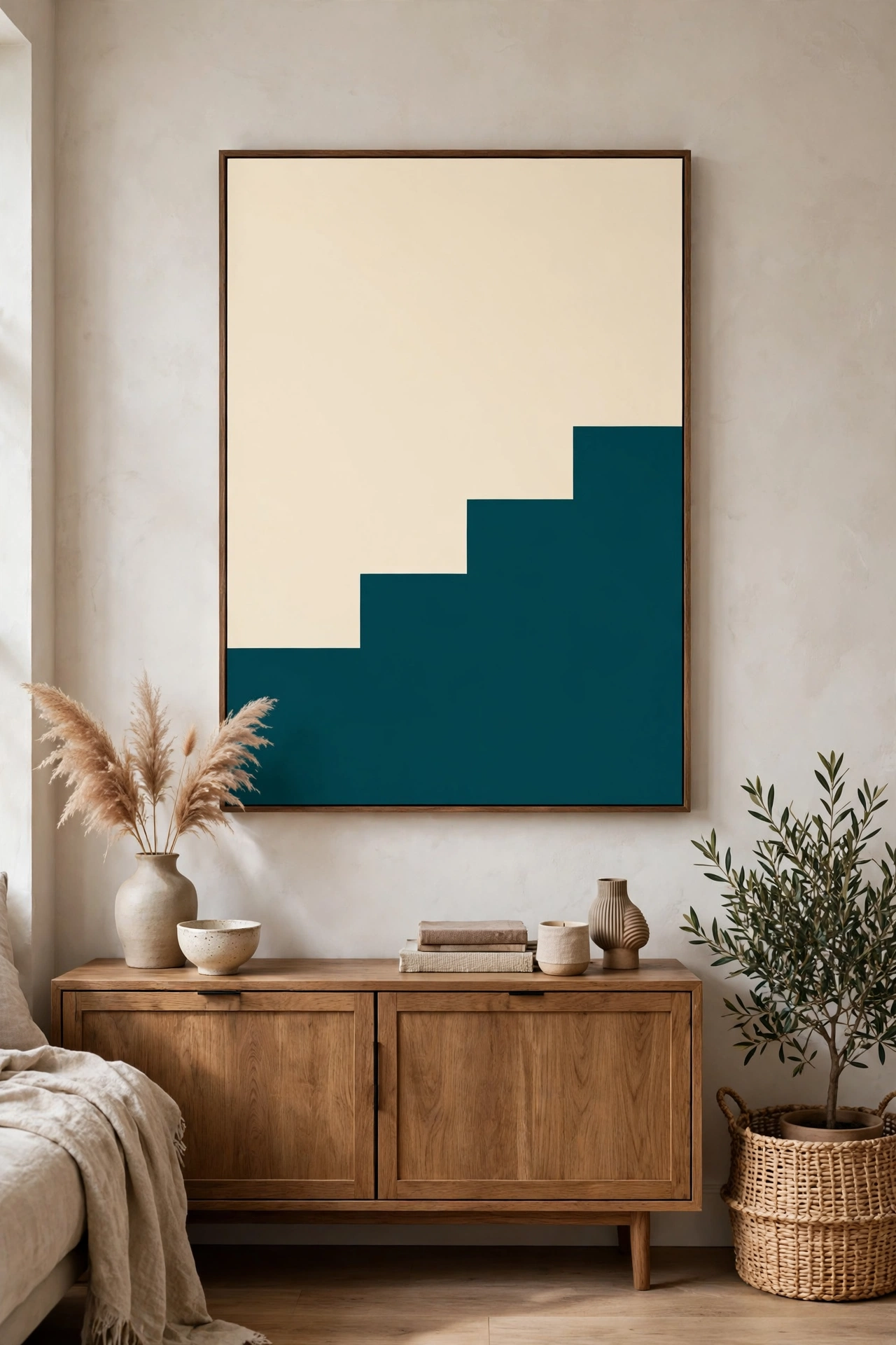
A canvas split into two tones, one dipped lower than the other, gives you a bold graphic piece in under an hour. The dip line does all the design work, so your colour choice is the only decision that matters, and that makes it a great first project.
Tape a horizontal line across the canvas, then drop it lower on one side with a second piece of tape so the line steps down like a horizon. Paint the top in a pale tone and the bottom in a deeper one. A cream top with a deep teal bottom, or a blush top with a chocolate base, both look sharp and modern.
Roll the paint on rather than brushing it, and use two coats for the darker half so the coverage is even. Peel the tape while the second coat is still tacky, and touch up any bleeds with a fine brush once everything is dry. The stepped line is what makes people look twice, so keep it crisp.
Colour: choose the deeper tone from something already in the room, a cushion or a rug, so the canvas ties the scheme together. Placement: dip panels suit wide, low furniture like a sideboard or a bench, where their horizontal line echoes the furniture below. Swap: swap the straight step for a gentle diagonal if the room feels too boxy; one angled line softens everything around it.
Try this: paint the bottom half, let it dry, then add a thin metallic line along the step with a fine brush. The glint catches the eye and lifts the whole piece.
Dip panels also work well as a pair. Paint two canvases with the step at different heights, hang them side by side, and the stepped lines create a rhythm across the wall. Keep the colours identical so the pair reads as one artwork in two parts.
7. Monochrome Ink and Charcoal Washes
 Save
One colour, water, and a big brush can produce a canvas that looks like a gallery ink study. Monochrome washes rely on tone rather than colour, so they suit rooms where a bright painting would fight the furniture, and they cost almost nothing to make.
Mix black or deep charcoal acrylic with water in three strengths: a pale wash, a mid tone, and a near-black. Wet the canvas lightly with clean water first, then sweep the palest wash across it in broad strokes. While it is still damp, drop in the mid tone and let the water carry it. The soft bleeding edges are the whole charm, so do not try to control them too much.
Once the first layer is dry, add the darkest marks with a nearly dry brush. A few bold strokes, a cluster of short marks, or one strong vertical line will anchor the composition. Less is more here: three dark marks beat thirty, and you can always add one more after stepping back to look.
Texture: crumple a piece of paper, dip it in the wash, and press it onto the canvas for a soft, cloudy texture. Placement: monochrome pieces suit studies, hallways, and minimalist bedrooms where quiet art earns its place. Swap: swap charcoal for deep indigo or forest green if pure black feels too stark; a single-colour wash in a dark tone still reads as monochrome.
Try this: leave one corner almost empty. The white space gives the dark marks somewhere to breathe and stops the piece feeling heavy.
Seal ink washes with a fixative spray before varnishing, since water-based washes can lift if the varnish brush drags across them. Two light coats of spray, ten minutes apart, are enough. The finished piece looks like a print from a much more expensive shop, and it took one afternoon.
8. Fabric and Paper Collage on Canvas
 Save
Collage is the answer when paint feels intimidating. Torn paper, fabric scraps, and old maps give you colour and pattern without a single brushstroke, and the torn edges look deliberate in a way cut edges never do.
Start with a painted background in one calm colour, then tear shapes from patterned paper, linen offcuts, or pages of an old book. Arrange them on the dry canvas before you glue anything down, moving pieces around until the balance feels right. Big shapes first, small accents last, and leave breathing room between them.
Glue each piece with a thin layer of matte medium or watered-down PVA, smoothing from the centre outwards so no air bubbles get trapped. Once everything is stuck down, brush a coat of matte medium over the whole surface to seal it. The sealer evens out the sheen so the piece reads as one artwork rather than a pile of paper.
Colour: limit yourself to one patterned paper and two solid fabrics so the collage stays calm. Texture: layer a piece of hessian or raw linen under a smooth paper shape; the contrast makes both materials stand out. Swap: swap paper for dried leaves pressed flat if you want a natural version; seal them well, since leaves are brittle once dry.
Try this: tear a long strip of fabric and run it across the canvas as a horizon line, then build the collage around it. One strong line organises everything else.
Collage suits renters especially well, because it uses materials you probably already own and costs almost nothing. It also works beautifully on a smaller canvas, so if the big canvases in this list feel ambitious, start here. The technique scales up too: a large collage on a wide canvas, with generous empty space, looks every bit as polished as a painted piece. For a room-wide colour commitment, a single bold shade on every surface changes the feel of a space completely, and our colour drenching guide explains how to carry one colour from walls to ceiling without it feeling heavy.
The combination: one big canvas, three colours plus white, and one technique matched to your patience.
Bringing It All Together
The thread running through all eight ideas is restraint. One big idea per canvas, three colours at most, and a finish that lets the materials speak. That is what separates a piece that looks expensive from one that looks busy. Start with the technique that matches your patience: dip panels and colour fields if you want a result today, plaster relief or scraped neutrals if you enjoy the process itself.
Hang the finished canvas, step back to the far side of the room, and live with it for a day before judging it. Abstract art settles into a room slowly, and the piece you doubted in the morning often looks exactly right by the evening. If it still feels off, change one thing only: the height, the wall, or a single colour. Small adjustments fix most problems, and the canvas is yours, so there is no wrong answer.
Frequently Asked Questions
What size canvas should I buy for above a sofa?
Aim for a canvas about two-thirds the width of the sofa. For a standard three-seat sofa around 210 cm wide, that means a canvas roughly 120 to 140 cm across, or a pair of canvases that add up to that width. Anything smaller looks lost, and anything wider crowds the wall.
Do I need expensive paint for DIY canvas art?
No. Student-grade acrylics work well for every technique in this article, and a foam roller hides the difference between budget and premium paint on flat colour work. Spend your money on the canvas itself and on a decent varnish, since those two things decide how the finished piece looks and lasts.
How do I stop my colours turning muddy?
Let each layer dry fully before adding the next, and mix no more than two colours together at a time. Keep a separate brush or knife for each colour, and clean tools between layers. Muddy paint almost always comes from wet colours mixing on the canvas, not from the colours themselves.
Can I paint over a canvas I already ruined?
Yes, and most artists do. Sand the surface lightly, wipe off the dust, and paint over it with a coat of white gesso. Two coats of gesso give you a fresh surface, and the faint texture underneath often adds character to the new piece. A ruined canvas is a free canvas.
How do I hang a heavy plaster canvas safely?
Use two fixings spread across the width, not a single nail, and check the weight rating on the fixings you buy. A plaster canvas can weigh several kilos, so picture hooks rated for at least twice the weight give a comfortable margin. If the wall is plasterboard, use proper plasterboard fixings rather than a standard nail.
One Last Thought Before You Pick Up a Brush
The best canvas in this list is the one you will actually finish. Pick the technique that feels enjoyable rather than impressive, buy the canvas a size bigger than feels sensible, and give yourself one unhurried afternoon. The wall has waited this long; one more day will not hurt, and the piece you hang tomorrow will look like it belonged there all along.
1 thought